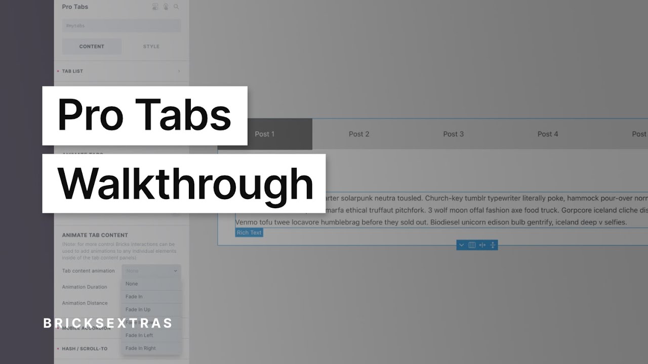
Pro Tabs
This element is nestable, allowing for any Bricks elements to be added inside.
This element can be used inside query loops.
This element supports being used inside AJAX filtered content, either by Bricks’ native filter elements, WPGridbuilder, JetSmartFilters or PiotnetGrid
This element has it’s own interaction settings. Refer the interactions tab below for the list of element-specific triggers and/or actions.
This element support being used inside both components & nested components.
- General
- Accessibility
- Interactions
- Developer
- Support FAQ
This element allows you to easily build accessible nestable tabs in Bricks, with support for the following features:
- Accessibility built-in.
- Accordion layout option for smaller screens.
- Fully nestable element, including accordion toggle + icon, everything editable visually in Bricks.
- Ability to dynamically populate tabs with query loops.
- Support for tabs being used inside other query loops.
- Option for horizontal scroll tabs.
- Animations for tab & tab content.
- Adaptive Heights.
- Support for using Bricks animations inside tab content on elements (with the option to disable animations for mobile accordion layout).
- Supports all Bricks’ interactions inside tab content area.
- Out-of-the-box support for use with facet plugins (WPGB, JetSmartFlters, Piotnet Grid).
Walkthrough Video
Adding tabs
Each tab is really two parts, the tab item and the tab content item. For every tab item, there would need to be a corresponding tab content item. Within the nested structure, it’s important to always remember that the ‘items’ are the parts you want to duplicate to create more tabs. Tab item and Tab Content Item.

If you wish to populate dynamically, these ‘item’ elements are where to apply the query loop.

Once the query loops are in place, you can then use dynamic tags to populate the content of the tabs dynamically.

Adding in tab content
The entire structure is built with native elements, mostly blocks. The block where to add in the content for the tabs is called ‘Tab Panel Content’.
Mobile Accordion
One of the key features of the Pro Tabs element is that it can shrink down to an accordion for smaller screens at the chosen breakpoint.
Each tab content item has its own accordion toggle, which by default contains the typical text & icon, but as the entire element is nestable, this can be customized entirely and styled separately to other parts of the element.
These are separate elements and so can either be customised from the Pro Tabs settings, inheriting the styles that have been set there, or can be selected in the structure and customised by adding classes etc.
Important to note, that you’re viewing the ‘tab content’ part of the structure when viewing the mobile accordion layout.

Tab List
The tab list controls apply to list of tabs which the user interacts with.
Tab Width: By default the tabs will take up the width of the content inside one, here you can set a width instead.
Flex grow tabs: Enabling to add flex-grow 1 to the tabs, meaning they’ll take up the available space (for example if there are two tabs, they’ll take up 50% each).
Tab Wrap / Scroll: Choose for the tabs to wrap, nowrap, or horizontal scroll. Horizontal scroll means the tabs will be allowed to be more than 100% of the available space and can be scrolled to.
Active styles – The typography, border, and backgrounds can be changed for the current active tab separately. These styles will also be inherited onto the mobile accordion toggle if used.
Tab Content
In the tab content settings you can apply the styles that will apply to all tab content areas in one go.
Animations
Animated Tabs – Instead of just changing the background/colors for the active tab, enabling the animate tabs option will add a little slider that makes the active tabs appear to move across each tab. (similar to how it’s done in the toggle switch element)
Animate Tab Content – Choose from a number of fadein animations for the tab content. For more control, the Bricks interactions can also be used to add animations on any elements inside the tab content that will play each time the tab is selected (This can also be disabled for the mobile accordion).
Behavior
Change some of the behaviors to best fit your use case.
Allow hover to select tabs – Will automatically activate the tab as soon as the cursor hovers over it. Useful if using the tabs inside a mega menu dropdown, where it creates a nicer experience being able to hover through the items.
Allow tabbing to unselected tabs – Note that is OFF by default. The common behaviour for keyboard users when it comes to tabs is to be able to tab into the content area from that active tab, not to move to the other tabs. Left/right keys are for moving between different tabs and then the tab key is for moving into the active content area (as can be seen here). However, if you do need the unselected tabs to be tabbable for your use case, enable this setting. (if you’re unsure, leave this disabled)
Adaptive Height – For the desktop-tab layout, this option will add a smooth transition for the overall height of the tabs content element to fit the new height of the active tab.
Note that if you’re using the adaptive height feature and are styling the tab content separately, like adding background colors or borders, it’s best to add these styles to the tab content element itself rather than the individual items inside. This way you get the benefit of actually seeing the transition on the element which is changing height.
Hash / Scroll-to
This feature allows you to use hash links to open specific tabs when the user lands on the page, or clicks a hash link somewhere on the same page.
The IDs to link to are the ‘Tab Panel’ element IDs. These are the elements underneath the accordion toggle so this feature can be used for both the tab layout and the mobile accordion layout.
If using a query loop – If you’re populating the tabs with query loops, then the Tab Panels won’t be using their regular IDs as Bricks removes them. In this case, just give your Pro Tabs element a custom ID, for eg ‘#question’, and then each Tab Panel will be given an incremented ID, #question-1, #question-2, #question-3 which can then be linked to, selecting the correct tab.
URL parameter
In BricksExtras v1.4.1+ a URL parameter can be used to open a specific tab. This can be useful if you still need the hash in the URL to scroll to a particular element, but need a certain tab to be open at the same time.
Similar to the above hash option, use the tab panel ID as the value to identify which tab to open. If the tab panel ID was question-2..
your-site.com/?tab=question-2Then if you wanted to scroll down to the section when the page loaded, rather than the tab panel itself, the section ID can be added. (Bricks would then handle the scrollto functionality as if it were a regular hash)
your-site.com/?tab=question-2#your-sectionThe ?tab key can be customised in the settings.
Keyboard Interactions
Note that by default, tabbing from the selected tab will move the focus into the tab content area.
The user can change the selected tab with the left/right keys and then tab over to the content related to that tab. There’s an option to allow the user to tab across to unselected tabs (although this is generally not recommended as the user would then need to tab through all the tabs to reach the content).
| Key | Action |
|---|---|
| Tab |
|
| Right Arrow |
|
| Left Arrow |
|
| Up Arrow |
|
| Down Arrow |
|
| Home |
|
| End |
|
Note that ‘Element Interactions’ must be enabled in BricksExtras > Misc settings.
This element adds new triggers to Bricks’ interactions options, so you can trigger actions based on the state of the element.
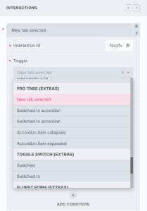
Triggers
New tab selected – Triggered as the user selects a new tab
Switched to accordion – Triggered as the element switches to an accordion (usually as the browser is resized)
Switched to tabs – Triggered as the element switches to tabs from an accordion (usually as the browser is resized)
Accordion item collapsed – Triggered the moment an accordion item is collapsed
Accordion item expanded – Triggered the moment an accordion item is expanded
Actions
The element can be controlled with interactions. (1.4.7+)
- Set the target to the element using a CSS selector
- Use one of the following functions below to set the action.
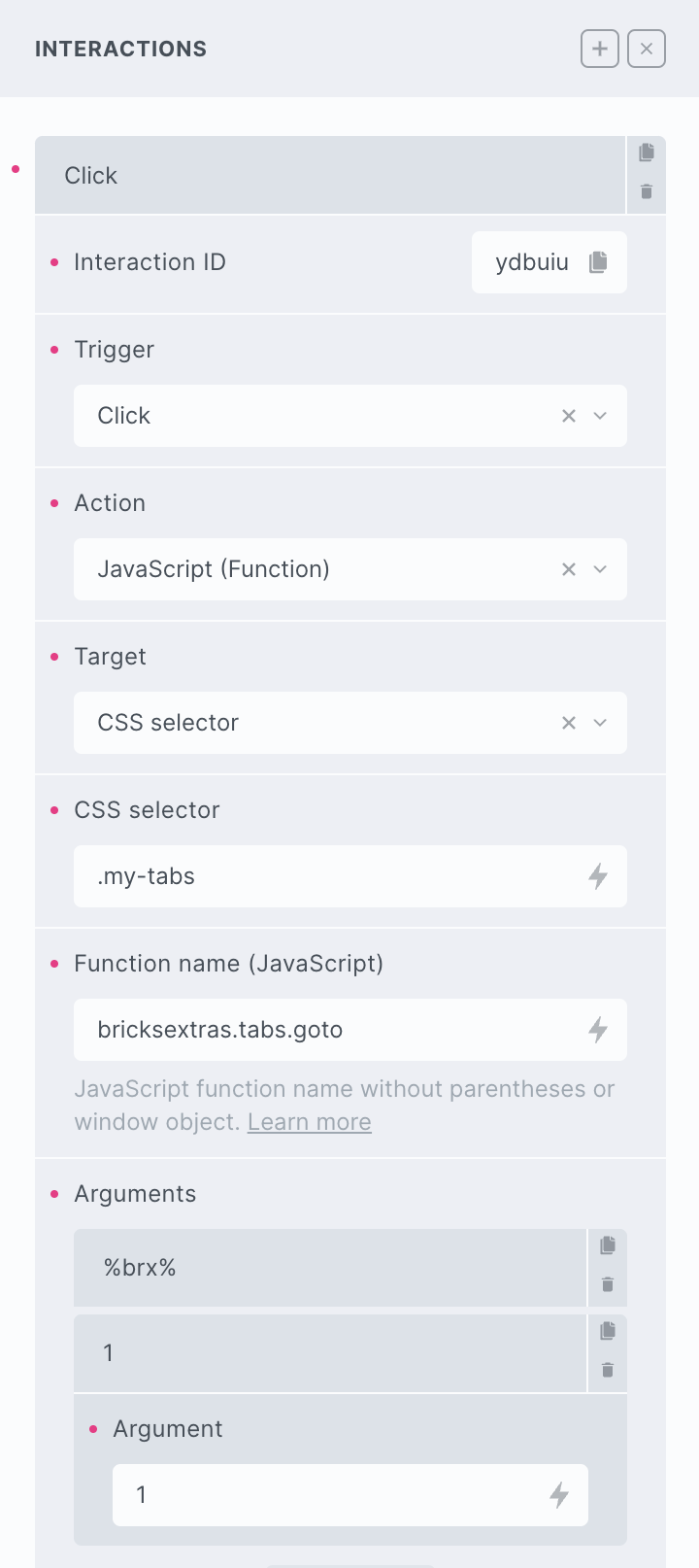
bricksextras.tabs.goto – Open the tab at a specific tab index, whether in tab or accordion view (the second argument being the tab index)
The Pro Tabs element triggers a number of different events..
And so does the accordion toggle element inside of the Pro Tabs..
Sample code for using events:
const tabs = document.getElementById('protabs-1');

tabs.addEventListener("x_tabs:switch", () => {
 // do something when user switched to new tab
});
The accordion events are on the accordion toggle elements.
const tabs = document.getElementById('protabs-1');

tabs.querySelectorAll(".x-tabs_toggle").forEach(toggle => {

     toggle.addEventListener("x_tabs_accordion:expand", () => {
         // do something as each toggle expands
     });
});