Pro OffCanvas
This element is nestable, allowing for any Bricks elements to be added inside.
This element can be used inside query loops.
This element supports being used inside AJAX filtered content, either by Bricks’ native filter elements, WPGridbuilder, JetSmartFilters or PiotnetGrid
This element has it’s own interaction settings. Refer the interactions tab below for the list of element-specific triggers and/or actions.
This element support being used inside both components & nested components.
- General
- Accessibility
- Interactions
- Developer
- Support FAQ
The element enables you to add an OffCanvas element sliding both in/out from either left/right/top/bottom of the viewport. The OffCanvas can be toggled open/closed by any selector being used as a trigger. Ideal for custom OffCanvas Menus or any content that you wish to be revealed instantly with a click.

Some benefits over Bricks’ native OffCanvas element..
- Any element can be used to trigger it.
- Can be used inside a query loop to display dynamic content from queries.
- Control over which element receives focus when OffCanvas opened.
- Included option to sync burger triggers.
- Smooth out transition when closed
- Option to close automatically if hash links are clicked inside the OffCanvas
- Two OffCanvas’ can be synced.
- Control over the transition.
- Control over what users with ‘reduce motion’ enabled will see.
- Will automatically stop any playing videos as they go out of view when OffCanvas closes
- Option to keep the backdrop, but disable it as a closing option when clicked.
- Comes with developer docs, functions/events to control programmatically if needed, for more use cases.
- Easier to work with inside the builder due to all animation/transitions being removed.
Quick start workflow
The general workflow when adding an OffCanvas to the page is the following:
- Add an OffCanvas element to the page/template, ideally near the bottom outside of any sections.
- In the OffCanvas settings, there is a Open / Close Trigger selector. Change this to the selector you wish to use for your button or link to toggle the Offcanvas. Let’s say you choose
.open-offcanvas. - You can then hide the OffCanvas inside the builder by enabling “hide in builder” at the top.
- Add an element that you wish to be the trigger, either a button, link or burger trigger. (Burger trigger is a common choice).
- Give this element the class you chose, in this case,
open-offcanvas. - That’s it. The OffCanvas will now open when the user clicks that element.
If the OffCanvas is intended to be site-wide, consider creating a global template for your global elements.
Primary Settings
Hide in Builder – Quick “hide” for when working in the builder so you can focus on building other elements. Has no effect on the front end.
Click Trigger – Choose the selector that will act as the trigger to toggle the OffCanvas when clicked. Any element can be used as the trigger. The Burger Toggle element works well as a button if you want an animated burger menu.
Component scope (v1.5.4+) – Enable if inside of a component and which to self-contain the functionality to the specific instance of component. ie only the elements within that particular component can be clicked to toggle the offcanvas.
Direction – Choose which direction the OffCanvas will start and slide in from. Left, right, top or bottom of the viewport.
Transition Type – Fade or slide in. Default is slide.
Layout / Spacing
The ‘inner’ content part of the OffCanvas, where the content is a flex container. Changing the flex alignments is a quick way to align of all the content inside.
There’s a default padding of 30px around the content, which can be changed in the layout/spacing tab.
Config
Clicking hashlink will close – If enabled, any hashlinks found in the OffCanvas will close the OffCanvas if clicked. This is useful for when creating links that move the user down the page, the OffCanvas will close as the page scrolls.
Esc to close – This allows users to be able to close the canvas by just pressing the escape key. This is useful for when using the offcanvas for filling in forms, or if there is no backdrop and you want an easier way for the user to go back to the main site.
Move focus to OffCanvas – This setting will allow you to deliver a smoother user experience, especially when using the OffCanvas for forms or call-to-actions. You can either choose to move the focus to “offcanvas inner” which will move the focus just inside the OffCanvas itself (this is the default), or to add a specific selector. A ‘selector inside OffCanvas’ can be useful if you have a particular link or button or form input, that you want the user to click or start typing immediately.
Prevent Scroll When Open – This setting will add overflow hidden to the html/body elements when the offcanvas is open, preventing the user from being able to scroll the page until the OffCanvas is closed.
Sync Burger Triggers – If you’re using two separate burger triggers. For eg, one in the header and one inside the offcanvas content itself. This setting will keep the burger animations synced so when the user clicks the inner one to close, the other one will animate to close automatically.
Force second OffCanvas to close – If you have two OffCanvas’ using the same click trigger. This means they will both open when the trigger is clicked. Enable this setting to make sure that if one OffCanvas is closed (for eg if the backdrop is clicked) that it will close the other one also.
Backdrop
Disable backdrop – Will completely remove the backdrop, meaning the site will be clickable even when the offcanvas is open.
Click backdrop to close – Enabled by default. if disabled, the user won’t be able to click the rest of the site (due to the backdrop being there) but also won’t be able to close the OffCanvas by clicking it. Only disable this if you’re adding another way to close the OffCanvas, like you’re own button.
z-index – Depending on your page design and content, you may need to increase the z-index on the offcanvas if some elements on the page are still visible and appearing above it.
Accessibility
Aria-label – Change the aria-label for the OffCanvas content to something better descriptive of the content inside. By default it is just ‘offcanvas’.
Add aria-controls to trigger – This will make sure the correct aria-controls attribute & value is added to the button/link you’re using as the trigger. Disable if you’re adding it yourself.
Prefers reduce motion – Choose to remove the slide in and choose to either ‘fade’ or ‘no transition’ for users that have reduce motion set in their browser.
Styling
Note that the ‘style tab’ containing all the CSS properties, will be applied to the ‘offcanvas inner’ (ie the container of the content inside the OffCanvas, not the element’s wrapper).
Some notes on the built-in accessibility..
- When the OffCanvas is hidden, it is removed (and all of its children elements) from the accessibility tree, so nothing is focusable until it’s opened.
- Esc key will close the OffCanvas (optional)
- Auto-focus to OffCanvas content when the opened (can be customised to focus to any selector inside the OffCanvas)
- Clicking hashlink will close the OffCanvas (this allows hashlinks to be used, where the user will expect to be scrolled to the content and the OffCanvas hidden)
- Default Aria label value is ‘Offcanvas’, this can be changed in the settings.
- Transition can be removed for user’s with ‘Reduce motion’ enabled on their device.
Note that ‘Element Interactions’ must be enabled in BricksExtras > Misc settings.
This element adds new triggers to Bricks’ interactions options, so you can trigger actions based on the state of the element.
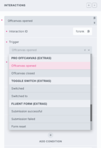
Triggers
Offcanvas opened – Triggers as the OffCanvas becomes visible
Offcanvas closed – Triggers as the user closes the OffCanvas
Options
Delay – How long to wait after the event until the chosen action takes place .
Actions
The element can be controlled with interactions.
- Set the target to the element using a CSS selector
- Use one of the following functions below to set the action.

bricksextras.offcanvas.open – Open OffCanvas
bricksextras.offcanvas.close – Close OffCanvas
bricksextras.offcanvas.toggle – Toggle OffCanvas Open/Close
You can open/close the OffCanvas programmatically with JS with the xOpenOffCanvas() and xCloseOffCanvas() functions.
Just pass in the ID of your OffCanvas, eg if the OffCanvas ID is offcanvas-1:
xOpenOffCanvas( 'offcanvas-1' )The OffCanvas also triggers events when opening and closing. You can listen for the events x_offcanvas:open and x_offcanvas:close to run your code as they happen.
Sample code:
const offcanvas = document.getElementById('offcanvas-1');

offcanvas.addEventListener("x_offcanvas:open", function() {
 // do something here when offcanvas opens
});

offcanvas.addEventListener("x_offcanvas:close", function() {
 // do something here when offcanvas closes
});
An example use case for these events would be making sure a video player stops playing inside the OffCanvas when the OffCanvas closes. Or running some code to capture how many time the offcanvas has been opened for analytics.
Another Example – how to close all other OffCanvas’ when one opens
 // get all offcanvas
   const allOffcanvas = document.querySelectorAll('.x-offcanvas');

   // for each offcanvas
   allOffcanvas.forEach(currentOffcanvas => {

    // when current one opens
     currentOffcanvas.addEventListener("x_offcanvas:open", () => {

       // find all open offcanvas'
        document.querySelectorAll('.x-offcanvas_inner[aria-hidden=false]').forEach(openOffCanvas => {

          // close all except the current one
          if ( openOffCanvas.closest('.x-offcanvas') !== currentOffcanvas ) {
            xCloseOffCanvas( openOffCanvas.closest('.x-offcanvas').id )
          }

        })

    });

 })