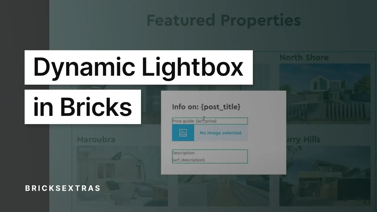
Dynamic Lightbox
This element is nestable, allowing for any Bricks elements to be added inside.
This element can be used inside query loops.
This element supports being used inside AJAX filtered content, either by Bricks’ native filter elements, WPGridbuilder, JetSmartFilters or PiotnetGrid
This element has it’s own interaction settings. Refer the interactions tab below for the list of element-specific triggers and/or actions.
This element support being used inside both components & nested components.
- General
- Accessibility
- Interactions
- Developer
- Support FAQ
This element allows you to build dynamic, content lightboxes visually in Bricks. The contents of the lightbox can be populated with any elements and, if used inside a query loop, can be used with dynamic data to pull the content from each post. Ideal for adding “view more” buttons for showing more post content inside post loops.
Walkthrough video
Here we show how to create “dynamic content” lightboxes where the post info can be displayed when the user clicks links inside of query loops.
Update – the need to style via class only (as seen in the video) no longer applies.
Differences to the Modal Element
The dynamic lightbox element also reveals content in a popup, similar to the modal element, but is different to the modal in a number of ways..
- Supports grouping, meaning the user can swipe left/right between multiple lightboxes.
- Allows for fetching content dynamically when called dynamically using links i.e., iframes, videos, images.
- Is always revealed via click, not designed to be used as a modal that appears due to different triggers.
- Backdrop will only close lightbox on desktop, not mobile. (mobile touch events are preserved for zooming images etc)
Inside Query Loops
Both the dynamic lightbox and the modal elements can be used for showing content from inside a query loop by clicking on an element inside. How to decide which one to use?
Should I use the Dynamic Lightbox or Modal
Setting up the Lightbox
Lightbox content – At time of writing, the available options are..
- Nest elements – you can add any elements inside the lightbox container to design the layout.
- iFrame – Content from other URLs can be loaded dynamically inside the lightbox. If showing another URL on the same domain, you can choose to only show part of the page. For eg just one section, by just providing the selector of that section. (Make sure to set a height for the lightbox content if linking to iframes as they don’t have a height by default)
- Manual (links) – You can set up one lightbox element to be used with multiple links on the page. The href of the links will determine what content appears inside of the lightbox. If the links point to image URLs, when clicked the lightbox will show those images. If lots of links, they can be displayed inside of a gallery by enabling “grouping” so the user can flick between each one.
- Gallery (new) – You can choose a selection of images from the media library (or by using dynamic data) to populate the lightbox. Make sure to enable ‘grouping’ to allow for swiping across multiple images. Similar to when using iframes, add the element(s) inside of the lightbox structure that you want the user to click to open.
Link selector – Provide the selector for the link that the user will need to click to open up the lightbox. Note that this needs to be a link, if you are using a button or image element, set it to be a link in the element settings. These elements aren’t links by default.
Component scope (v1.5.4+) – Enable if inside of a component and which to self-contain the functionality to the specific instance of component. ie only the elements within that particular component can be clicked to open the lightbox.
Custom Close Button
There’s always a close button at the top right of the viewport when the lightbox is opened, but you may wish to also add a custom close button inside of the lightbox content if nesting elements inside.
You can do this by adding the attribute data-x-lightbox-close to any element inside of the lightbox. Clicking that element will then close the lightbox.
There’s also the option to enable “hash link to close” meaning that if a hashlink is clicked inside of the ligthbox (like inside of a menu that scrolls the user to a specific part of the page) then the lightbox will close.
Custom Nav Buttons
Similar to the custom close above, if you’re nesting elements inside of a grouped lightbox and would like to include some elements that will move the lightbox prev/next when clicked, you can add the attributes data-x-lightbox-prev and data-x-lightbox-next to any elements (ideally buttons).
Using the iFrame or Gallery Options
When using the iframe or gallery option, the process is the opposite way around than when filling in the contents with elements. This time the content is going to be dynamically fetched from the settings. Simply wrap the lightbox around the button/image/heading or whatever element you want the user to click to open up the lightbox.
Example structure below. Here the image inside of the lightbox element will appear inline on the page and when clicked the lightbox will open showing the contents as set in the settings (either the iframe URL or the images from your gallery). The dynamic lightbox element is acting more like a link wrapper here, providing the clickable link to open up the content.

Make sure to set a height for the lightbox content if linking to iframes, as they don’t have a height by default.
Using the Manual (links) Option
It won’t matter where the actual lightbox is positoned on the page, it could be inside of a template or just on the page where you need it. The job of “manual” mode is that you’re telling the ligthbox to look for certain links on that page where it exists (links that match the selector that you provide).
The lightbox will dynamically load up the content that it finds from those links (from the href attribute). If the links are pointing to Youtube video URLs, it will popup a Youtube video when clicked. For images, the image will be displayed and for a page URL, the page will be displayed inside of an iFrame.
The width of the lightbox content will be depentant on the “content width” setting. There’s also a specific video width and image width setting, to allow you to customize these separately. For example, you may wish for the iFrame to appear quite large but limit any videos to have a specific max width.
Live Demo and 1-click Copy code.
Using the lightbox with Bricks’ Gallery or Image elements
Any images from Bricks’ image element or gallery can be used to trigger the dynamic lightbox. You only need to set the ‘link to’ option to ‘media file’ to make sure that the images are wrapped inside links. Then you can use the ‘manual’ mode in the lightbox to add the selector for those links.
For example,
- In the gallery element settings – set the ‘link to’ option to ‘media file’. Now you have a gallery which contains links to each image URL.
- Give your gallery a class, say ‘my-gallery’.
- Add a dynamic lightbox element to the page, set to ‘manual’ mode to look for links.
- Use the class of the gallery in your link selector to make sure the lightbox is targeting the links inside of the gallery, ‘.my-gallery a’.
Screen recording showing the above steps – https://support.bricksextras.com/recordings/Hd7qokzM2iPvR9SfhHEr
Styling the Lightbox
Content height/width – Set the height/width of the content inside of the lightbox. By default the height is auto, so can just be left if you wish for the lightbox to always take the height of the elements inside of it. If there’s going to be a lot of content, then it’s best to set a height so the lightbox can be scrolled.
Styling the UI – The built-in close button and navigation arrows (if grouping is enabled) can all be styled separately.
Inner Content – For setting up the layout, default background color for the content, borders etc, go to the inner content tab style settings.
Grouping
If you’re using the lightbox inside of a query loop, then you have the option to group all of the posts together so that when the user opens up one lightbox, they can navigate forwards/backwards between the different posts. Navigation arrows will appear.
Loop slides on end – If enabled, when the user reaches the last slide it will loop back around to the first slide.
Draggable – Allow the user to drag left/right to navigate (instead of needing to press the arrows). Most of the time this is best enabled, but some examples of when it’s best disabled are:
- You’ve added a slider or some other draggable element inside of the lightbox, so you want the user to drag that instead of the lightbox.
- You’re using an animation other than “slide” for the slide effect, such as “fade” where it doesn’t make sense for the user to swipe and see a fade effect.
Slide effect – Set a different animation for when the user is navigating between slides.
Grouping scope (v1.5.4+) – Allows you to scope the grouping to either a particular component that the lightbox is inside of, or to the query loop that the lightbox is inside of. (ideal for when multiple query loops or components on the page, all with the same classes etc and you want them to be grouped independently)
Config
Close button – Enable a close button to appear in the top right of the viewport
Click backdrop to close – Enable to allow clicking anywhere outside the lightbox content to close the lightbox
Keyboard Navigation – Enable to allow the user to use the arrow keys to navigate between slides if using grouping.
Animation
To change the movement of the lightbox when it opens and closes here you can change both the “start position” and the “end position”.
The start position is the position the lightbox is in before it appears. The end position is the position it moves to as it closes.
You can use the preview options to view the modal in its different positions.
Prefers reduce motion – Choose to limit the animation for users that have reduce motion set in their browser.
Captions
If using the ‘manual link mode’ or the ‘gallery’ mode to include images inside your lightbox, the new captions option will enable you to show the image captions at the bottom of the viewport when each image is revealed.
Depending on which gallery you’re using, here’s how to get the captions to display..
If using the Pro Slider Gallery – Captions are automatically built-in for the images, simply enable from the lightbox settings to show the caption data for each image.
If using the ‘gallery’ option in the lightbox – Captions are automatically built-in for the images, simply enable from the lightbox settings to show the caption data for each image.
If using the Bricks’ Gallery Element – Make sure ‘captions’ is enabled in the gallery element’s settings.
If using your own links with ‘manual link mode’ – Add the attribute ‘data-description’ to any custom links with the value being the text that you wish to appear as a caption. This can be any dynamic data.
1-Click Copy Sections
Dynamic Posts Lightbox on BricksSections.com
Some notes on the built-in accessibility..
- Auto-focus lightbox content when the lightbox opens
- Trigger always needs to be a link, so open/closing can be done via keyboard (space or enter key).
- Focus returns to original trigger when lightbox closes (optional)
- Default aria-label “close” on the default close button (can be changed, or you can use a custom button for closing)
Keyboard Interaction
| Key | Action |
|---|---|
| Left/Right | Will browse between content inside lightboxes when ‘grouping’ is enabled |
| Tab | When lightbox open, will tab across to the lightbox controls – arrows and close button |
Tips
It’s important to add your own aria label to your link being used to open up a lightbox if there’s not already text inside of the link. For example if using an icon, to give context on what clicking the link will do.
Note that ‘Element Interactions’ must be enabled in BricksExtras > Misc settings.
This element adds new triggers to Bricks’ interactions options, so you can trigger actions based on the state of the element.
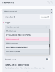
Triggers
Lightbox opened – Triggered as lightbox is opening
Lightbox closed – Triggered as user is closing lightbox
Options
Delay – How long to wait after the event until the chosen action takes place .
The dynamic lightbox element is powered by GLightbox. If you’re needing to control the lightbox programmatically using GLightbox’s methods, you need to get the GLightbox instance like this..
First, find the identifier on your lightbox element, it’s the value of the attribute ‘data-x-id’.
So for eg, if the lightbox has the attribute ‘data-x-id=bfcads’, then you’d get the instance like this..
const myLightbox = xDynamicLightbox.Instances.bfcadsNow we can control using any of the methods built into GLightbox..
myLightbox.nextSlide(); // Go to next slide
myLightbox.close(); // Close the lightbox
Example using gLightbox JS events;
myLightbox.on('slide_changed', () => {
  // Do something when slide changed
});

myLightbox.once('slide_changed', () => {
  // Do something just one time when slide changed
});

myLightbox.once('slide_after_load', () => {
  // Do something one time after slide has loaded
});
See the gLightbox events in their docs.
Events
If you’re needing to run code when any lightbox opens/closes on the page. There are two events x_lightbox:open and x_lightbox:close.
Eg..
document.querySelectorAll('.brxe-xdynamiclightbox').forEach((lightbox) => {

    lightbox.addEventListener('x_lightbox:open', function() {
        /* do something here when lightbox opens */
    })

    lightbox.addEventListener('x_lightbox:close', function() {
        /* do something here when lightbox closes */
    })

})
Re-initialise
If you’re addind content dynamically to the page using AJAX or facets and need to manually reinitialise the lightbox, run the following function at the time when the content is added..
if ( typeof doExtrasLightbox == 'function') {
    doExtrasLightbox(container, true)
}
(the variable ‘container’ needs to be an element that contains the newly added content)