Pro Accordion
This element is nestable, allowing for any Bricks elements to be added inside.
This element can be used inside query loops.
This element supports being used inside AJAX filtered content, either by Bricks’ native filter elements, WPGridbuilder, JetSmartFilters or PiotnetGrid
This element has it’s own interaction settings. Refer the interactions tab below for the list of element-specific triggers and/or actions.
This element support being used inside both components & nested components.
- General
- Accessibility
- Interactions
- Developer
- Support FAQ
This element allows you to build nestable accordions with animated toggle icons, support for hash linking to open individual accordion items & comes with accessible markup out of the box.

Feature Highlights / Differences to Bricks’ native accordions..
- Out-of-the-box accessible markup
- Auto-open based on URL hash. ie linking to another page /#FAQ. will go to that page, and scroll to the accordion item with it opened.
- Fully supports being used inside query loops, or with query loops used to dynamically populate accordion items.
- Animate arrows on expand.
- Built-in events on expand/collapse (see developer docs)
- Fully nestable (accordion header and content areas) for full styling control
- No content-shifting inside of the accordion content when opened.
- No re-rendering inside builder when changing settings.
- Conditional accordion behaviour across breakpoints (v1.4.1+)
Note – when editing in the builder, click on the accordion header to open the individual accordion items. Each item will act individually inside the builder for easier editing.
Overview – Using for static or with dynamic data
To use with dynamic data – Add a query loop to an accordion item. This will then duplicate the items inside the element based on the query. Any elements inside the accordion header or content area can then be populated with dynamic tags.
Adding static accordions – If not using any dynamic data, simply duplicate the accordion items inside the structure panel until you have as many as you need and then customise the content.
Configuring
Collapse in builder – After setting up your accordions and adding all of the content, enabling this setting to force the accordion items (apart from the first one for editing purposes) to collapse inside of the builder.
Expand first item – This will ensure the first item in the accordion is expanded by default.
Expand All – Will make every accordion item expanded by default. (useful if wishing all content to be visible unless the user decides to close it)
Disable closing sibling items – This will stop other accordion items closing when one is opened.
FAQ schema – This will add all the FAQ microdata to the elements inside of the accordion header and content area and set the page to FAQ page as per Google’s structured data guidelines.
If using a ‘delay scripts until user interaction’, from any performance plugin. It can mean the JS won’t run when checking your site on Google rich snippets. We’ve seperated the schema implementation to a seperate file, so it can be easily excluded. The file name to exclude is faq-schema.js
Example PerfMatters settings.

Accordion Items
Either add manually inside of the settings, or just add one and then use a query loop to have them dynamically generated based on a CPT or custom field.
Accordion Header / Content
All the accordion headers and content areas within an accordion can be styled directly from the Pro Accordion main settings. As the element is nestable, you could also style by editing all of the individual items directly.
Icons
The built-in toggle icons come with the option to change the colour and change transform based on the state of the accordion item. These settings will change the state of ALL the icons inside of every accordion item. To customise individually, or to change the icon, go directly to the icon element itself.
Hash / Scroll to
The accordion items can be linked to individually. When a user first lands on the page, the page will scroll to that particular accordion item and open it.
Enable the setting and choose an offset (useful if you have a sticky header) for the number of pixels the page should scroll.
The result will be that if you link to yourpage.com/#FAQ-3 and the accordion header or accordion item on the page has the ID ‘FAQ-3’, then that accordion item will be opened and the page will scroll to that position.
Update for v1.3.3+ If using a query loop on the accordion items, Bricks will remove any IDs. So to make it easier to have control over the hashlink, you can now just add a custom ID to the pro accordion element itself. (let’s say #faq-question) and then each accordion item will automatically receive an incremented ID based on that. So you can just link to #faq-question-1, #faq-question-2 and the accordion will know to open at that item, and scroll to it, when the user lands on the page.
Conditional Accordion (v1.4.1+)
The main use case this was requested for was footer content, where you may wish to have multiple blocks containing menu items, links or other content, arranged as columns or in a grid for larger screens and then have them stack as accordion items for mobile view (similar to the Apple website footer menu).
When the accordion behaviour is disabled at a specific breakpoint, the accordion header will no longer act as a button and will just be a heading for that content. (and the default icon hidden). At the breakpoints where the accordion behaviour is re-enabled, it will act as a button again to toggle the accordion item.
Quick example setup.. (you can then add in menu items or links to create an entire footer menu that shrinks down for mobile)
https://support.bricksextras.com/recordings/6T4dbQizztgeNWok1cCT
Some notes on the built-in accessibility..
- This element is fully nestable, built primarily with Brick’s block elements. By default the ‘accordion header’ part of the structure can be toggled by keyboard, either space or return key.
- Both aria-controls / aria-expanded attributes are automatically added to the accordion item headers to ensure it’s synced with the corresponding content area that it will toggle open/close.
- The accordion content areas are labelled by the text found in the accordion header.
Keyboard Interactions
| Key | Action |
|---|---|
| Tab | Moves focus to the next focusable element. If all accordion items are closed, this will be the next accordion header. |
| Space/Return | When focus is on the accordion header of a collapsed item, it will expands the item. |
| Shift+Tab | Moves focus to the previous focusable element. Either back up to the currently opened accordion header, or to the previous accordion item. |
| Up | Moves focus back to previous accordion header, if already on the first header will go to the last header. |
| Down | Moves focus to next accordion header, if already on the last header will go to the first header. |
| Home | Moves focus to the first accordion item header |
| End | Moves focus to the last accordion item header |
Note that ‘Element Interactions’ must be enabled in BricksExtras > Misc settings.
Actions
The element can be controlled with interactions.
- Set the target to the element using a CSS selector
- Use one of the following functions below to set the action.
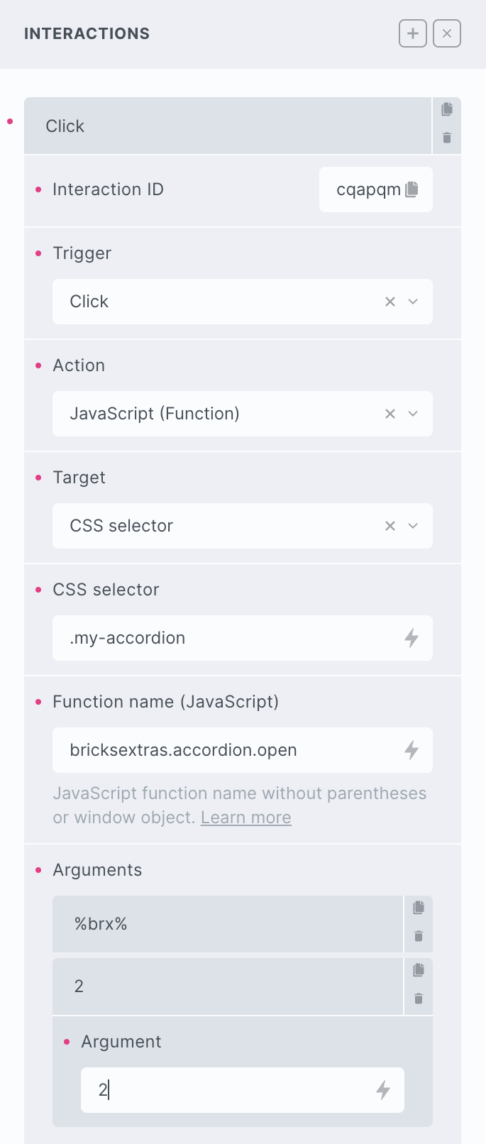
bricksextras.accordion.open – Open specific accordion item
bricksextras.accordion.close – Close specific accordion item
bricksextras.accordion.toggle – Toggle Open/Close specific accordion item
bricksextras.accordion.openall – Open all accordion items (no animation)
bricksextras.accordion.closeall – Close all accordion items (no animation)
The Pro Accordion element triggers events on the accordion header buttons on both expanding and collapsing accordion items. If you’re needing to trigger something when this happens, the events are..
x_accordion_item:expand – triggered just as the accordion item expands
x_accordion_item:collapse – triggered just as the accordion item collapses
Sample code: If the accordion header ID was ‘brxe-egdwug’, then you could do..
const myAccordionButton = document.getElementById('brxe-egdwug');

myAccordionButton.addEventListener("x_accordion_item:expand", function() {
 // do something as this accordion item expands
});

myAccordionButton.addEventListener("x_accordion_item:collapse", function() {
 // do something as this accordion item collapses
});
Needing to use an accordion element inside dynamically added content (for example being loaded in via AJAX), you can use this function to add it in when it’s needed.
doExtrasAccordion(container) – where ‘container’ is the container element with the pro accordion element(s) inside.