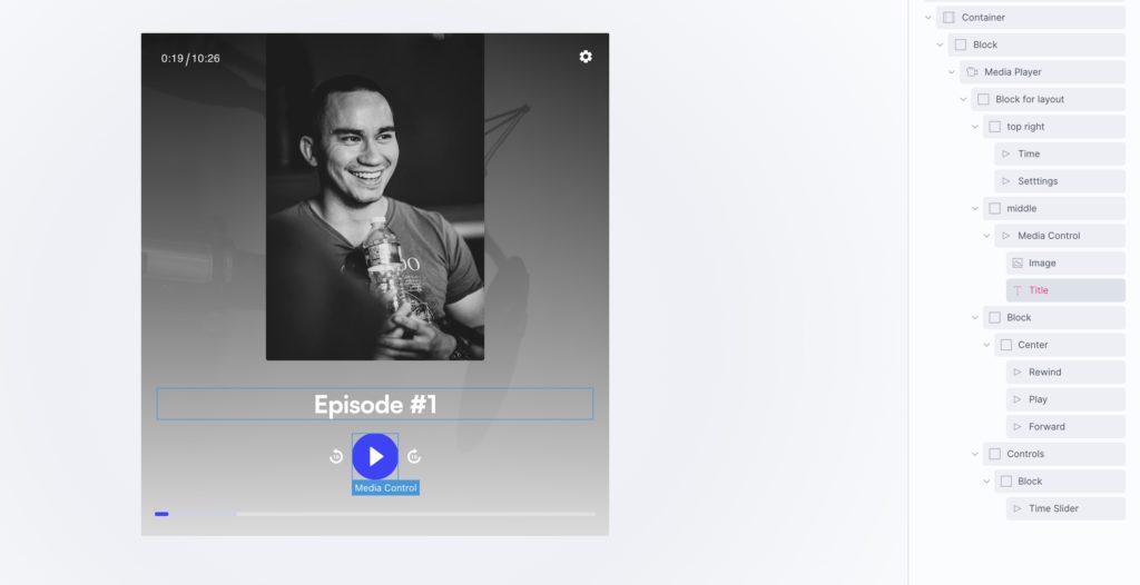
Media Control
This element can be used inside query loops.
This element supports being used inside AJAX filtered content, either by Bricks’ native filter elements, WPGridbuilder, JetSmartFilters or PiotnetGrid
This element support being used inside both components & nested components.
- General
- Accessibility
- Support FAQ
This control element is designed for use inside of the Media Player element, when choosing to build your own custom UI. The true flexibility of the Media Player is to have so much control over the design, and the positioning of each element. Use the media controls to allow users to control the player in different ways.
Note – this element is only needed if choosing to built your own custom layout for a player UI, by default the player comes with it own customisable UI which includes controls, so this wouldn’t be needed.
The media contol element will need to be placed inside of a media player element.

Media Control Options
‘Play’ – Play/pause playback
‘Play (Large)’ – A larger play/pause playback
‘Seek-forward’ – Fast forward by the seek time (default 10 seconds)
‘Seek-backward’ – Rewind by the seek time (default 10 seconds)
‘Time slider’ – The progress bar and scrubber for playback and buffering
‘Time’ – For showing the current time of playback & The full duration of the media
‘Title’ – The title of the current media, either coming from the title settings or dynamically from the video source.
‘Mute’ – Toggle mute – with an optional volume slider.
‘Captions *’ – Toggle captions on/off (if they exist)
‘Chapter Menu *‘ – Open up the chapter menu
‘Chapters Title *‘ – Display the current chapter (will change as the media goes through different chapters)
‘Settings’ – Settings menu with conditional options for speed, audio, quality, accessibility options
‘Fullscreen *‘ – Toggle fullscreen (video only)
‘PIP *‘ – Toggle Player in Player (video only)
‘Custom text’ – Add your own text
‘Image’ – Add your own image (ideal for if needing to add branding to the UI)
‘Poster image *‘ – Display poster image for current media
‘Previous item’ – Button to skip to the previous item in the playlist
‘Next item’ – Button to skip to the next item in the playlist
Conditional Display
Note that any controls with an asterisk next to their name in the dropdown options are displayed conditionally based on the current media. For example, if there are no chapters for the current video in the player – neither the chapter menu button or the chapter title elements will be displayed. This should be taken into account if building a custom layout.
Styling the controls
You can style the controls in two ways..
- Style at the player level – By using the style controls in the media player element, as you add in new controls they will inherit those styles. This is a fast way, for example, to have all the buttons share similar styling.
- Style at the control level – The global styles coming from the player can be overridden at the individual control level.
Icons
The default icons are added as SVGs but can be changed in the settings, either using a font library or your own SVGs. Many controls have different states, like the play/pause where two different icons are used for the same button when as the player changes state.
Show controls
Each control has 5 visibility options

- When user interacts (default) – The control will be hidden when the player is playing, along with the other controls
- Only visible before first play – The control will be visible on page load, but as soon as the player is played it will be invisible
- Only visible after first play – Invisible on page load, but appears with the rest of the controls once the user has clicked play.
- Only visible when player ready to play – Invisible until the media has loaded
- Only visible before player ready to play – Visible only until the media has loaded
Building a UI Layout
With the Custom UI option, we recommend that you first add in a ‘block’ element to take care of the overall layout inside of the player. See in the image above where the block named ‘block for layout’ is the only child element of the media player. And then within that block there’s more block elements handling the layout for the top, the middle part and the bottom. The controls can then just be dropped in where needed within the layout being created by the native Bricks’ elements.
Some notes on the accessibility of the Media Controls..
- Each interactive control is either a button or slider which can be accessed and controlled via keyboard by tabbing into the player.
- The player’s ‘Focus ring color’ applies to all controls when they are tabbed to and can be set in the player styles tab in the Media Player settings.
- Each control type has its own ‘label’ settings, which are then used as the aria labels and also the tooltip content if enabled.