Modal
This element is nestable, allowing for any Bricks elements to be added inside.
This element can be used inside query loops.
This element has it’s own interaction settings. Refer the interactions tab below for the list of element-specific triggers and/or actions.
This element support being used inside both components & nested components.
- General
- Accessibility
- Interactions
- Developer
- Support FAQ
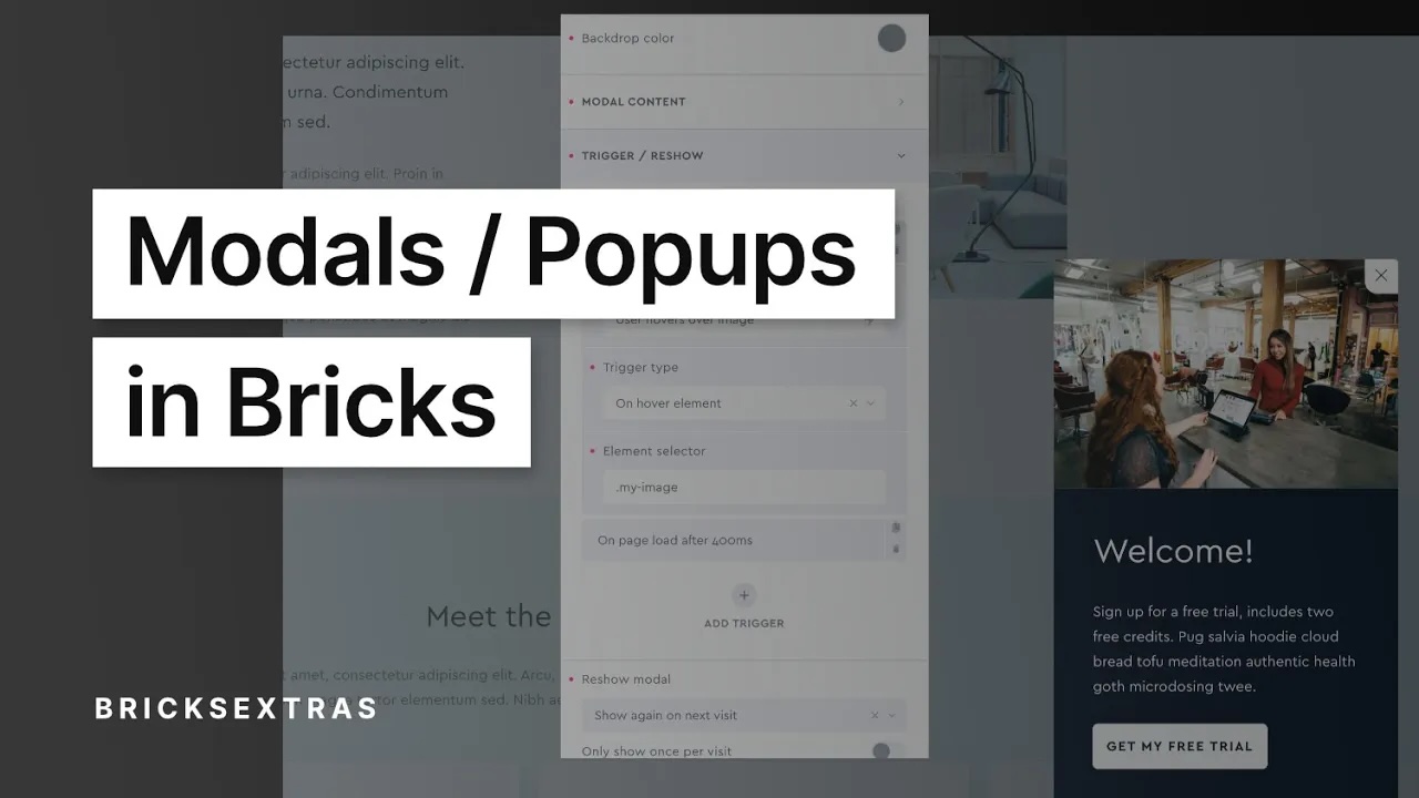
This is a fully accessible modal element that can be used to create any type of popup/modal to appear across any pages or templates on your site. It’s fully nestable, so supports containing any elements and can be used inside query loops (up to three levels deep). There are a number of triggers that can be together or separately as well as reshow settings to limit how often the same user would potentially see the same modal.

Highlighted Features
- 9 different trigger types (use separately or together).
- Choose whether to display to the same user or how long to wait until they see it again.
- Precise control over both open and close animations.
- Out of the box accessible.
- Auto-focus modal content, with focus trapping.
- Choose to disable the scroll on the page when the model is open.
- Custom close buttons.
- Option to only show once per visit (canceling triggers once modal has been shown).
- Easy to open/close modals programmatically (see developer docs).
Video Walkthrough
As of v1.0.6, there are now two versions of the modal element, ‘modal’ and ‘modal (template). The video shows the modal template version, which is still available but more for backward compatibility. The modern version allows for elements to be nested directly inside the modal inside of the structure panel, the settings for each is exactly the same.
Using inside Query Loops
Both the dynamic lightbox and the modal elements can be used for showing content from inside a query loop by clicking on an element inside. How to decide which one to use?
Should I use the Dynamic Lightbox or Modal
Setting up Triggers
Control when you want the modal to open. You can choose multiple triggers.
On page load (after x seconds) – Choose a number of seconds after the initial page load to display.
On page load (incl. URL parameter) – Modal will load on page load, but only if there’s a URL parameter that contains the string that you enter. Useful for targeting visitors that have come from specific links where you’ve added some URL parameters. https://mysite.com/?ref=weeklynewsletter etc.
On scroll number of px – Modal will show after the user has scrolled a set number of px down the page.
On scroll to element – If using on templates, the pages are likely to be different sizes, so you can add a selector for an element so when the user scrolls to that element the modal will show. This way you know they’ve definitely reached the end of the article, or reached the footer etc.
On page exit intent – Once the user attempts to exit the page by moving the cursor or clicking away from page, the modal will show. This will only happen once, if they close and then try to leave again it won’t show.
After number of page views – Choose the number on pages of your site that the user needs to visit before displaying the modal. The counter will restart so if you want to show it every 10 pages, set to 10. If you only want to show it once on the 10th page but never again, see the ‘show again’ settings below to control this.
After time inactive – Choose the number of seconds the user is idle for before showing the modal. This means no clicks, no scrolling, no moving the cursor or tapping on a mobile device for x seconds.
On click element – Make the modal show everytime the user clicks the element of your choice. Useful for call to action buttons etc where you’d want it to display everytime it’s clicked.
Component scope (v1.5.4+) – Enable if inside of a component and which to self-contain the functionality to the specific instance of component. ie only the elements within that particular component can be clicked.
On hover element – If you need info to popup each time a user hovers over a specific element, you can just enable this setting and add the selector for the element.
Programmatically – The modal can also be easily opened and closed programmatically with JS if you need to integrate it to work with some custom code or other plugins. Details are found in the DEVELOPER tab near the top of this doc.
Reshow Modal
Depending on how you’re triggering the modal, it may be that you don’t want to show the modal again to the same user. Or if you do, only allow it after a certain time period.
Show again on next visit – This means each time the page loads the modal will do the same as it did the first time. You probably don’t want this if you’re displaying the modal on page load or after scrolling as it could get annoying. If you’re displaying after 10 page views, it makes more sense.
Never show again – This will strictly never show the same modal to the same user.
Only show after: Set the number of days and hours that need to pass before the modal would be allowed to be shown to the same user. After that time passes, the trigger goes back to doing what it did the first time they visited.
Only show once per page visit – if using multiple triggers such as scrolling to a specific section and after a certain amount of idle time, you may want the modal to actually only shown once with whichever trigger is triggered first. Enabling this setting means that once the modal has shown, all other triggers are cancelled for that page visit. (in other words, it changes the list of triggers to OR instead of AND)
Only show once per session (new) – Similar to the above, but the triggers aren’t reset each page view, they will only be reset once the user session has finished. ie when the user next returns to the site, but not again while they’re still browsing pages of the site. If they open up a new tab, it will start a new session and the modal triggers will be active again.
Positioning
For a fast workflow, the vertical and horizontal positioning of the modal can be done straight from the general tab with the nine common positions for a modal or popup. Use the margin control to move the modal away from the edges of the viewport.
Styling the Modal Content
Go to the ‘styles’ tab instead of the ‘content’ tab, where you have access to all the CSS controls which will apply to the modal content area directly.
Close button
The close button consists of an icon and text that can be customised or removed. The aria-label for the button can be customised also (aria label’s provide more information about the button for users who use assistive technology, such as screen readers)
Custom Close Button
Any element can be used as a close button if you don’t want to use the default icon/text button. You can turn an element into a close button by giving the element a custom attribute with the name “data-x-modal-close” (using Bricks Builder’s custom attributes feature in the advanced tab)
Interaction
Customise how the user can interact with the modal.
Click backdrop to close – Clicking anywhere outside of the modal content will close the modal.
Press Esc to close – Pressing Esc at any time while the modal is open will close it.
Auto focus on first focusable element – By default, if there are any links, buttons, form inputs etc inside of the modal they will be focused as soon as the modal opens. This can be disabled. The focus will still go into the modal, but only if the user tabs will the focus move to an element inside.
Hash link to close – Useful if there are menu items inside of the modal that have hashlinks to specific parts of the page. You may wish for the modal to close if the user clicks these links.
Aria Label – You can choose a custom label, or default to using the first heading found inside of the modal.
Role Attribute – Default: ‘dialog’. Depending on the use case for the modal and content type, you may wish to change to ‘alertdialog‘.
Animation
To change the movement of the modal when it opens and closes here you can change both the “start position” and the “end position”.
The start position is the position the modal is in before it appears. The end position is the position it moves to as it closes.
You can use the preview options to view the modal in its different positions.
Prefers reduce motion – Choose to limit the animation for users that have reduce motion set in their browser.
Related Tutorials
Some notes on the built-in accessibility..
- Auto-focus modal content when the modal opens, with focus trappped inside the modal until closed.
- Esc key will close modal by default (optional)
- Default aria-label “close modal” on the close button (can be changed, or you can create a custom button)
- Content remains on the page when closed, but focusable elements inside the modal will never be focusable.
- Transition can be removed for user’s with ‘Reduce motion’ enabled on their device.
- Supports being triggered by click, so any link/buttons can be used to trigger for keyboard access. (with option to automatically add ‘aria-controls’ attribute to your chosen click trigger)
Keyboard Interactions
| Key | Action |
|---|---|
| Tab | If modal open, will move focus within the modal between focusable items (including the close button). All other items on page not focusable until the modal is closed |
| ESC | If modal open, will close the modal. |
Note that ‘Element Interactions’ must be enabled in BricksExtras > Misc settings.
This element adds new triggers to Bricks’ interactions options, so you can trigger actions based on the state of the element.
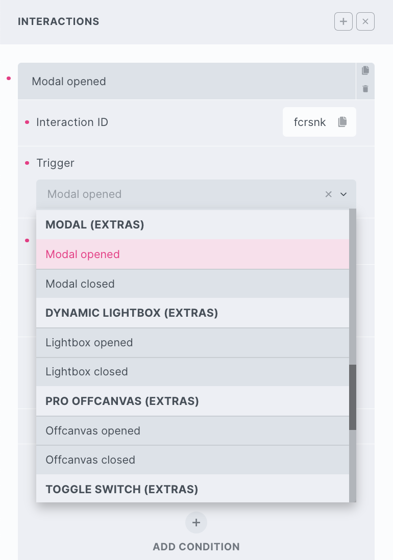
Triggers
Modal opened – Triggered as modal is opening
Modal closed – Triggered as user closes modal
Options
Delay – How long to wait after the event until the chosen action takes place .
Actions
The element can be controlled with interactions.
- Set the target to the element using a CSS selector
- Use one of the following functions below to set the action.
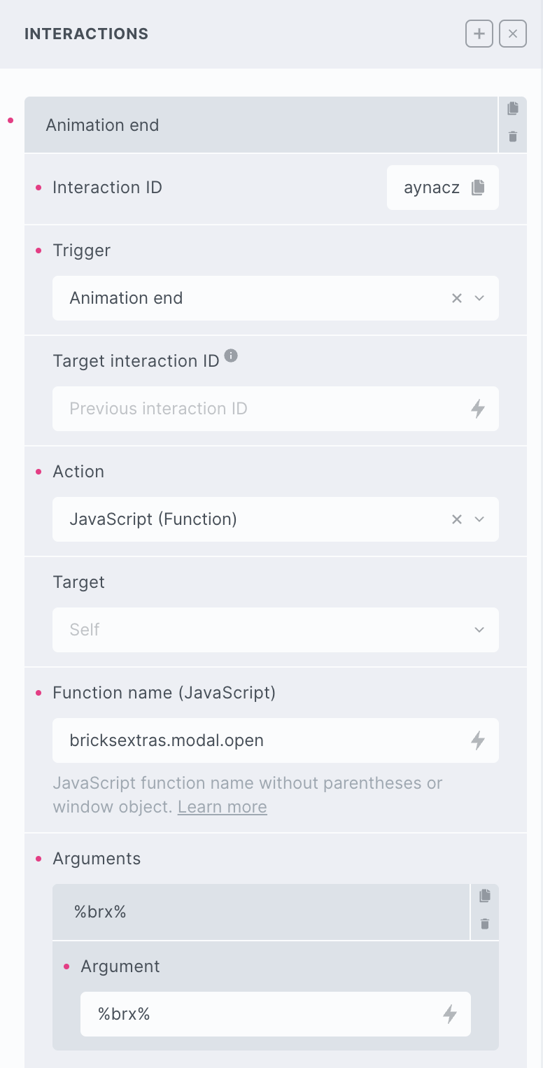
bricksextras.modal.open – Open Modal
bricksextras.modal.close – Close Modal
You can open/close your modal programmatically in JS with the xOpenModal() and xCloseModal() functions.
Just pass in the ID of your modal into the function, eg if the modal ID is modal-1:
xOpenModal( 'modal-1' )The modal triggers events on both opening and closing. You can listen for the events x_modal:open and x_modal:close on the modal to run your code as they happen.
Sample code:
const modal = document.getElementById('modal-1');

modal.addEventListener("x_modal:open", function() {
 // do something here when modal opens
});

modal.addEventListener("x_modal:close", function() {
 // do something here when modal closes
});