Popovers / Tooltips
This element is nestable, allowing for any Bricks elements to be added inside.
This element can be used inside query loops.
This element supports being used inside AJAX filtered content, either by Bricks’ native filter elements, WPGridbuilder, JetSmartFilters or PiotnetGrid
This element has it’s own interaction settings. Refer the interactions tab below for the list of element-specific triggers and/or actions.
This element support being used inside both components & nested components.
- General
- Accessibility
- Interactions
- Developer
Build custom popovers and tooltips. Supports nesting elements inside, being used inside of query loops and is out of the box responsive and accessible.
Overview
The popover element can be used in a few different ways, to cover many use cases.
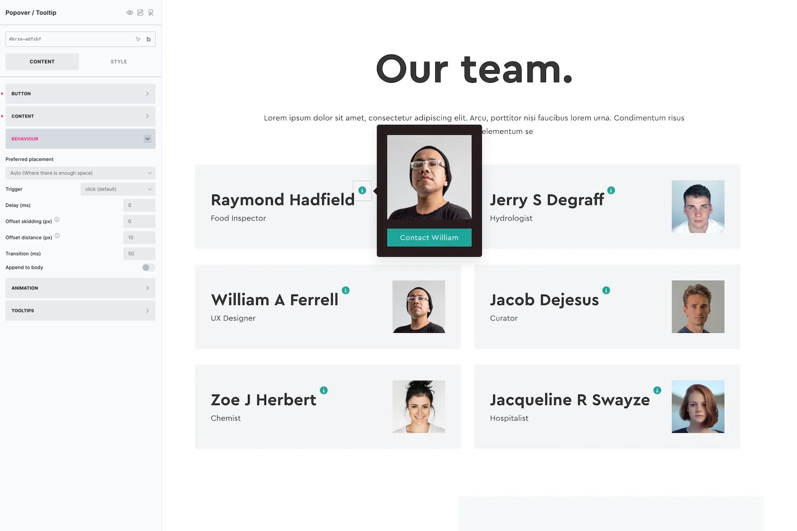
Out of the box it consists of two parts, the ‘button’ or ‘marker’ which is the element that the user would interact with either by hovering/clicking or by keyboard (for eg see the green icons above in the image) and then the popover content, which is the content that pops up. Any elements can be nested inside of the popover content and can be used with dynamic data.
There’s also the option to use to add as tooltips, to any other elements on the page. This is for when you want the user to interact with other elements on the page, not the built-in button, for the popover to appear. See the ‘advanced’ settings.
Popover Content
The typography, colors, shadows, etc can all be styled from the popover content tab in the settings. If you’re nesting elements inside, then you are free to style each element however you like using the relevant style settings for that element.
Behaviour
Preferred Popup Placement – By default, the popup will appear where it has room to do so, the auto setting will ensure that across different devices there is always space. However, if you need to force it into a certain direction you can do with this setting.
User Interaction to Open – ‘Click’ ensures a click and tap will open the popup. If you’re wanting to open on hover, use ‘mouseenter click’, this way on desktop the hover will trigger it, but on mobile the user can still tap to open.
Offset Skidding – Change the position of the popover along the side of the element in which it will appear.
Offset Distance – Add spacing between the edge of the element and the popover position
Append to body – This option is ideal for situations where the popover is being added inside an area that either has overflow:hidden or a lower z-index than neighboring elements, and therefore is causing the popover to not be fully visible when opened. Enabling this setting will ensure the popover is always above all other elements on the page by moving the popover to the bottom of the page, while still positioning it correctly above the element it needs to.
Animation
Set the starting position of the popover to control the reveal animation. By default, the starting position is translateY of 10px and a scale of 0.95. This means the popover scales up and moves slightly upwards when revealed.
Tooltips
I’d recommend using the built-in button where possible, to open up the popover, as you then have the done-for-you accessibility and it’s relatively easy to get set up.
However, you can also use the element to dynamically add tooltips to other buttons/links etc on the page. Here you enable tooltip mode and then provide the selector of the elements on the page that should have a tooltip.
Use as tooltip – Set element to ‘tooltip’ mode, meaning it will be looking for other elements on the page for the user to interact with.
Element selector – Add the selector for the element(s) to be interacted with to show a tooltip. If wishing to use on multiple elements, the simplest way is to use a class, and add the same class to multiple elements.
Hide button in builder – Even with tooltip mode enabled, the button remains visible in the builder just so you can click it to style the popover content or add in new elements. Once you’ve set things up, you may wish to hide the button so it matches the front end (where there’s no button).
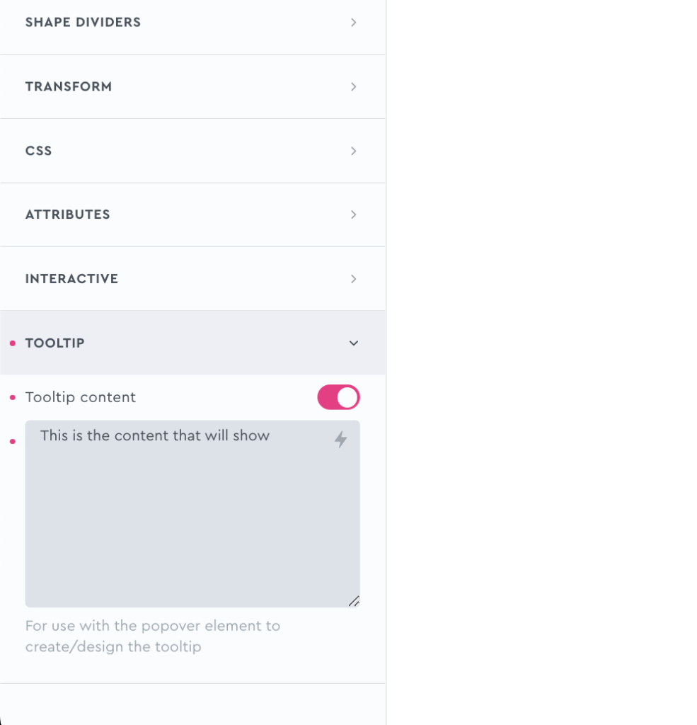
Tooltip Content
Dynamic tooltip text – If you wish to add tooltips to multiple elements, to make each element have it’s tooltip content, enable this setting and then head to your chosen element’s ‘Tooltip’ setting (in the style tab) to add content for that element specifically..
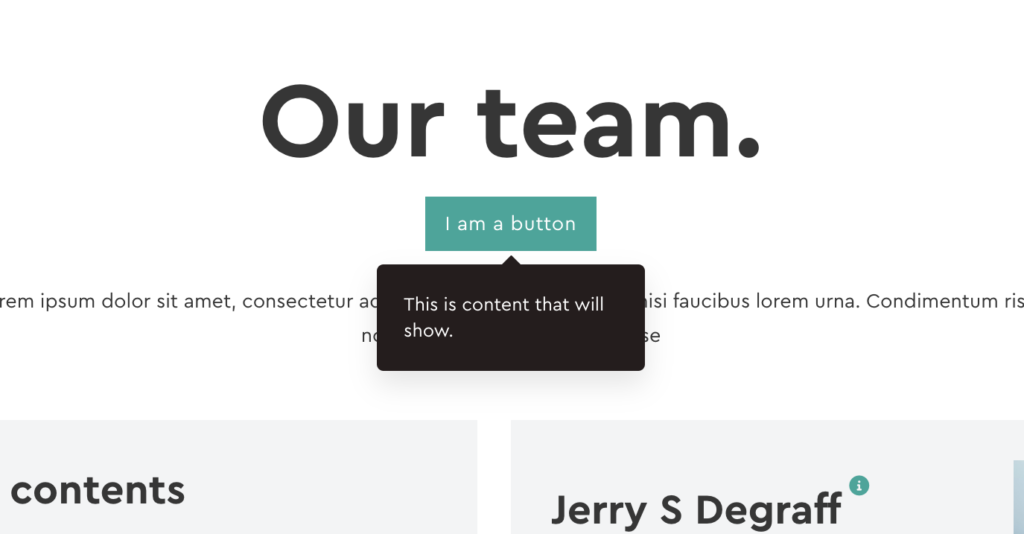
For example.. here we’re adding some manual content to a button element in the settings (making sure the button has the class to match the ‘element selector’ from the tooltip settings)
The result is that our styled popover element is then being used as the tooltip for that button element. All the styling will be inherited for any elements that you add tooltips to.
Some notes on the built-in accessibility..
- Each popover comes with a button as the default toggle to open it. This is a <button> element and so is focusable and can be pressed via keyboard (Space or return key)
- Buttons/links/inputs found in inside the popover will always be the next focusable element after the button, making it easy to access once the popover is open.
- As the button default is just an icon, there’s an aria-label with the default value ‘more information’, which can be customised from the settings. (also text can be added inside the button)
Keyboard Interaction
| Key | Action |
|---|---|
| Space/Return | When the focus is on the button, will open the corresponding popover. |
| Tab | Moves focus to the next focusable element. The buttons will be focusable. If the popover is open, the next focusable element will be found inside of the popover content |
| ESC | Close any open popovers on the page |
Note that ‘Element Interactions’ must be enabled in BricksExtras > Misc settings.
This element adds a new triggers to Bricks’ interactions options, so you can trigger actions based on the state of the element.
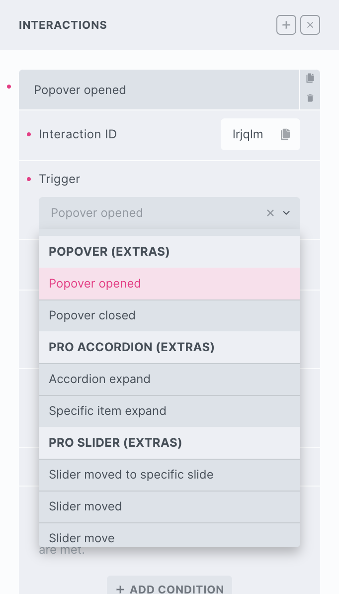
Triggers
Popover opened – Triggered the moment the popover is fully opened
Popover closed – Triggered the moment the popover is closed
Options
Delay – set a delay (ms) for waiting after the trigger before doing the action.
Actions
(BricksExtras v1.5.1+)
The element can be controlled with interactions.
- Set the target to the element using a CSS selector
- Use one of the following functions below to set the action.
bricksextras.popover.close – Close the popover
The Popover element triggers some JS events when showing/hiding.
‘x_popover:show’
‘x_popover:hide’
Sample code:
const myPopover = document.getElementById('brxe-skbff');

myPopover.addEventListener("x_popover:show", () => {
 // do something here when popover shown
});

myPopover.addEventListener("x_popover:hide", () => {
 // do something here when popover hidden
});
This element is using Tippy.js, which comes with lots of built-in methods allowing you to control things programmatically, you just need access to the instance.
Find the identifier from the data-x-id attribute on the element. For example, if your popover element has the attribute data-x-id="ixqrsu", to get the instance, you can do so like this:
const instance = xTippy.Instances.ixqrsuThen the popover can be controlled using the Tippy API. For ex.:
// Force the popover to show
instance.show();

// Add new content
instance.setContent('New content')

// Or add custom options/props, for eg to do something when popover opens
instance.setProps({
  onShow(instance) {
     /* do something here when popover shows */
  }
});