Image Hotspots
This element can be used inside query loops.
This element supports being used inside AJAX filtered content, either by Bricks’ native filter elements, WPGridbuilder, JetSmartFilters or PiotnetGrid
This element has it’s own interaction settings. Refer the interactions tab below for the list of element-specific triggers and/or actions.
This element support being used inside both components & nested components.
- General
- Accessibility
- Interactions
- Developer
- Support FAQ
Easily create image hotspots that can be added manually or dynamically using Query loops. Supports preferred placements & using dynamic data to position each of the markers and the popover content.
Support for nestable hotspots added in v1.6.1. Now supports using with Bricks’ filter elements to search/filter the nestable hotspots.

The element has two separate parts, the image itself and then the individual markers inside of it. The markers can be added manually or dynamically using Bricks’ query loop feature. Each marker has its own ‘popover content’ that will be revealed as the marker is interacted with.
Type
- Built-in hotspots (default) – either adding manually via the repeater control or populating by query loop)
- Nested hotspots – This allows you to nest in the image hotspots marker element, which is more flexible as it allows for adding in any elements and also supports being filtered by Bricks’ filter elements.
Image
Image – Choose the image and image size of the image you are wishing to add the hotspots to. This can be taken from the media library or added via dynamic data.
Marker
Here you can add new markers either one by one manually, or by just having one and setting a query loop.
If adding manually – Simple set up the horizontal/vertical position, add a label and the content you wish to display inside of the popover. You can also change the ‘marker action’ to ‘link’ if you instead what a specific marker to just be a link rather than having a popover.
If using a query loop – then the position, content, choosing to display a link or popover (the default is popover) and the popover content will all need to be added via dynamic data from the loop.
Marker action – Choose the action when the user clicks the marker ( popover, link or both ).
- popover – the default which will show the content in a popover.
- link – will set the marker to be a link instead of a button, where you can set up the link options.
- both – will still set the marker to be a link, but the link itself has a popover that will reveal on hover.
Marker Image – (from BricksExtras v1.5.0) – You can add a custom image to replace the marker icons, this can be populated with dyamic data. Add any styling needed to the images from the marker styles tab.
Marker / Popover Styles
General styles for the content that pops up when the marker is interacted with.
Popup Behaviour
Offset Skidding – Change the position of the popup along the side of the marker in which it will appear.
Offset Distance – Add spacing between the edge of the marker and the popup position
Preferred Popup Placement – By default the popup will appear where it has room to do so, the auto setting will ensure that across different devices there is always space. However, if you need to force it into a certain direction you can do with this setting.
User Interaction to Open – ‘Click’ ensures a click and tap will open the popup. If you want to open on hover, use ‘mouseenter click’. This way, on the desktop, the hover will trigger it, but on mobile, the user can still tap to open it.
Move focus to popover content on tab – Choose whether the focus moves over to the popover content after opening the popover and pressing the tab key (disable if you prefer to move the user to the next marker).
Pulses
The animated shadow pulses can be customized, change the color, size, duration and how many pulses are visible. You can also remove the pulse when the popup is open and the marker is active.
Some notes on the built-in accessibility..
- Each popover comes with a button as the default toggle to open it. This is a <button> element and so is focusable and can be pressed via keyboard (Space or return key)
- Buttons/links/inputs found in inside the popover will always be the next focusable element after the button, making it easy to access once the popover is open.
- As the button default is just an icon, there’s an aria-label with the default value ‘Toggle popover’, which can be customised from the settings. (also text can be added inside the button)
Keyboard Interaction
| Key | Action |
|---|---|
| Space/Return | When the focus is on the button, will open the corresponding popover. |
| Tab | Moves focus to the next focusable element. The buttons will be focusable. If the popover is open, the next focusable element will be found inside of the popover content |
| ESC | Close any open popovers on the page |
Note that ‘Element Interactions’ must be enabled in BricksExtras > Misc settings.
This element adds a new triggers to Bricks’ interactions options, so you can trigger actions based on the state of the element.
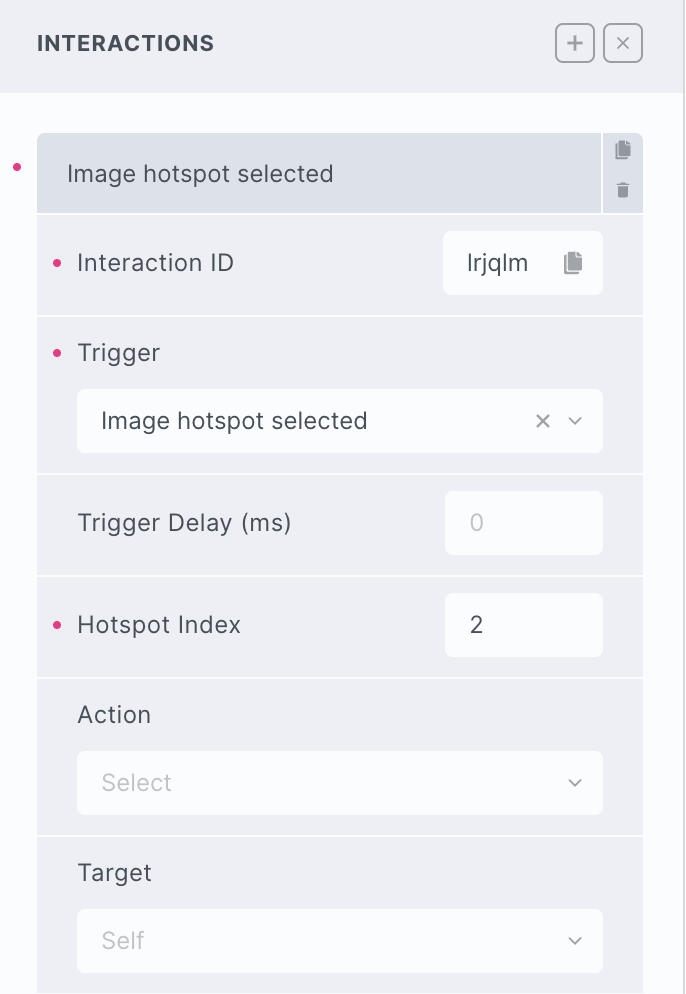
Triggers
Selected – Triggered the moment the marker is selected (either the popover opened, or the link clicked)
Options
Hotspot index – provide the index of the marker you’re listening for.
Delay – set a delay (ms) for waiting after the trigger before doing the action.
The markers in this element are using Tippy.js, which comes with lots of built-in methods allowing you to control things programmatically, you just need access to the instance.
Find the identifier from the data-x-id attribute on each marker. For example, if the marker has the attribute data-x-id="ixqrsu", to get the instance, you can do so like this:
const instance = xHotspots.Instances.ixqrsuThen the popover can be controlled using the Tippy API. For ex.:
// Force the popover to close
instance.close();

// Add new content
instance.setContent('New content')