Pro Slider Control
This element is nestable, allowing for any Bricks elements to be added inside.
This element can be used inside query loops.
This element supports being used inside AJAX filtered content, either by Bricks’ native filter elements, WPGridbuilder, JetSmartFilters or PiotnetGrid
This element support being used inside both components & nested components.
- General
- Accessibility
- Support FAQ
A unique feature of the Pro Slider is the ability to sync up external controls for the navigation, progress bars or play/pause button for the auto play. This opens up many possibilities when building custom layouts for your sliders or carousels. By all being separate elements to the slider, pretty much any layout can be created and built visually in Bricks.
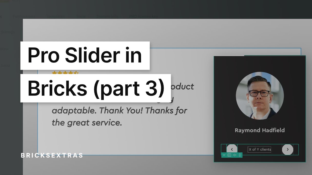
To get a quick idea of how you may go about using them to extend your sliders, check out this video ‘Pro Slider in Bricks ‘part 3’ where we put some of them to use.

Control types
Navigation button – Add previous/next buttons. Each button contains a customisable arrow by default, but you can also nest elements inside to create any button. Clicking the arrow will move the slider in either direction and the button will become disabled if there are no more slides.
Progress bar – Display the progress of the slider to give users a better idea of how much content there is. This can also be made interactive, so users can click the progress bar to navigate the slider (or via keyboard).
Counter – Display the slider pagination ‘X of Y’, with X updating in real-time as different slides become active. The text is customisable, with the option of adding suffixes/prefixes to give the slides more context. for eg, displaying as “Page 5/10” or “3 out of 15 clients”.
Autoplay Play/Pause – If using Autoplay on your slider, it’s recommended to give users a way to pause the autoplay if they need to. (or start it). Here you can add a button that will change from play to pause automatically based on the slider’s current state.
Autoplay Progress – If using Autoplay, you can display a progress bar that will monitor the autoplay interval. The progress (either a bar or circle) will move as the autoplay is waiting and start again once the slider has moved. This for giving a visual indication on how long in between in slide.
Slide content – Sometimes you may need some data from inside of the slider to appear outside of the slider. For eg when using a Pro Slider Gallery, where you want the captions to appear as the slider moves, but not inside of the slider. This new control type does exactly this.
The content types are;
- Pro Slider Gallery Captions – Will automatically grab the caption from the current active slide to display.
- Slide attribute – In a case where you need to get some dynamic data from a slide (for eg a post title), you can simply add a custom attribute to the slide element, with the dynamic tag as the attribute value. This can then be passed over to the controller to appear as that slide becomes active. Add the attribute you’re using in the settings. The default is ‘data-x-content’.
- Custom element – This will grab the text from any element inside of a slider and show it when the slide is active. Add the selector of the element in the settings.
Pagination dots (v1.7.0+) – Add pagination dots anywhere on the page. They will auto-update the number of dots based on the current state of slider, similar to the built-in pagination dots.
Controlling the Slider
Out of the box, the controls will control the closest slider found within the same section. Most of the time, it won’t need to be configured. However, if you’re using multiple sliders within the same area, or need the slider to be positioned somewhere else on the page, you can also choose to name an individual slider (by adding the ID or class) to ensure the controls are synced with the correct slider.
Component scope (v1.5.4+) – Enable if inside of a component and which to self-contain the functionality to the specific instance of component. ie target only the slider within that particular component.
Styling / Customizing
Each control type has it’s own unique style settings and options to change the icons or text. As they are seperate elements, for positioning and other styles settings you can use the ‘style’ tab as you would any regular div or button.
For the navigation buttons, you can also choose to nest elements inside instead of displaying an icon.
Some notes on the built-in accessibility..
- When being used for ‘navigation buttons’ or ‘autoplay button’ the element outputs as a <button> element, so can be focused and toggled via keyboard (return or space key)
- As the element is a button at the root level, you can add any attributes using Bricks’ custom attributes settings for your specific use case.
- The default aria-label value for screen readers are dependant on the control type “Play autoplay”, “previous slide”, “next slide”, “Move to another slide”
- The progress bar type uses a is progress role type with the aria-valuenow synced with the slider as the user interacts with it.