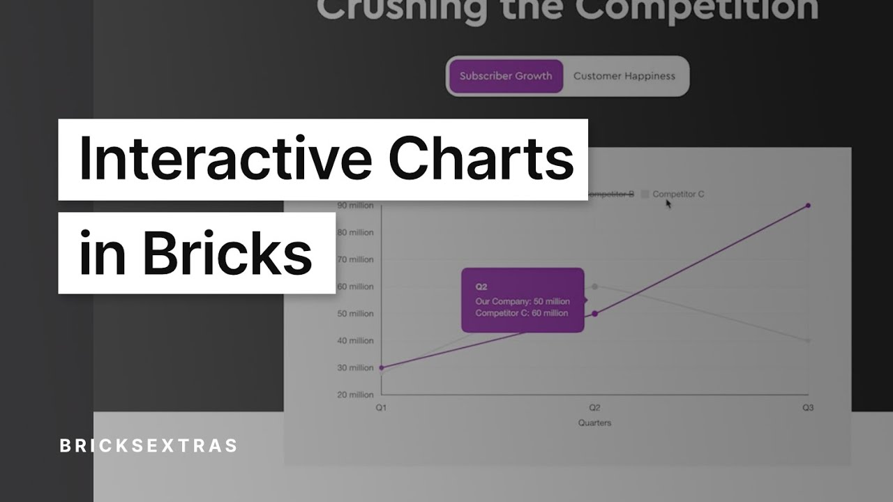
Dynamic Chart
This element can be used inside query loops.
This element supports being used inside AJAX filtered content, either by Bricks’ native filter elements, WPGridbuilder, JetSmartFilters or PiotnetGrid
This element support being used inside both components & nested components.
- General
- JSON ARRAY
- Developer
Display charts with data from ACF, Metabox, etc through Brick’s Query loop feature. Supports multiple datasets, linear/logarithmic scales & easily customized and styled to match your site.
Intro
This element will be most useful for displaying relatively standard charts where the x-axis has text labels, and the y-axis value has numbers. The chart can either be used to display one data set, ie one line or one set of bars with different values, or multiple datasets, where dynamic data will be needed to fetch the values for each set.
For dynamic data, ideally, you’d be using an ACF repeater field, or similar, where you’d be looping through rows, with each row having new values from sub fields being plotted for each dataset.
Use Query Loop
There are now three query loop types –
- Datasets
- Datapoints
- JSON array (BricksExtras v1.6.3+)
Datasets – If you’re wishing to use dynamic data to populate multiple datasets, set a query loop (for example an ACF repeater) to loop through rows for each set of data. This can then be added to the chart using Bricks’ built-in dynamic data options (this can be seen in the video above).
Datapoints – The datapoint type allows you to instead add new data points along the x-axis for each item inside the query loop. This ideal for showing data that is time based, which may need to be updated regularly and you want more dates across the x-axis added over time.
JSON array – (from BricksExtras v1.6.3+), but will allow for using a single JSON array to populate the chart data from Bricks v2.2 JSON arrays – this allows for both Datasets and Datapoints to be added dynamically via one query loop.
A common use for the ‘datapoints’ type would be showing company profits each quarter, where every new quarter you’ll be wanting to plot a new point on the existing chart. Each new item in the loop, whether it’s a new post or new repeater row, would plot a new data point on the chart.
Not using a Query Loop
If not using any dynamic data, you can just add the number/labels in manually in the settings to plot a chart.
Data
Here’s where to add the data points, add as many data points as you need and fill in the fields inside each one. The three fields are..
- Label – this is the labels across the x-axis (Jan, Feb, Mar etc)
- Value – the corresponding value to plot in the y-axis. (20%, 50%, 90%). if using dynamic data, this is where you’d insert the custom field to populate the number for each dataset.
- Data point color – If you’re NOT using multiple data sets, you may wish to change the colour across each data point. (if using multiple data sets, the colours will be changed across each dataset instead, see the bottom of the docs for a visual guide).
Chart Style
There are currently a few chart styles available..
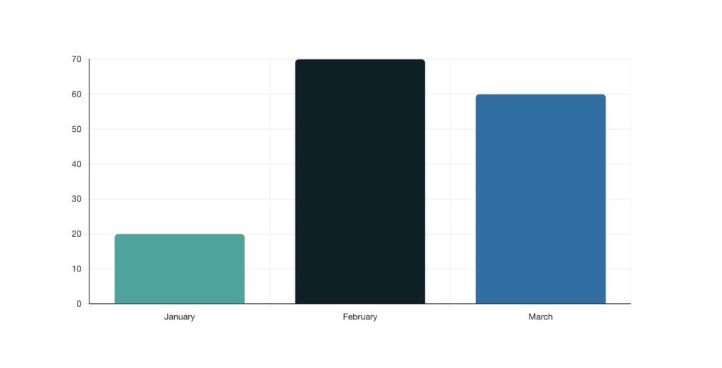
- Line charts
- Bar charts
- Pie / Doughnut charts
Line width/tension – the line style can be customised by changing the width, the colour and also the tension, which prevents the line from being straight and allows more of a curve.
Chart Stacking (v1.6.4+)
If using multiple datasets, instead of the bar charts being side by side at each data point they can be stacked, the two options are;
- Stack on top – This is where the bars are simply added on top of each other, so the total height will be the value of all bars added together.
- Overlay – Here the bars are drawn overlaying each other. Useful if you want to compare the sizes easily.
See the below example to see the difference, both using the same data. On the left the two datasets (named total views and unique visitors) are being added on top of each other. On the right the smaller dataset (the unique visitors) is being drawn over the top of the other dataset.

(be mindful of the colors used if using overlay, as you’ll need to be able to see the bars. Also you may need use the ‘reverse the order of the datasets’ option if the smaller one is being drawn at the back and so is being hidden)
AXES
Both the x-axis and y-axis can be customised, in terms of changing the grid colours, border colours and adding labels to the axis.
The y-axis has some extra settings relating to the data..
Y-axis type – Choose between linear (default) or logarithmic scale for the y-axis.
Begin at zero – By default the y-axis begins at zero, this may not be ideal depending on what data you’re showing and can be disabled.
Suggested min – Set a min value for the y-axis (only a suggestion, if there’s data lower than this number then it will adapt)
Suggested max – Set a max value for the y-axis (only a suggestion, if there’s data higher than this number then it will adapt)
Legends
If showing multiple datasets, legends can be added to the chart to show what each line/bar is referring to. The colours will automatically match the dataset colour. These can be positioned and aligned on any side of the chart.
Dataset Colours
When needing to add a different colour to each dataset, there are two options.
- Using dynamic data – this is useful if you need the colour to be edited/added at the time that the data is added by custom fields. (ie the content editor has control)
- Manually – this is useful if you instead which to create a colour palette for the chart to use, not connected to the datasets. This option means you can use your colour palette from inside Bricks rather than fetching the data.
A visual example to demonstrate the difference in applying colors either per data point or per dataset..
Using one dataset, it’s useful to change the colour per data point. For eg having a different colour for each month.
Using multiple datasets, it’s no longer useful to change the colour per data point. Instead, we change the colour per dataset. Here we have a different colour for each company, so the datasets can easily be compared visually. The legends use the dataset colours and can be used to filter the chart by clicking the legends.

Data labels
From BricksExtras v1.5.2+ data labels can be added to show the values of each data point inside the chart.
Anchor – Choose where to position the label, relative to the data point (Start/Center/End)
Align – Align the label vertically or horizontally depending on the chart direction (Start/Center/End)
Offset – Set the distance from the data point
Styling – The labels have a number of style options. By default the background & border colors will be inherited from the colors being used on the chart.
Spacing – When adding data labels, some of the labels may overflow the edge of the chart (for example if a bar chart has a bar that touches the very top of the chart and you’re positioning your labels above the bars). in this instances, you can add chart padding (in the ‘spacing tab’ to make sure the label is still visible)

Responsive Options (v1.6.8+)
Chart padding, font sizes for labels, tooltips & data labels can now all be changed per breakpoint. These aren’t CSS settings (charts are drawn on a canvas element), but options that chart will apply separately at each breakpoint.
The x-axis and y-axis labels can also be rotated at different breakpoints. This is useful if your chart has quite long labels where it struggles to fit at smaller screen sizes. (note that labels containing <br> will break into a new line, which is also a useful way to deal with longer label names)
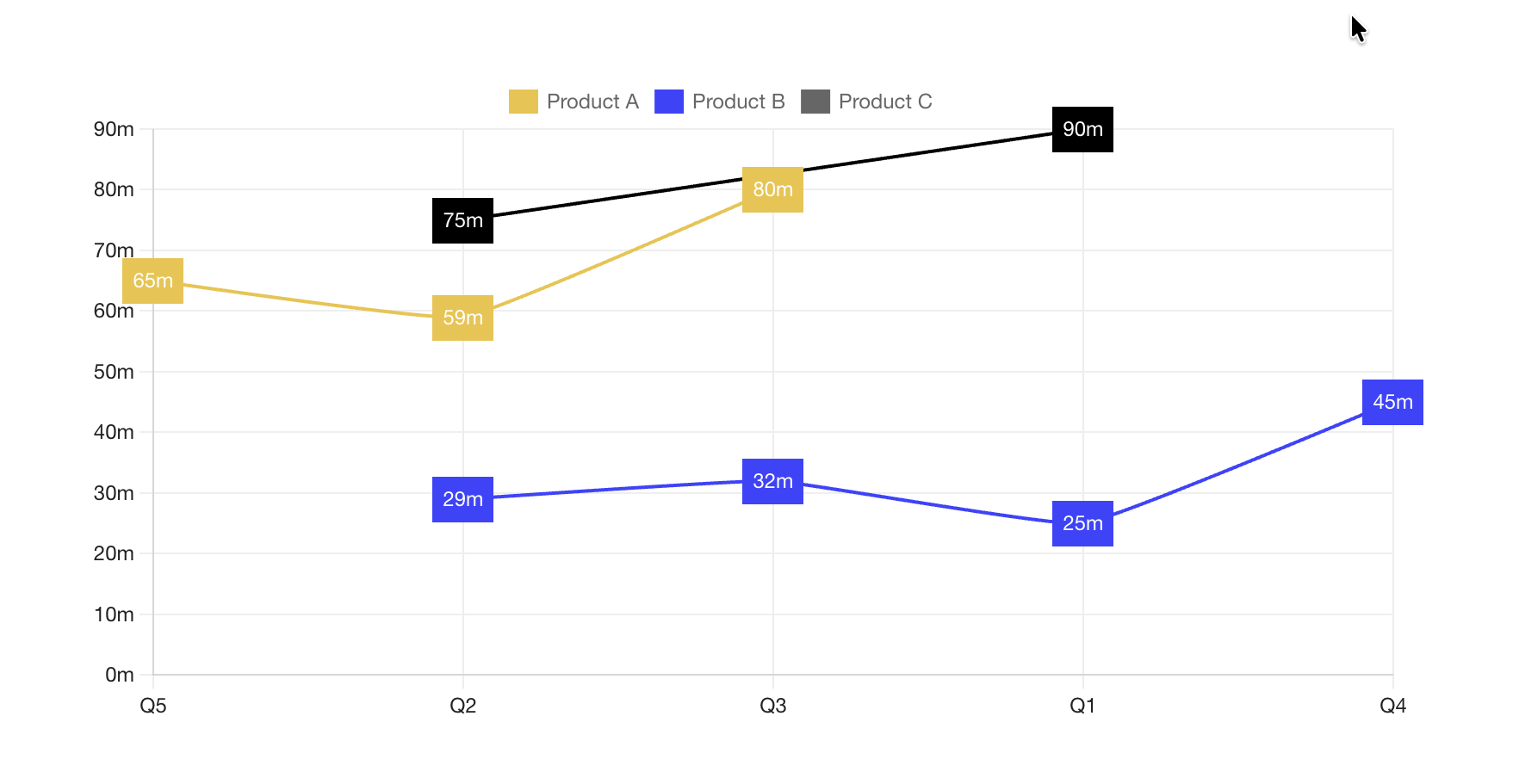
From BricksExtras v1.6.3+ we can plot data directly from a JSON array through Bricks’ array query type (available from Bricks v2.2+).
This allows us to loop through an array of datapoints, either from just one dataset or multiple datasets..
One Dataset Example
Note that it must be a flat array (as there’s no way to nest in a second query loop),
[
  {"datapoint": "Q1", "value": 65},
  {"datapoint": "Q2", "value": 59},
  {"datapoint": "Q3", "value": 80},
  {"datapoint": "Q4", "value": 25},
  {"datapoint": "Q5", "value": 29},
  {"datapoint": "Q6", "value": 45}
]
To get the label and data for each datapoint use with the key for the dataset, datapoint and value.
Dataset – Leave blank as there’s only one set of data
Datapoint –
Value –
Change @key:datapoint and @key:value if using different keys in your array.
Multiple Dataset example
We now have an extra data, to choose which dataset each item belongs to.
[
  {"dataset": "Product A", "datapoint": "Q1", "value": 65},
  {"dataset": "Product A", "datapoint": "Q2", "value": 59},
  {"dataset": "Product A", "datapoint": "Q3", "value": 80},
  {"dataset": "Product B", "datapoint": "Q1", "value": 25},
  {"dataset": "Product B", "datapoint": "Q2", "value": 29},
  {"dataset": "Product B", "datapoint": "Q3", "value": 32},
  {"dataset": "Product B", "datapoint": "Q4", "value": 45},
  {"dataset": "Product C", "datapoint": "Q1", "value": 90},
  {"dataset": "Product C", "datapoint": "Q2", "value": 75}
]
Dataset –
Datapoint –
Value –
Bricks also allows us to use dynamic data to populate this array with custom functions.
Example PHP code if you were building this JSON from posts with ACF repeaters (each post being a new data set, containing a repeater field for the datapoints inside each set)
function get_chart_data_from_posts() {

    $data = [];

    // Query posts
    $posts = get_posts([
        'post_type' => 'post',
        'posts_per_page' => -1,
        'post_status' => 'publish'
    ]);

    foreach ($posts as $post) {

        $dataset_name = $post->post_title;

        // Get ACF repeater field
        $data = get_field('sales_data', $post->ID); // sales_data = ACF repeater field name

        if ($data) {
            foreach ($data as $datapoint) {
                $data[] = [
                    'dataset' => $dataset_name,
                    'datapoint' => $datapoint['dataset'], // dataset = ACF subfield name
                    'value' => $datapoint['value']  // value = ACF subfield name
                ];
            }
        }
    }

    return $data;
}

(Remember to register any custom function names with Bricks via the filter, to be able to use the echo tag with it)
This means any data can be used to populate, as long as the function returns the array with the keys for ‘dataset’ ‘datapoint’ and ‘value’ for each point on the chart.
Here’s how you can access the chart instance. This will allow you to use the ChartJS API to either change options, or change data in the chart with JS.
Find the identifier from the data-x-id attribute on the element. For example, if your chart has the attribute data-x-id="auxrry", to get the chart instance, you can do so like this:
const myChart = xChart.Instances.auxrrySome example code, showing how to change a chart option.
/* Get the chart instance */
const myChart = xChart.Instances.auxrry

/* Change Y scale to logarithmic */
myChart.options.scales.y = {
    type: 'logarithmic'
};

/* always update chart to see changes */
myChart.update();
Example: Adding new data points to chart
/* Get the chart instance */
const myChart = xChart.Instances.auxrry

/* helper function for adding to existing data */
function addData(chart, label, data) {
    chart.data.labels.push(label);
    chart.data.datasets.forEach((dataset) => {
        dataset.data.push(data);
    });
    /* always update chart to see changes */
    myChart.update();
}

/* Add new data point for March (will plot new point at 90) */
addData(myChart, 'March', 90)

/* Add new data point for April (will plot new point at 60) */
addData(myChart, 'April', 60)
Example: Updating dataset values.
/* Get the chart instance */
const myChart = xChart.Instances.auxrry

/* Change first data set to these values */
myChart.data.datasets[0].data = [
    20,
    30,
    40,
    50,
    60
]

/* Change second data set to these values */
myChart.data.datasets[1].data = [
    60,
    30,
    20,
    10,
    15
]

/* always update chart to see changes */
myChart.update();
Example: How to toggle between bar/line chart when button clicked.
document.addEventListener("DOMContentLoaded", () => {

  const myButton = document.querySelector('#my-button-id')

  /* When button is clicked */
  myButton.addEventListener('click', (e) => {

   /* Get the chart instance */
   const myChart = xChart.Instances.auxrry

    /* toggle between bar/line chart */
    if ( 'line' === myChart.config.type ) {
      myChart.config.type = 'bar'
    } else {
      myChart.config.type = 'line'
    }

    /* always update chart to see changes */
    myChart.update();

  })

})