Slide Menu
This element is nestable, allowing for any Bricks elements to be added inside.
This element can be used inside query loops.
This element supports being used inside AJAX filtered content, either by Bricks’ native filter elements, WPGridbuilder, JetSmartFilters or PiotnetGrid
This element has it’s own interaction settings. Refer the interactions tab below for the list of element-specific triggers and/or actions.
This element support being used inside both components & nested components.
- General
- Interactions
- Developer
- Support FAQ
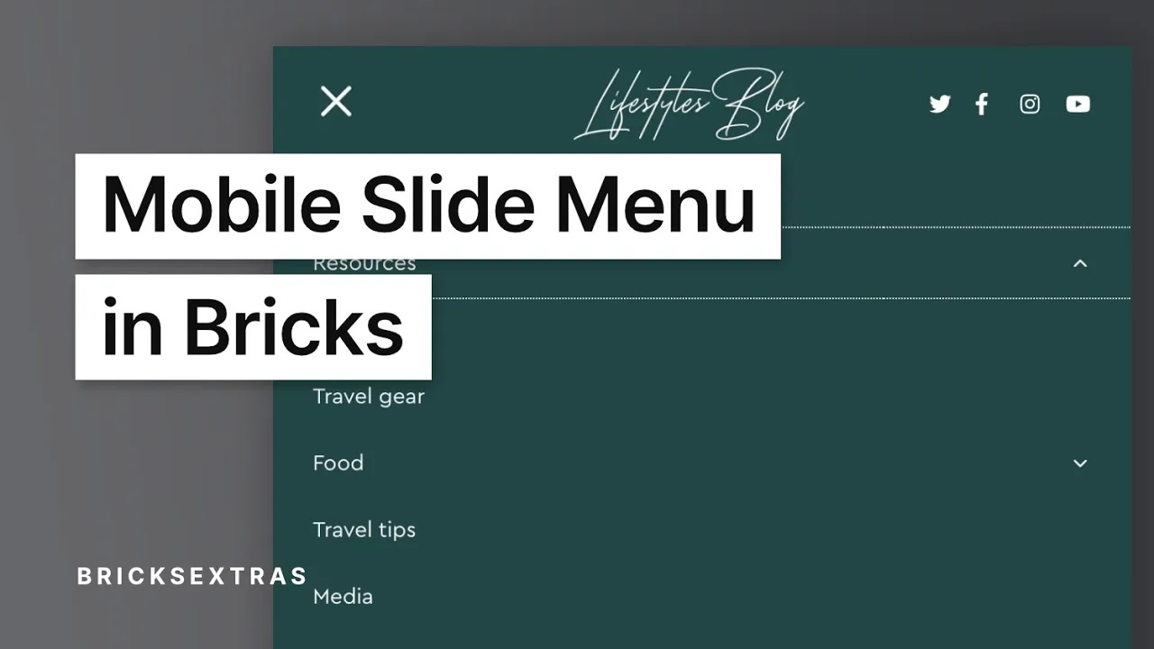
The Slide Menu element allows you to add slide toggle menus, ideal for building off-canvas menus or adding custom mobile menus to your header to be revealed when a trigger is clicked/touched.

Clicking the sub menu arrows will slide open the sub menus. Note – if you want it so that clicking the entire menu link opens up the sub menu, not just clicking the arrow, ensure the menu link is a hashlink.
Primary Settings
Menu source – Choose to either just select a static menu from the menu dropdown, or use dynamic data to populate the menu ID or menu slug. (useful if using menus in templates, where you may want a different menu to show for each page)
With the dynamic option, if no menu is found the element won’t output at all.
Nest elements – You can now add any Bricks element before or after the slide menu menu items by selecting either before or after and then dragging the elements inside the slide menu in the structure panel. This ideal for adding elements inside a mobile menu being created with the slide menu (see video further down the page for creating custom mobile menus with the slide menu).
Menu Item Styling
The menu item and sub menu links all have their own seperate style controls for default and active styles (active meaning the user is currently on that page). Remember for focus/hover styles can be applied using Bricks’ psuedo states feature.
The dropdown arrows will inherit the color menu link typography settings. The arrow size can be changed in the sub menu tab. (the default is 1em, meaning it will be the same size as the menu links next to it)
Default state
Choose whether to have menu visible on page load (default) or hidden. Hidden is useful if you’re using the slide menu as a mobile menu and don’t wish for it to be visible unless the user is going to toggle it open with a button.
Video Tutorial on Using for Creating a Mobile Slide Menu
Here’s an example use case for the element, where instead of having inside an offcanvas we are using inside the header element to create a nice mobile slide menu that is revealed under the header when the trigger is clicked/pressed.
Update – not shown in the video below, but you can now nest elements to appear either above the menu items or below them. Ideal for adding search bars, call to action buttons etc into your mobile menu. (see ‘nest element’ setting into above).
Note that if you want the entire menu item to be clickable to open up the sub menu, ensure the link is just a blank ‘#’ rather than a real link, otherwise clicking will follow the link and opening the sub menu is done by clicking the arrow.
Note that ‘Element Interactions’ must be enabled in BricksExtras > Misc settings.
This element adds new triggers to Bricks’ interactions options, so you can trigger actions based on the state of the element.
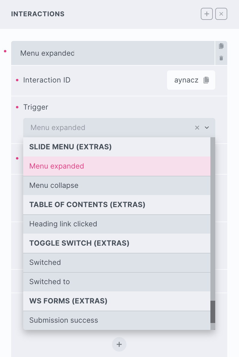
Triggers
Menu Expand – Triggered as the slide menu is expanded
Menu Collapse – Triggered as the slide menu is collapses
Actions
The element can be controlled with interactions.
- Set the target to the Lottie element using a CSS selector
- Use one of the following functions below to set the action.
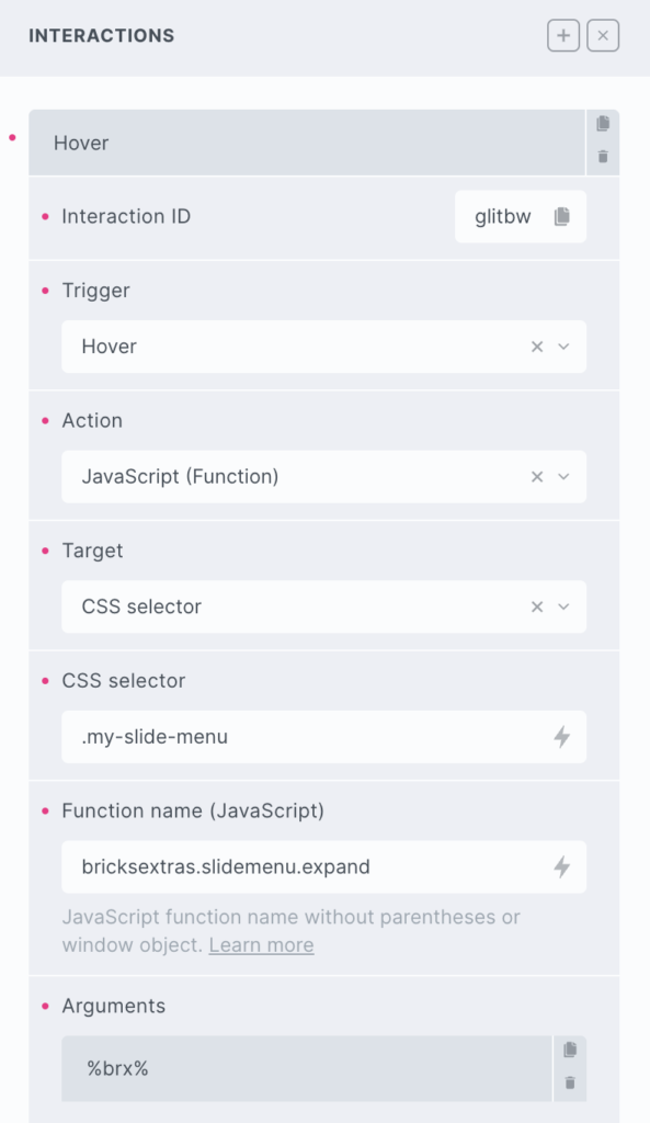
bricksextras.slidemenu.expand – Open slide menu
bricksextras.slidemenu.collapse – Close slide menu
bricksextras.slidemenu.toggle – Toggle slide menu
The slide menu element triggers events when expanding and collapsing (when the start position is set to hidden and the slide menu is being expanded).
You can listen for the events x_slide_menu:expand and x_slide_menu:collapse to run your code as they happen.
Sample code:
const mymobilemenu = document.getElementById('slide-menu-1')

mymobilemenu.addEventListener("x_slide_menu:expand", function() {
 // do something here when menu expands
})

mymobilemenu.addEventListener("x_slide_menu:collapse", function() {
 // do something here when menu collapses
})