Toggle Switch
This element can be used inside query loops.
This element supports being used inside AJAX filtered content, either by Bricks’ native filter elements, WPGridbuilder, JetSmartFilters or PiotnetGrid
This element has it’s own interaction settings. Refer the interactions tab below for the list of element-specific triggers and/or actions.
This element support being used inside both components & nested components.
- General
- Accessibility
- Interactions
- Developer
This element provides a way to build your own toggle switch. Ideal for switching between two or multiple variations of elements/content, based on user selection.

For more flexibility, the content switcher which switches out the versions of the content is a separate element. This way, the one toggle can be used to switch out multiple elements on the same page without any limitation on design/layout. Sample structure:

Supports Multiple Variants
The toggle switch has two modes, either design your own switch (with labels positioned either side) or allow for multiple labels with animated active styles on the labels themselves.
Toggle Type – Choose either to display two labels and a stylable toggle switch, or multiple labels. if using multiple levels, any number of options can be added in manually or a query loop can be used to populate dynamically.
Which content switcher? – You can either set the toggle switch to interact with all content switchers found in the same section. (this is for convenience so you don’t need to provide the selectors for nearby content switchers), or you can enter the selector of the content switcher you wish to use.
Component scope (v1.5.4+) – Enable if inside of a component and which to self-contain the functionality to the specific instance of component. ie control only the content switchers inside the specific component.
Labels – Set the label text for each option.
Styling
Depending on which toggle type you choose, you’ll have different settings for the styles. Either styling the animated toggle switch or the animated labels.
Some notes on the built-in accessibility..
- For toggle type: two labels: The focusable element is two radio inputs. The screen reader label, to give context to what is being clicked, is ‘Switch pricing’ by default. This can be changed inside of the settings. The user can toggle by pressing the left/right keys or space key
- For toggle type: multiple labels: The labels here act follow a tab role and are so each seperate buttons, taking on either a selected or unselected state.
When using the ‘multiple labels’ option, the keyboard interactions are as below..
| Key | Action |
|---|---|
| Tab | When focus is outside of the toggle switch, it will move te focus to the active tab. If focus is on the active tab, it moves focus to the next element in the keyboard focus order ( ideally the content switcher below it) . |
| → | Focuses next tab in the toggle switch list. |
| ← | Focuses the previous tab in the toggle switch list. |
When paired with the ‘content switcher’ element, the entire thing will behave as tabs, with all of the ‘aria-labelledby’ and ‘aria-controls’ automatically added to make sure each content item inside of the switcher corresponds and is labelled correctly to match the correct button in the toggle.
Note that ‘Element Interactions’ must be enabled in BricksExtras > Misc settings.
This element adds new triggers to Bricks’ interactions options, so you can trigger actions based on the state of the element.
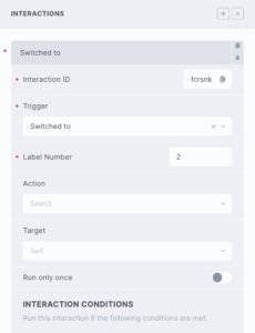
Triggers
Switched – triggered when the toggle switch is switched
Switched to – triggered when the toggle switch is switched to the number provided
Options
Label number – Set which label is the trigger, 1 for the first label.
The toggle switch element triggers events when the toggle is switched. If you’re needing to trigger something when this happens, the events are..
x_toggle_switch:change– triggered any time the toggle is switched
x_toggle_switch:checked– triggered when the toggle switch moves to checked (right) position
x_toggle_switch:unchecked– triggered when the toggle switch moves to unchecked (left) position
x_toggle_switch:toggled_{label number}– triggered when the switch moves to a particular label
Sample code..
const myToggleSwitch = document.getElementById('toggle-1');

myToggleSwitch.addEventListener('x_toggle_switch:change', function() {
 // do something as switch is toggled
});

myToggleSwitch.addEventListener('x_toggle_switch:toggled_3', function() {
 // do something as switch is toggled to third option
});