Copy to Clipboard
This element is nestable, allowing for any Bricks elements to be added inside.
This element can be used inside query loops.
This element supports being used inside AJAX filtered content, either by Bricks’ native filter elements, WPGridbuilder, JetSmartFilters or PiotnetGrid
This element has it’s own interaction settings. Refer the interactions tab below for the list of element-specific triggers and/or actions.
This element support being used inside both components & nested components.
- General
- Accessibility
- Interactions
- Developer
- Support FAQ
This nestable button provides an easy way to allow site visitors to copy any text from the page onto their clipboard. Either provide the selector for the element on the page, or use dynamic data to fetch to be copied to the clipboard. Supports being used inside query loops, in lightboxes, used with facets etc.

This element is nestable, and so can contain any elements. For convenience, there are icons, button text and a tooltip built-in to the element, which can adapt when the button has completed copying to give visual feedback to the user.
Text to Copy
Choose the source of the text to copy.
Choose selector – If the content exists on the page, you can use the class/ID of the element as the ‘copy selector’. The copy button will find the text to copy based on that selector.
Component scope (v1.5.4+) – Enable if inside of a component and which to self-contain the functionality to the specific instance of component. ie target only the text within that particular component.
Dynamic data – if the content isn’t on the page, for eg you may be inside of a loop and want the user to be able to quick copy the URL of the post, or something from a custom field that isn’t actually being output on that page (for example, a discount code). You can populate with any text and include dynamic tags, which will then fetch the data from the current post.
Icons
Built-in button icons to give visual feedback when the user copies to their clipboard.
Copy icon – Choose an icon to appear in the button in the default state.
When copy complete – Choose to replace the icon with a built-in animated check/tick, or select a new icon for the copied state.
Icon animation – When the button switches into the copied state, the icons will need to switch. Choose the animation to switch between the two. Fade, SlideUp, FlipX, etc.
Button
Button text – Add optional button text which will automatically change when the copying is complete.
Button copied state – The style controls are divided into both default state and copied state. This allows for easily giving more feedback that the button has been used. (remember that focus/hover states are all controlled via the states dropdown in the top left of the builder)
Tooltip
Built-in tooltip, useful if not using button text and need a way to show the user what the button is for (as well as give feedback once the copying has been completed)
Tooltip text – Add text inside of the tooltip which will automatically change when the copying is complete.
Show on.. – Either show the tooltip anytime the user interacts with the button by hovering / focusing or only show the tooltip once the copying is complete.
Preferred Popup Placement – By default, the tooltip at the top of the bottom. This can be customised similar to the tooltip eleent.
Offset Skidding – Change the position of the tooltip along the side of the element in which it will appear.
Offset Distance – Add spacing between the edge of the element and the tooltip position
Copied state – There are separate style controls for the copied state to allow for changing the style of the tooltip only once the copying has been completed.
Behavior
Hide if no text to copy – Will keep the button hidden if there’s no content found to copy. Either the dynamic data returned empty or the class/ID there was nothing found.
Button state delay – How long for the button to remain in the ‘copied’ state until it resets back to the default. The default is 3000ms.
Select text after copying – if the text is on the page, this setting will make sure the text that is being copied from the page is also selected after the button is pressed.
Some notes on the built-in accessibility..
- Each comes with a button. This is a <button> element and so is focusable and can be pressed via keyboard (Space or return key)
- If displaying the button as just an icon, it’s recommended to add an aria-label from inside the settings to add context for keyboard users. (if adding button text from in the settings, the aria-label is automatically removed)
If nesting elements inside, be mindful that you’re placing them inside of a button element. So no links, h1-h6s etc.
Note that ‘Element Interactions’ must be enabled in BricksExtras > Misc settings.
This element adds new triggers to Bricks’ interactions options, so you can trigger actions based on the state of the element.
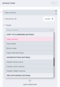
Triggers
Copy success – Triggered if successfully copied to user’s clipboard
Copy failed – Triggered if failed to copy to user’s clipboard
Button reset – Triggered when button returns to it’s original state
Copy returned empty – Triggered if successfully copied, but there was nothing to copy
Options
Delay – How long to wait after the event until the chosen action takes place .
The Copy to Clipboard element triggers a few different events for the various button states.
You can listen for the events to run your code as it happens.
Events
‘x_copy:copied’ – Triggers the moment the copying has been successful.
‘x_copy:failed’ – Triggers if the copying has failed (maybe there’s no element found, or the page isn’t on HTTPS, or the browser settings is preventing it).
‘x_copy:reset’ – Triggers the moment the button resets back to it’s default state.
‘x_copy:empty’ – Triggers if there was nothing to copy (ie dynamic data was empty, or was an empty string) – only applies if not hiding the button when empty.
Sample code:
const copyButton = document.getElementById('your-element-id');

copyButton.addEventListener("x_copy:copied", () => {
  // do something here when copying has completed
});

copyButton.addEventListener("x_copy:reset", () => {
  // do something here when button returns to its default state
});
Some example use cases:
// Alert the user if copying fails
copyButton.addEventListener("x_copy:failed", () => {
  alert('copying failed');
});
// Open a BricksExtras modal
copyButton.addEventListener("x_copy:copied", () => {
  xOpenModal('my-modal-id');
});