Back to Top
This element is nestable, allowing for any Bricks elements to be added inside.
This element support being used inside both components & nested components.
- General
- Accessibility
- Developer
- Support FAQ
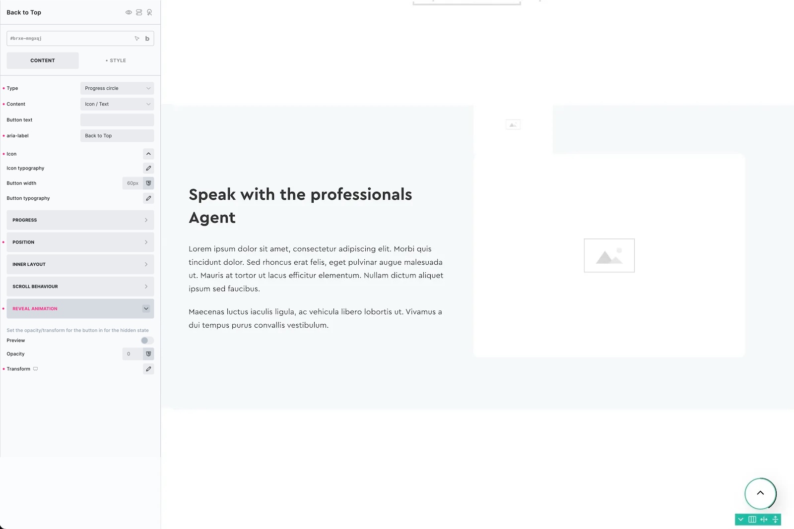
Fully customisable back to top button, with an optional built-in ‘scroll progress circle’ if you’re looking for something a bit more fancy out of the box. The button is nestable, so as well as including text/icons you could add in anything you like and just take advantage of the functionality for when to become visible etc.
Note – Generally a good place to add your back to top is inside of a footer template. Or consider creating a global template for your global elements.
Button Type – Progress circle or Regular. The main difference is that the progress circle comes with an animated circle border that will fill up based on the scroll position.
Button Content – Icon/Text or Nest elements – For convenience, icons and text can be added just by changing the settings. Switch to ‘nest’ if you want to build your own button.
Button text – Add text inside of the button
Aria Label – Important if not adding button text. Will add an aria-label directly the button
Progress Circle
Style the animated progress circle, line width, colors and if you wanted it rounded edge or square.
Position
By default the button is positioned fixed at the bottom right of the viewport, this can all be changed inside the position tab.
Inner Layout
Change the flex layout of the content inside of the button.
Scroll Behaviour
Visible after scrolling – Default 100px. This is the number of pixels scrolled down the page before the button is allowed to be visible and interacted with.
Only visible when scrolling up – Make sure the button is never revealed when the user is scrolling down.
Reveal Animation
Here you can change the hidden state of the button to control the reveal animation.
By default the button starts off with an opacity of 0 and translateY of 10px. So as it’s revealed it will fade in and go up by 10px. Any transforms can be added to make the button pop in from different directions, or rotate etc.
Preview hidden state – Toggle on and off to preview the button being revealed inside of the builder, based on the settings.
Note that the back to top buttons are not recommended if using scroll snapping on your entire page, due to how on iOS will prioritise the snapping and not allow the page to be scrolled.
Some notes on the built-in accessibility..
- Element is a <button> element, so is focusable and can be triggered via keyboard (return or space key).
- Default aria-label value for screen readers is “back to top”. This can be customised (either from settings or can add text to the button as it’s nestable)
- Button will change aria-hidden to true, and the button to ‘disabled’ whenever not visible. This ensures the element no longer focusable (or clickable).
- As the element is a button at the root level, you can add any attributes usng Bricks’ custom attributes settings for your specific use case.
If nesting in custom elements inside your back to top button, be mindful that you’re adding elements inside of a button. Some elements, like text links, shouldn’t be inside buttons.
The Back to top button triggers an event when it has scrolled the page.
‘x_back_to_top:scroll’ – Triggers the moment the back to top has scrolled the user to the top.
Sample code:
const backToTop = document.getElementById('your-element-id');

backToTop.addEventListener("x_back_to_top:scroll", () => {
// do something here when user is scrolled back to the top
 });