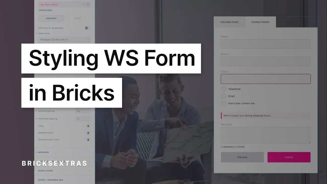
WS Forms
This element has it’s own interaction settings. Refer the interactions tab below for the list of element-specific triggers and/or actions.
- General
- Accessibility
- Interactions
- Support FAQ
This element provides an easy way to add and visually style any WS Form at the class level, directly inside Bricks. The WS Form plugin must be active for this element (either LITE or Pro version).
Watch an example workflow..
Recommended Workflow
Due to how WS Form adds the form styles, it can be a lengthy process to style the form. The recommended workflow to maintain consistency as well as having full control over the styles, is the following..
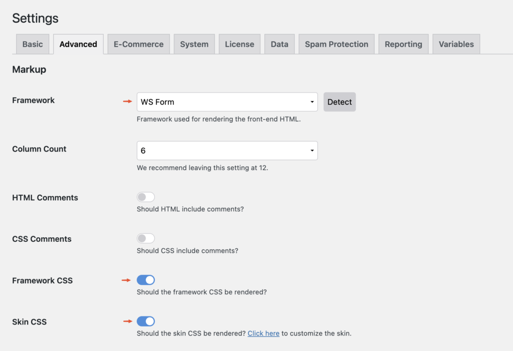
Update – if styling forms with this element, we recommend first disabling the WSForm styler. This can be done with the below PHP filter provided by WSForm..
add_filter('wsf_styler_enabled', function() { return false; });Ensure the default ‘WS Form’ framework is enabled with the default skin.
This will provide the base structure of the form. (see image below)
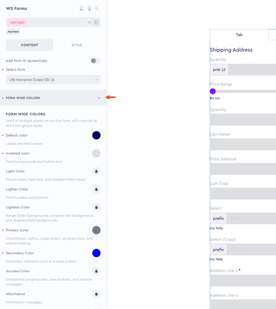
Override the site-wide form colors first
The first tab in the element settings is named ‘Form Wide Colors’. These colors are used in multiple places across the form. Instead of having to apply your colors across all the separate field types, it’s much quicker to override all the color defaults here in one place and then move into more specific field-type settings after this step.
This way, assuming you’re styling by class, the same class can then be used on other forms on the site which may have different field types, and you’ll know the correct colors are going to be applied.
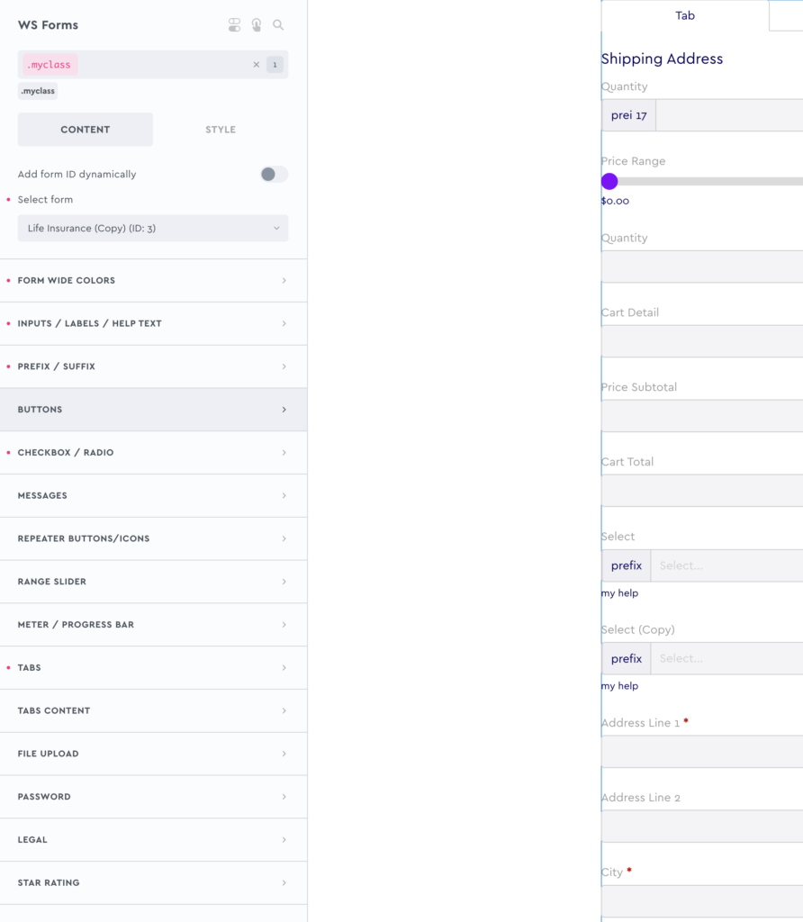
Next, dig into the individual field settings as needed
Once the overall form styles have been added, then you can move deeper into individual field settings to customise further.
Remember that with Bricks, hover/focus states are all managed with the states dropdown in the top/left of the builder, which is why there aren’t dedicated style settings for them. Activating :hover in the states dropdown, which essentially makes ALL controls now hover style settings when active.
Send in a feature request for anything specific if you’re struggling with styling a certain field type where you’d benefit from more settings. We can then prioritise it for the next update.
Apart from being mindful of color contrast, and making sure all text is readable, most of the accessibility related settings (adding labels, etc) is handled from in the WS Form plugin itself.
They have a good summary on accessibility in forms here;
Note that ‘Element Interactions’ must be enabled in BricksExtras > Misc settings.
This element adds new triggers to Bricks’ interactions options, so you can trigger actions based on the state of the element.
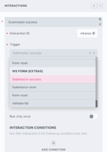
Triggers
Submission success
Submission fail
Form reset
Validate fail
Options
Delay – How long to wait after the event until the chosen action takes place .