Pro Slider
This element is nestable, allowing for any Bricks elements to be added inside.
This element can be used inside query loops.
This element supports being used inside AJAX filtered content, either by Bricks’ native filter elements, WPGridbuilder, JetSmartFilters or PiotnetGrid
This element has it’s own interaction settings. Refer the interactions tab below for the list of element-specific triggers and/or actions.
This element support being used inside both components & nested components.
- General
- Gallery Sliders
- Accessibility
- Interactions
- Developer
- Support FAQ
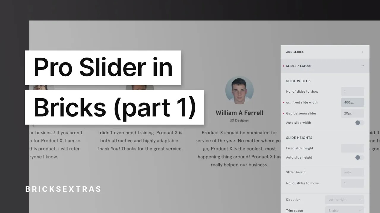
Build more advanced, accessible sliders more easily in Bricks. The Pro slider is powered by SplideJS (the same as Bricks native sliders) and extends the functionality in a number of ways..

Highlighted Features
- “Edit mode” in the builder for a smoother building experience (no re-rendering)
- Add progress bars, slide counter, Autoplay pause/play button, custom navigation buttons, autoplay progress bars as separate control elements.
- Slider syncing for creating thumbnail sliders
- Support for adding animations inside the slides.
- Intersection settings, to start the slider only when comes into view.
- Control over the slider user interaction (threshold / flicking power and slide transition easing)
- URL Hash Navigation (eg link to /my-page/#slide-5)
- Add dynamic galleries for slides (ACF, Metabox, Media Library etc)
- Allow code elements inside the slider, to allow for outputting anything as a slider.
- Built-in ‘clip-direction’ for overflowing sliders is only one direction.
- Developer docs for controlling dynamically with JS.
Video Tutorials
There’s a series of videos for the Pro Slider (starting off with beginner, and moving towards more advanced)
Start with Part 1..
The following tutorials can be found on YouTube..
Part 2 – Gallery Slider
Part 3 – Syncing Sliders & External Controls
Part 4 – Conditional Sliders
What can be used inside of a Pro Slider?..
- Anything that you can put inside a container, or from using Bricks’ query loop, can be made into a slider (the slides are just blocks, dynamic tags can be used inside to pull in dynamic data)
- Images pulled directly from either your media library, or a gallery custom field such as ACF gallery field, or Metabox’ Advanced Image field (using the Pro Slider Gallery element)
- A code element, to cover use cases where you need to add slides using code (ie for uses outside of the current available options)
- .. Is it possible to add X or Y? If it’s not listed above, send a feature request.
Pro Slider Elements
The Pro slider has a few elements, which allows for a lot of flexibilty in terms of creating layouts and building sliders.
- Pro Slider (the main slider track element itself). This is where all the configuration and layout controls for the slider are found.
- Slides – the individual slides that can contain any elements.
- Pro Slider Controls – External controls/extras such as progress bars, slide counter, autoplay buttons that can be used to control the slider.
- Pro Slider Gallery – Instead of nesting individual slides, you can instead populate the contents of the Pro Slider with a gallery. This element allows you to configure the gallery, choose the image source, image sizes, captions etc that you wish to appear inside the slider. (you can then configure the slider using the main Pro Slider settings)
Option Controls
Many of the behaviour / interaction options are coming directly from Splide, if you don’t quite understand what a specific option is supposed to do, check the Splide docs for a list of the options and descriptions.
Some notes regarding some options..
- Setting options for the slider isn’t a style that can be done with a class, it’s changing the behaviour of the slider, so make sure the element ID is selected.
- Setting a width on the slides will override the number of slides to show. ie you either set the number of slides (like 3) OR you set a fixed width (like 300px, or 3em), the fixed width will be prioritised.
- To hide/show the pagination dots or arrows at different breakpoints. make sure they’re enabled, and then use the ‘hide at this breakpoint’ setting. If they’re disabled or set to ‘none’ they won’t be output at all.
- If you’re adding in images, for the purpose of making them control the height or width of the slides, you likely need to use the ‘force image size’ settings to make sure they are taking up the full space of the slide.
Syncing Sliders
Enabling syncing on the thumbnail slider (the one you want the user to be able to click to control the other one). After enabling, provide the selector for the slider you wish to control, ie the element ID.
The slider syncing can also be used inside query loops. Use the element ID for the selector of the other slide. (not a class, as the classes will apply to every slider in the loop).
Sync multiple sliders – You can choose for the slider to act as the navigation for more than one other slider. To do so, include all of the selectors inside of the ‘sync selector’ setting seperated by commas.
Example: “.slider-to-control, .another-slider-to-control”
Component scope (v1.5.4+) – Enable if inside of a component and which to self-contain the functionality to the specific instance of component. ie sync only with the slider within that particular component.
Independent scrolling – Enable if you want to be able to browse/scroll through the navigation slider without actually moving the main slider. Only when the user clicks the slide will then it change the active slide on the slider being controlled.
Looping / Infinite Slides
Go to Pro Slider > Behaviour > Type = Loop.
Note that if using loop, Splide will create clones of the slides to give the illusion of ‘infinite slides’. To prevent multIple ID issues, Splide will change the IDs of these new slides. For this reason, if using loop mode, avoid adding styles to the slides using their IDs, either use a class or if just changing color/layout, use the settings directly in the Pro Slider.
If wishing to have a fade slider that continously loops, select ‘fade’ from the type dropdown and then enable ‘rewind’. This will ensure the slider starts back at the beginning after the last slide.
AutoPlay / AutoScroll
Autoplay – Move to the next slide after a set number of ms. if wishing to have the interval different for each slide, add the data-splide-interval attribute to each slide with the number of ms you wish for that slide.
Autoscroll – Continiously move the slider at the set speed. (negative speed will make it go in the opposite direction)
Start as paused – (for autoplay) If adding play/pause button to control the slider, you can choose to start the slider as paused so the autoplay will only happen if the user clicks the button.
Pause on hover – Hovering over the slider will pause the movement, to allow the user to interact with the slide (for eg to allow them to click a button).
Pause on focus – The same as above, but for the user focus. So if the user tabs to the element, or clicks something inside of the slide to focus it.
Intersection
Start slider when comes into view – Enable will prevent both autoplay or autoscroll from starting until the user actually scrolls down to the slider.
Root margin – Change how far away from the viewport the slider needs to be to start playing. for eg, 200px would mean that the slider will need to be within 200px of the viewport to start. (default is 0px).
URL Hash Navigation
The URL hash navigation allows you to link to a specific slide from another page. By default, the URL hash for each slide is going to be the slider element’s ID followed by the index of the slide.
So, for example, if you have a slider with the ID of #product. Then you could link to the third product in the slider with /my-page/#product-3. When the user lands on the page, the slider will start at that particular slide as active.
If you’re using individual slides and want to create your own URL hash for a specific slide, you can manually add the attribute data-splide-hash with the value you want. For eg, adding the attribute to one individual slide as data-splide-hash="my-important-slide" will allow you to then link to that slide from another page with /my-page/#my-important-slide.
Conditional Sliders
The slider functionality can be automatically disabled at breakpoints where there isn’t enough slides to cover the slider width. Very useful for use with query loops, where you may be using the slider in a template and occasionally there won’t be enough slides so the arrows, the pagination dots, the controllers etc don’t make sense to be there.
Horizontal layout if not active – When the slider is disabled, the slides will just be a regular horizontal flex layout. You can change the alignment when it’s disabled for what is best for your design.

Code Element
To add some more flexibility, if you’re trying to add images from a source that isn’t yet supported by Bricks dynamic data and need to use a code element to output the slides manually, we’ve added support for using a code element inside of the Pro Slider to populate the slides.
Splide is very strict on the structure needed, so the requirement is..
- The code element must have the class
splide__list - The output of the code element must be the list of slides (containing whatever you want) as divs with the two classes
x-slider_slideandsplide__slide. - The Pro Slider element must be in gallery mode.
For eg, the output code from the code element would be something like..
<div class="x-slider_slide splide__slide">
   <img src="/image-1.jpg">
</div>
<div class="x-slider_slide splide__slide">
   <img src="/image-2.jpg">
</div>
<div class="x-slider_slide splide__slide">
   <img src="/image-3.jpg">
</div>
Inner Animations
Bricks comes with the ability to add entry animations to any elements, so they appear when they become visible on the page. We added support for adding these into the Pro Slider so that instead of being triggered when they scroll into view, they can either be triggered when the slide becomes active or visible. Currently “fadeins” are the animations that are supported.. fadeIn, fadeInUp, fadeInLeft etc.
Update – as of Bricks 1.6 (Beta), the entry animations have been removed from Bricks. We’ve added support for the new ‘interactions’ to achieve the same. Choose ‘enter viewport’ as the trigger and ‘start animation’ and then select any fadein animation. The Pro Slider will make sure the animations only trigger on active or visible slides.
Animation trigger – Choose whether the animations are triggers when the slide they are in is active, or is made visible.
Only animate once – Will ensure the animations are only seen one time, then the elements will remain visible.
First element delay (ms) – You may want to delay the very first animation, so that it waits for the slider transition to complete before starting.
Auto-stagger animation delays – You can already set delays on the animations, but to save time if you want them all to animate after set intervals you can enable auto-stagger and set a delay time.
For eg, setting up auto-stagger and a delay of 100ms, means the first element with an animation will play after 100ms, followed by the next 100ms later, and then the next one another 100ms after. To remove any elements from this auto-stagger (you may want to add your own delay for that element), give it the class ‘no-stagger’ to be ignored.
Lazy Loading
As of v1.2.4, the slider supports Bricks’ native loading. ie any images that are off-screen when the page loads, won’t be loading until the user starts using the slider. We’ve now also added the option to enable ‘Splide Lazy Loading’ instead. This means you can take advantage of Splide’s lazy loading feature where you choose how many slides off the screen you want the images to start loading.
If using the Pro Slider Gallery, the Splide Lazy Loading is enabled by default. If adding in images yourself, refer to the Splide docs on how to add lazy loading to your images.
(Splide lazy loading gives more control, but the simplest method is to stick Bricks’ native lazy loading, where this is built into all image elements out to box if it’s enabled.)
Fade gradient
[BricksExtras v1.3.7+]
When in ‘loop’ made, a new option is available to easily add a fading gradient to the sides of the slider, with control over the distance from the edges and the gradient slope.

Tutorials
- Synced thumbnail sliders in Bricks using BricksExtras
- WooCommerce Product Gallery Thumbnail Slider in Bricks
- Dynamic Post Galleries in Lightboxes using BricksExtras
Copyable JSON
Gallery Sliders
There are two different ways to add a gallery to a pro slider. Either using the pre-built Pro Slider Gallery element, which populates the slides and images automatically for you. Or with a gallery query loop, which is a little more manual but offers the most control,.
1. Using the Pro Slider Gallery Element..
There are two requirements for adding the gallery to a slider..
- Enable gallery mode in the Pro Slider settings.
- Replace any slides or inner content of the Pro Slider with the dedicated Pro Slider Gallery element. (This will populate with slides containing the gallery)
This element is doing the job of replacing the slides, it will behave as is set up in Pro Slider settings.
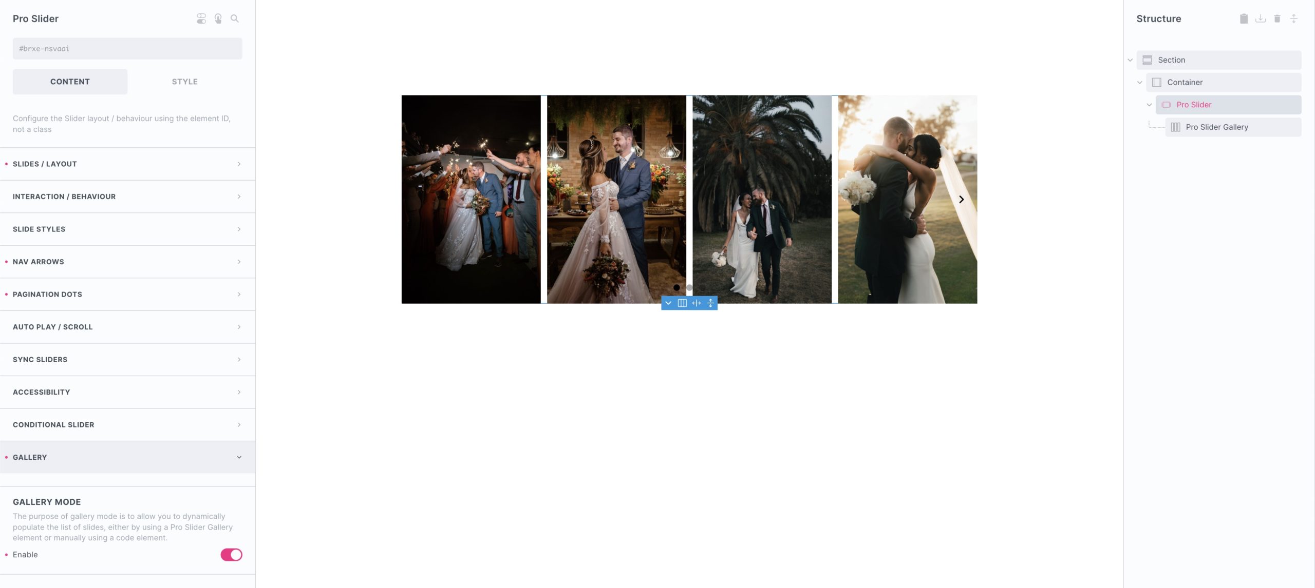
Workflow – add in the Pro Slider Gallery element as the only child of the Pro Slider, use the gallery settings to get the images and image sizes you want. Then go back to the Pro Slider to set the layout and configure. See the video tutorial on Gallery Sliders.
Image sources – The element hooks into Bricks’ dynamic gallery system, so as well as being able to just add image directly from the media library, you can also use dynamic data such as ACF gallery fields to populate the slides.
Link to – Add links to the individual images, including the option to link to Bricks’ native lightbox element.
Max no. of Images – Set the limit for the number of images that will appear in the slider, useful if using dynamic data and need a limit.
Randomise order – The array of images is randomised each time the page loads.
Image sizes – 80% of issues with images inside sliders can be solved by creating a correct image size for the layout you’re building. For eg, even though it’s possible to create square images using the slider options to force the layout (and use object fit to prevent stretching), it’s often better to just create a new image size that is a square and then use that.
Object Fit – If you’re needing to set the width/height of the slides and wish for the images not to stretch when trying to fit the space, the CSS property object-fit is to make the images behave more like background images. Cover/contain etc.
Captions – Choose to add captions to the images. By default they appear at the bottom of the images, they can be styled and repositioned.
SRCSET – Enable if you wish the images in the gallery to follow the srcset rules as set up on your site. Disabled by default (generally images in gallery carousels remain at a similar size across devices)
Support Lazy Load – Choose whether the images use the Bricks lazy loading (if it’s enabled) or Splide Lazy loading (if it’s enabled) or none.
2. Using a Gallery Query Loop
Another way to include a gallery inside of a slider, is to use the Gallery query loop on the slide element. This isn’t as done-for-you, as it requires then adding in an image element to populate the images (populate the image element with the post_id tag while inside the loop). But the benefit is the element is then completely nestable, and you have more control over the image settings such as setting aspect ratios etc.
Example – https://support.bricksextras.com/recordings/NizKzdpNejFG7Wd5BrKg
All the slider controls work exactly the same, but here you have direct access to the content within the slides while still getting the images populated from the gallery.
Keyboard Interaction
(To control whether these keys control the slider globally, or only when that particular slider is focused, go to Pro Slider > Interaction > Keyboard)
| Key | Description |
|---|---|
| ← | In horizontal pagination, moves focus to the previous (or next in RTL) dot and displays the corresponding slide |
| → | In horizontal pagination, moves focus to the next (or previous in RTL) dot when pagination contains focus and displays the corresponding slide |
| ↑ | In vertical pagination, moves focus to the previous dot and displays the corresponding slide |
| ↓ | In vertical pagination, moves focus to the next dot and displays the corresponding slide |
| Space | Displays the slide if it’s not active |
| Enter | Displays the slide if it’s not active |
| Home | Moves the focus to the first dot and displays the first slide |
| End | Moves the focus to the last dot and displays the last slide |
Pro Slider Settings
We added some useful settings to customise your slider relavent to accessibility..
Aria labels – All the labels from the navigation arrows, the slider itself, the slides and the pagination dots can be changed to be more relavent to your slider.
Conditional slider – We added an option to remove all the slider features dynamically if there aren’t enough slides. This then will remove all the pagination, the navigation and won’t confuse users into thinking there’s a slider present that can be interacted with when there isn’t. (the slider becomes a regular flex layout)
Autoplay Controls –
W3C suggests that a slider with autoplay must satisfy following things:
- Have a button for pausing/resuming autoplay
- Should pause autoplay when focus comes into the carousel
- Should pause autoplay while the mouse is hovering over the carousel
All these options are available in the Pro Slider, the Pro Slider Control comes with the option to add your own pause/play autoplay button.
Splide
The Pro Slider is powered by the same SplideJS library from inside Bricks, which is already one of the best in terms of accessibility out of the box. All the info is in Splide’s docs.
Note that ‘Element Interactions’ must be enabled in BricksExtras > Misc settings.
This element adds new triggers to Bricks’ interactions options, so you can trigger actions based on the state of the element.
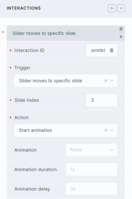
Triggers
Slider move – Triggered as slider moves to a new slide.
Slider moved – Triggered the moment that the slider finishes moving
Slider moved to a specific slide – Triggered the moment that the slider finishes moving and lands on the specified slide.
Options
Delay – How long to wait after the event until the chosen action takes place .
Actions
The element can be controlled with interactions.
- Set the target to the element using a CSS selector
- Use one of the following functions below to set the action.

bricksextras.slider.forward – Move slider forward x number of slides.
bricksextras.slider.backward– Move slider backward x number of slides.
bricksextras.slider.toslide – Move slider to specific slide index (the second argument would be the index)
bricksextras.slider.topage – Move slider to specific page index (the second argument would be the index)
Quick screen recording below of using the ‘bricksextras.slider.toslide’ on a click trigger on buttons to move the slider to a specific slide index after clicking on button elements.
https://support.bricksextras.com/recordings/eVT605rcnOq6APaj5zdc
If you’re looking to be able to use the Splide API, for more control over the slider..
Find the identifier from the data-x-id attribute on the element. For example, if your slider has the attribute data-x-id="ixqrsu", to get the Splide instance, you can do so like this:
const mySlider = xSlider.Instances.ixqrsuSome example code, showing how to control the slider using the Splide API in your JS.
document.addEventListener("DOMContentLoaded", () => {

  /* provide the identifier */
  const sliderIdentifier = 'ixqrsu';

   /* listen for slider being initialised */
  document.querySelector('.x-slider[data-x-id=' + sliderIdentifier + ']').addEventListener( 'x_slider:init', () => {

      /* get the Splide instance to control the slider */
      const sliderInstance = xSlider.Instances[sliderIdentifier]

      /* Now we have the instance, we can do anything the Splide API allows for, some examples.. */

      sliderInstance.on( 'move', () => {
        // do something here when slider moves
      } );


      /* Move slider to the next page */
      sliderInstance.go( '>' );

      /* Go to slide 2 */:
      sliderInstance.go( 2 );


      /* example how to get the index of the current active slide */
      sliderInstance.on( 'active', ( slide ) => {
        console.log(sliderInstance.index)
      } );

  })

})
If wishing to use the Pro Slider inside dynamically added content, for eg adding content with AJAX, or using filter plugins to dynamically add the slider ( WPGridBuilder, FacetWP, etc) the function that needs to run to refresh the slider when the content is added is..
doExtrasSlider(container).. where ‘container’ is a container element surrounding the newly added content. For eg if the container around the content/posts has the ID ‘ixqrsu’, then you’d do..
doExtrasSlider(document.getElementById('ixqrsu'))at the moment when the new content is added.
If you’re looking to go completely custom and override all of the element options with custom Splide options, we recommend using the Nestable Slider that already comes with Bricks (which has the option for this built-in).