Add to Calendar
This element can be used inside query loops.
This element supports being used inside AJAX filtered content, either by Bricks’ native filter elements, WPGridbuilder, JetSmartFilters or PiotnetGrid
This element support being used inside both components & nested components.
- General
This element creates a button that allows users to add events to their calendar apps (Google Calendar, Apple Calendar, Outlook, etc.) via a tooltip menu.
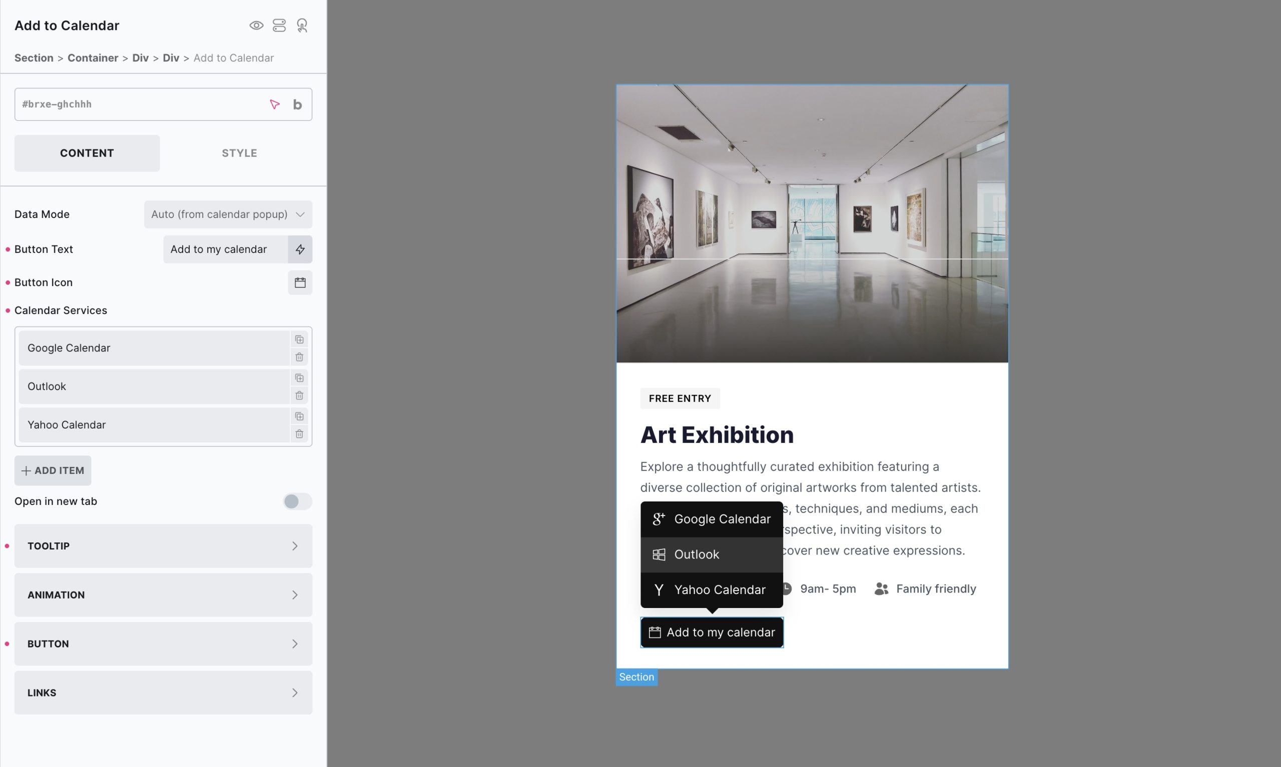
Key Features:
- Two data modes: Enter dynamic data into the element or auto-populate if used inside of an AJAX popup opened via the calendar element.
- Multiple calendar services: Google, Outlook, Yahoo, and iCal download for Apple calendar etc.
- Customizable tooltip: Configure trigger (click/hover), placement, delays, and offsets
Settings
Data Mode Choose how event data is provided to the element:
- Auto (Popup) — Automatically pulls event data when this element is placed inside an AJAX popup opened by the Calendar element. No manual configuration needed.
- Dynamic data — Manually map event fields below using dynamic data tags (ideal if displaying this element in a regular query loop or on a single event page)
The following fields only appear when Data Mode is set to “Dynamic data”:
- Title — The event title/name.
- Start Date/Time — The event’s start date/time.
- End Date/Time — The event’s end date/time. If left empty, defaults to 1 hour after the start time (or 1 day, for all-day events).
- Description — Event description.
- Location — Event location (address, venue name, etc.).
- All Day Event — Enter
trueorfalseto mark the event as an all-day event.
Service
Service (repeater) Add one row per calendar service you want to display in the tooltip menu. Each row supports:
- Service — Choose the calendar provider: Google, Outlook, Yahoo, or ICS (downloads a
.icsfile for Apple Calendar and other apps that support the format). - Label — The text shown for this service link.
- Icon — Custom icon for this service. Leave empty to use the built-in default icon for that provider.
- Icon color — Overrides the icon color for this specific service row.
- Background — Background color for this specific service link.
- Text color — Text/icon color for this specific service link
Display Controls whether each service link shows the Icon, Label, or Both.
Open in new tab When enabled, calendar service links open in a new browser tab
Button
- Text — The button’s label text.
- Icon — Custom icon for the button. Leave empty to use the default calendar icon.
- Display — Show the button’s Icon, Label, or Both.
- Typography / Background / Border / Box shadow / Padding — Standard styling controls for the button.
Tooltip
- Trigger — How the tooltip opens: Click or Hover.
- Placement — Tooltip position relative to the button: Top, Bottom, Left, Right.
- Delay (ms) — Delay before the tooltip appears.
- Offset skidding (px) — Shifts the tooltip along the side of the button.
- Offset distance (px) — Distance between the tooltip and the button.
- Transition (ms) — Speed of the tooltip’s move transition when repositioning.
- Append to body — When enabled, renders the tooltip at the end of the
<body>instead of inline — useful for avoidingoverflow: hiddenclipping issues on parent containers. - Typography / Background / Border / Box shadow / Padding (Tooltip Styles) — Standard styling controls for the tooltip container.
Animation
- Transition (Show) — Fade/transform duration when the tooltip appears.
- Transition (Hide) — Fade/transform duration when the tooltip disappears.
- Translate X / Translate Y — Offset the tooltip’s entrance animation along the X/Y axis.
- Scale — Starting scale of the tooltip’s entrance animation (e.g.
0.95).
Links
Styling controls that apply to all service links in the tooltip (use the per-row Icon color / Background / Text color fields under Service to override individual rows):
- Gap — Spacing between the icon and label within each link.
- Typography / Background / Border / Padding — Standard styling controls for all service links.