Toast Notifications
This element is nestable, allowing for any Bricks elements to be added inside.
This element can be used inside query loops.
This element has it’s own interaction settings. Refer the interactions tab below for the list of element-specific triggers and/or actions.
This element support being used inside both components & nested components.
- General
- Accessibility
- Interactions
- Developer
- Support FAQ
A toast is a small message that appears on the screen to inform the user of a specific event or action. They can be triggered via interactions, automated to show at set intervals, through custom functions, etc.

How it Works
Toasts work using positioning zones. Think of these as designated areas on your screen where notifications appear and can stack together if inside the same zone (top left, top center, top right, bottom left, bottom center, bottom right)
Any Toast Notification elements you add inside this ‘Toast’ container will:
- Share the same positioning zone
- Stack vertically when multiple are shown at the same time
- Inherit the container’s spacing and offset settings (distance from the edge of the viewport)
- Users can dismiss notifications by swiping or an optional close button (they disappear after a few seconds)
- All notifications can have their own unique styling, content, and triggers.
Typically, toasts are not for use where the user needs to make a decision or interact with the message (here you’d want a modal element), instead they’re for displaying a message that will disappear after a few seconds.

You could have all of your site notifications appear within the same zone. Or optionally, create a new zone for different types of notifications so they don’t interact or stack together.
Triggering Toasts
There are three ways to trigger, depending on the use case.
Built-in triggers – There’s a variety of common trigger types built into the element, similar to the modal element – On page load, after X seconds, and control over when/if to show the same user.
Bricks Interactions – For more control, use any triggers from Bricks’ interaction setting to trigger toast notifications. Clicking an element, when a product is added to a cart, after a form submission, after pausing a Media Player, opening an OffCanvas, etc.
Custom JavaScript or PHP – Easily trigger toasts based on any JavaScript event or condition, or queue toasts via PHP to appear after page redirects (see developer docs)
Getting Started
When first adding the ‘Toast’ element to the page. By default, you’ll already have one notification element in place with a text message inside of it.
The toast element is a container to receive the notifications. It controls the overall positioning and how many notifications can be displayed at once within that container.

Position – Which position zone to populate with the notifications
Max. visible toasts – The maximum number you can see at any one time. When each item is dismissed, if there are more still available, they will come into view.
Gap between toasts – Controls the visible gap between the toasts (note this is not visible in the builder).
Offset – The distance from the edge of the viewport (note this is not visible in the builder).
Toast Notifications
The actual notification content and triggering is all handled by the individual Toast Notification elements inside. See the structure below, where all notifications live inside one bottom-right positioned toast container.

Duration – Auto-dismiss after a set number of ms. Default is 5000.
Dismissable – Whether the user can swipe to dismiss a notice.
Screen reader notifications – This allows you to control the aria-live value, which controls how screen readers will read the message when it appears.
- Polite – Wait for the current action to end before announcing.
- Assertive – Interrupt immediately.
- Off – Don’t announce.
Triggers – There are some built-in triggers, similar to the modal element. Alternatively, you can also trigger manually using any Bricks’ interaction trigger, or via code if needing to show only after specific actions have taken place.
Icons
For convenience, there are two optional built-in icons on either side of the nestable content. One for displaying a dismiss button, and the other as a way to add context to the message. (alert, notice, error icons etc). These are both optional. The element is nestable, so any elements can be added in for custom designs/layouts.
Using in Query Loops / with Dynamic Data
The elements can be used inside query loops if wishing to include dynamic data from inside the loops in your message

Looped Intervals
One of the requested triggers was to be able to show a message every X number of seconds to users, where different content can be displayed each time it shows (to give the impression that ‘live events’ are happening in the background as the user is browsing the site – perhaps other users buying products).
This can be done by choosing the built-in trigger named ‘Looped intervals‘.
By default, the interval time is set at 20 seconds. So this means the toast would show after 20 seconds of visiting the site, and will loop through the child elements of the toast notification element to show a different message each time (each after the set interval).
Interval – Choose the required time between showing each message (default is 20 seconds)
Loop – Whether to loop back to the beginning after the last message is viewed
Note that the intervals will continue as the user browses different pages of the site (assuming the toast element is site-wide and so exists on every page)

Focus Management
Unlike modals, toasts do not move keyboard focus. Users can continue their current task on the page without interruption, while screen readers can announce the message in the background.
Announcements
This can be changed per notification…
–polite (default) – Waits for the screen reader to finish the current speech, then announces. (Use for success messages and general updates.
–assertive – Interrupts the screen reader immediately to announce the message. (Use for errors and time-sensitive information).
– off – No announcement, visual only. Use for decorative notifications (i.e., if the action taken already includes its own announcement).
Things to bear in mind..
– Keep messages concise (screen readers read out the whole message)
– Provide sufficient duration (default is 5 seconds until auto-dismiss)
Note that ‘Element Interactions’ must be enabled in BricksExtras > Misc settings.
Actions
The element can be controlled with interactions.
- Set the target to the element using a CSS selector
- Use one of the following functions below to set the action.
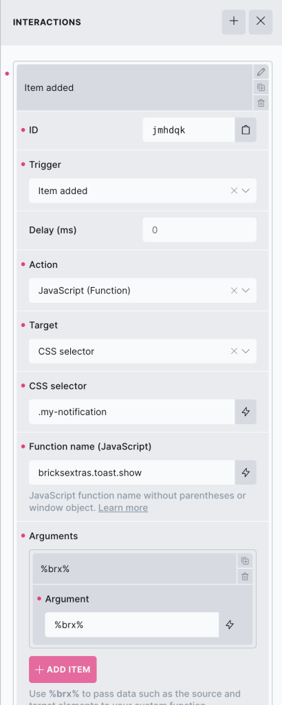
bricksextras.toast.show – Trigger a notification
If wanting to replace with a custom message, the bricksextras.toast.show supports a number of arguments to customise the settings.
This way you can show the same toast, but change the message or behaviour depending on the action.
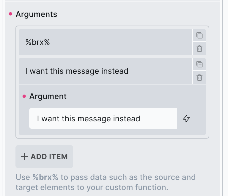
Arguments;
%brx% – always use this that Bricks’ adds as the first argument.
Message – (optional) – Override the message with custom text.
Announce – (optional) – Override the screen reader announce option
Duration – (optional) – Change the auto-dismiss duration
ContextIcon – (optional) – Whether to include the context icon (true/false)
Dismissible – (optional) – Whether to make the message dismissable by swiping (true/false)
CloseButton – (optional) – Whether to include the built-in close button (true/false)
You can show a notification programmatically with JS with the xShowToast() function.
First find the identifier from the data-x-id attribute on the element. For example, if your element has the attribute data-x-id=”auxrry”, you can trigger it to show any time with
xShowToast('auxrry');
Or optionally change the message being shown as you trigger it..
xShowToast('auxrry', {
  message: 'Optionally add custom message',
  duration: 5000
});
Queuing a toast in your PHP..
bricksextras_queue_toast('bricks-element-id');Or optionally change the message, and settings as you trigger it..
bricksextras_queue_toast('bricks-element-id',
  $message = 'Optionally add custom message',
  $announce = 'polite',
  $duration = 5000,
  $context_icon = true,
  $dismissible = true,
  $close_button = false,
);
Example code for queuing a toast using WooCommerce’s ‘woocommerce_add_to_cart_redirect’ hook, so the toast can appear after the redirect.. (with the product name added inside the message)
add_filter( 'woocommerce_add_to_cart_redirect', 'show_add_to_cart_toast', 10, 1 );
function show_add_to_cart_toast( $url ) {

    $product_id = absint( $_REQUEST['add-to-cart'] ?? 0 );

    if ( $product_id ) {

        $product = wc_get_product( $product_id );

        if ( $product ) {
            $product_name = $product->get_name();
            $message = '"' . $product_name . '" has been added to your cart';
            bricksextras_queue_toast( 'xqwbyy', $message );
        }
    }

    return $url;
}