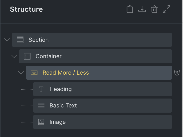
Read More / Less
This element is nestable, allowing for any Bricks elements to be added inside.
This element can be used inside query loops.
This element supports being used inside AJAX filtered content, either by Bricks’ native filter elements, WPGridbuilder, JetSmartFilters or PiotnetGrid
This element has it’s own interaction settings. Refer the interactions tab below for the list of element-specific triggers and/or actions.
This element support being used inside both components & nested components.
- General
- Accessibility
- Interactions
- Developer
- Support FAQ
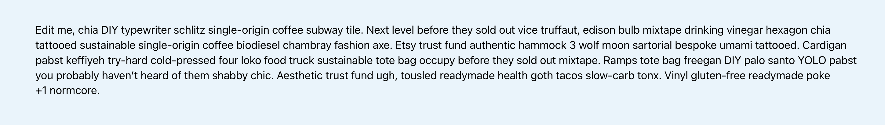
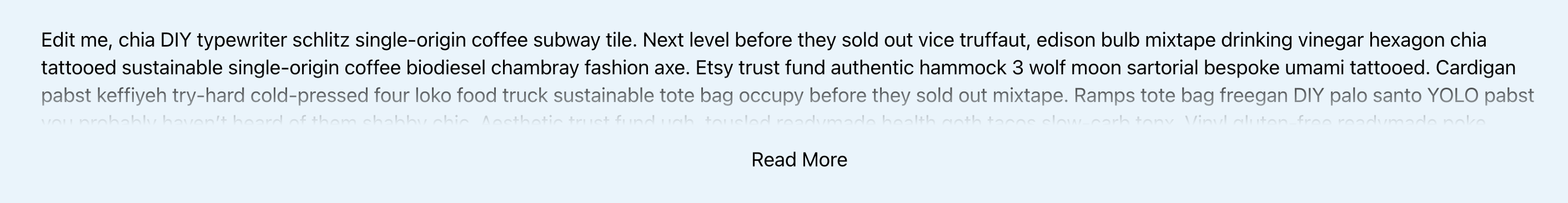
This element is for being able to collapse/expand long blocks of content with customizable “Read more” and “Read less” button and icon. The read more links are added dynamically, meaning it works well with dynamic content. ie if there’s not enough content, no link will be added.
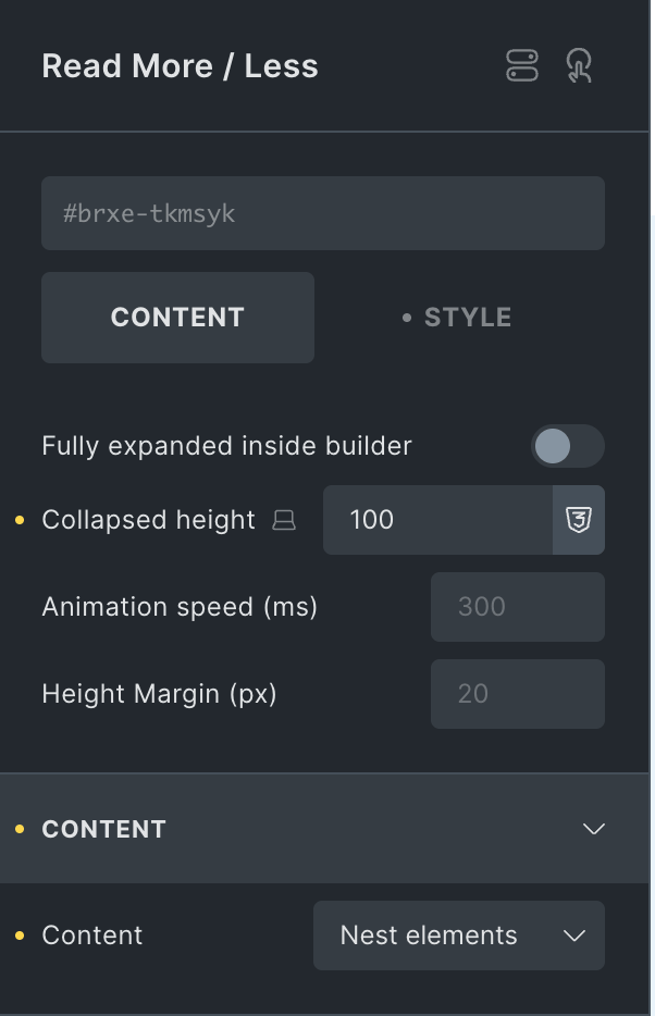
Fully Expand in Builder – View either as collapsed or expanded while viewing inside the builder. Collapsed will take into account the collapsed height and show the element as it will appear on the front end. Expanded is useful for editing the content, while previewing.
Collapsed Height – (minimum is 1px) This will set the maximum height of the component in its collapsed state. The content inside that has a larger height will be hidden. If the content is smaller than the collapsed height (taking into account the ‘height margin’ set as a buffer, the element will leave the content as is and there will be no read more button added.
Animation Speed – Control the timing in milliseconds for the entire opening or collapsing of the container.
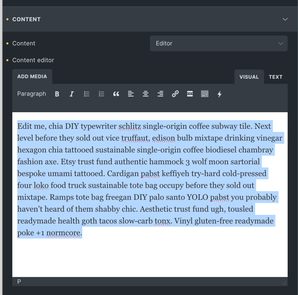
Content
These are the possible sources for the content:
- Editor
- Nest Elements
If you need text, whether dynamic or just straight-up text in the builder, the editor is the simplest option. For most control over styling and adding different types of elements, choose ‘nest elements’ and then drag in any Bricks elements into the container.
Read More Button
Customise the button text, style the button and change the alignment from this tab. Remember to style the hover/focus is done through Bricks’ psuedo class dropdown at the top of the builder.
Button fade duration – This controls the small fade effect that happens as the read more is expanded and the button changes text.
Read More Icon
Choose to display any icon inside the read more button and have it rotate in the different states.
Fade Gradient
The fade gradient settings allow you to create a gradient the top of the content inside of the element to better indicate that there is more to read than what is currently visible. The transparency has a ‘start’ and ‘end’ percentage to allow you control exactly the point where the content fades to transparent.
How to use the Read More / Less element
Add the element inside a Section’s Container.
Checking on the frontend, you may not see the ‘Read More’ button by default.
Set the Collapsed height to say, 100 and reload the page to see the button.
Test the expand/collapse functionality to make sure it is working.
To change the default content, expand the CONTENT control group, delete the default text and type/paste in your own.
It is also nest elements instead of having a static text.
To do this, change the Content to ‘Nest elements’.
and add your desired elements.
Ex.:
Now, let’s see how this element can be used with dynamic post content in a query loop.
Add a Block inside the Container, enable query loop on it. Change your post type as needed.
Add Post Title, Image with source set to featured image and Post Content elements inside the Block.
Let’s move the featured image and post content element inside a Read More / Less element, like this:

Check the frontend. For each post, only a part of the image should be visible and visitors will have to click the Read More button to reveal the rest.
Some notes on the built-in accessibility..
- The ‘read more’ / ‘read less’ buttons under the content are <button> elements, dynamically added to the page based on if they’re needed or not for that specific content height.
- The button text and aria labels can be changed in the settings, and defaults are ‘read more’ and ‘read less’. If button text removed, the aria labels need to be there.
- The state of the button is known with the aria-expanded attribute, which will change as the read more content expands/collapses.
- The aria-controls attribute is automatically added to the buttons, to identifiy which content on the page is being hidden with the buttons.
Note that ‘Element Interactions’ must be enabled in BricksExtras > Misc settings.
This element adds new triggers to Bricks’ interactions options, so you can trigger actions based on the state of the element.
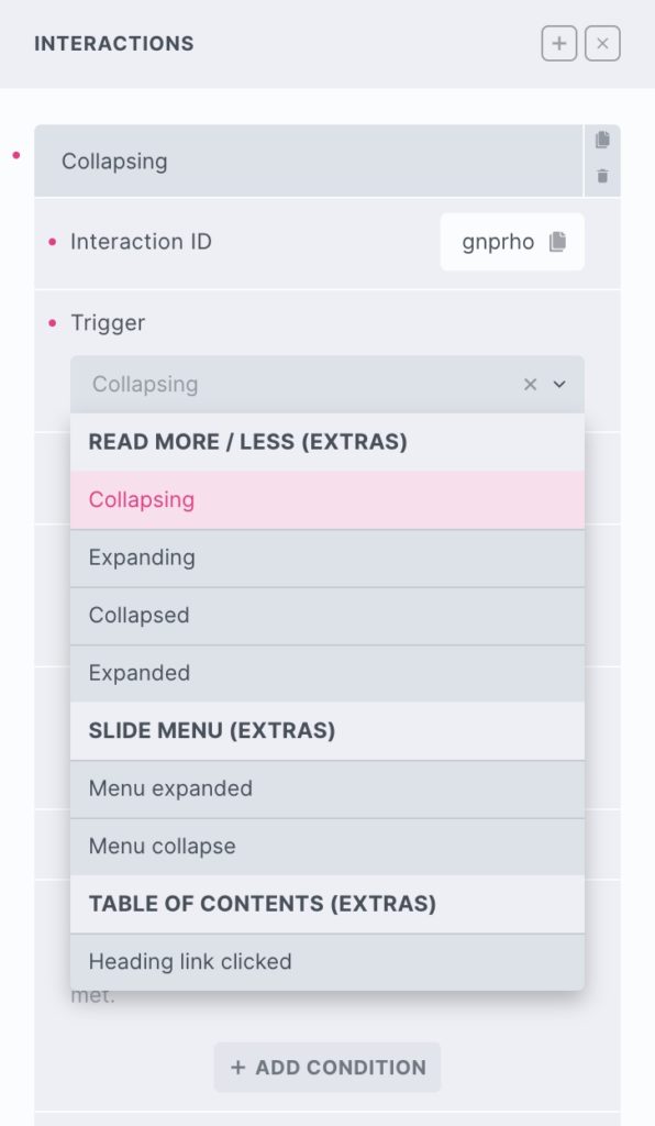
Triggers
Collapsing – Triggered the moment the content starts to collapse
Expanding – Triggered the moment the content starts to expand
Collapsed – Triggered the moment the content has finished collapsing
Expanded – Triggered the moment the content has finished expanding
Options
Delay – How long to wait after the event until the chosen action takes place .
Actions
The element can be controlled with interactions. (v1.4.7+)
- Set the target to the element using a CSS selector
- Use one of the following functions below to set the action.
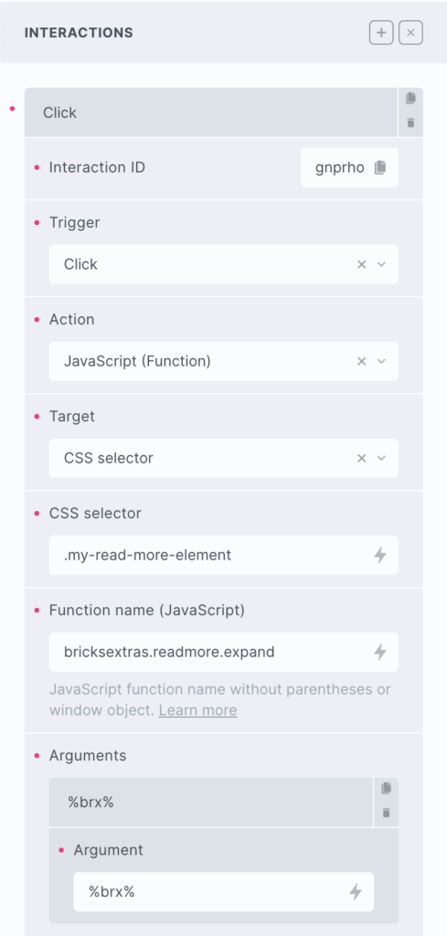
bricksextras.readmore.toggle – Toggle between expand/collapsed state
bricksextras.readmore.expand – Expand content (if currently collapsed)
bricksextras.readmore.collapse – Collapse content (if currently collapsed)
The Read More / Less element triggers events on both expanding and collapsing. If you’re needing to trigger something when this happens, the events are..
x_readmore:expand – triggered just as the read more begins to expand
x_readmore:collapse – triggered just as the read more begins to collapse
x_readmore:expanded – triggered just as the read more finishes expanding
x_readmore:collapsed – triggered just as the read more finishes collapsing
Sample code:
const readMore = document.getElementById('readmore-1');

readMore.addEventListener("x_readmore:expand", function() {
 // do something as element starts to expand
});
Needing to use a read more element inside hidden content or dynamically added content (where the height would be unknown on page load), you can use this function to add it in when it’s needed.
doExtrasReadmore(container) – where ‘container’ is the container element with the read more element(s) inside.
This will then calculate the need for the read more button based on the height of the newly added content.