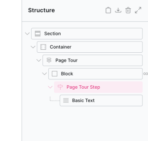
Page Tour / Steps
This element is nestable, allowing for any Bricks elements to be added inside.
This element can be used inside query loops.
This element has it’s own interaction settings. Refer the interactions tab below for the list of element-specific triggers and/or actions.
This element support being used inside both components & nested components.
- General
- Quick Start
- Accessibility
- Interactions
- Developer
- Support FAQ
The Page Tour & Steps elements are nestable elements that allow you to create interactive guided tours on any Bricks pages/templates. Highlight specific elements on your page and provide step-by-step instructions inside of popovers to guide new users through features, workflows, or important content on the page.

Note that the tour is not live when viewing inside the builder, simply click on the steps inside the structure panel to preview and edit each step.
Trigger – There are four built-in ways to trigger a tour.
- Page load – Will start the tour as soon as the page content loads.
- Click – Choose which element the user needs to click to start the tour
- Interaction – Choose this if manually triggering the tour via Interactions (or via custom code)
- Window Event – Allows you to choose a JS event that will trigger the page tour. Ideal if you’re doing something via custom code and need to trigger the tour at a certain point. The tour element will be listening for that window event to trigger.
Navigation Buttons – By default there are three global navigation buttons that are added to every step; back, next and complete. Each button will appear conditionally based on the current step. (no back button at the first step, for example)
Custom navigation buttons – The global navigation buttons can be disabled and replaced with any elements inside of each step to control the tour. This allows you to design your own buttons/links to navigate between the steps. Simply provide the selector for the elements you wish to use for the back, next, skip, complete links or buttons.
if you wish to include any links/buttons inside of the steps that control the tour, the classes to add to those elements are;
- ‘x-tour-next‘ – moves to next step
- ‘x-tour-back‘ – moves to previous step
- ‘x-tour-complete‘ – completes the tour
- ‘x-tour-skip’ – skips/cancels the the tour
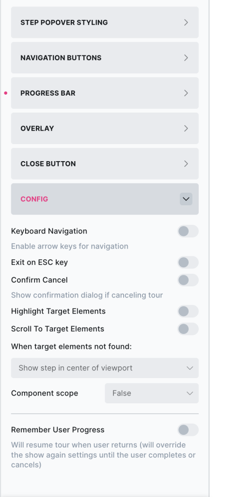
Progress Bar – Optionally add a progress bar to display a user’s progress along their journey.
Overlay – Add an overlay to the site content while each step is open. This will prevent users being able to click outside of the steps.
Click overlay to exit tour – Disabled by default, allow users to cancel the tour quickly by clicking anywhere on the overlay.
Allowing Clicking Target element – This will ‘open a hole’ inside the overlay, to allow the user to be able to click just the element being targeted. Useful if you’re showing users buttons where they may wish to click to see the result.
Styling Step Popovers – The steps within a tour can all be styled from the parent page tour element, but also can be styled at an individual level in the page tour steps element settings.
Config
Keyboard Navigation – The arrow keys can be used to navigate quickly between steps.
Exit On Esc – Allow users to cancel the tour by pressing the ESC key,
Confirm Cancel – Will add a confirmation dialog when the user tries to cancel the tour.
Highlight Target Elements – Will add highlight styling to the elements on the page that are being targeted at each step.
User Progress
Remember User Progress – Allows the user to leave the page and come back to be at the same step in the tour, or the very next step. This can be used to create multi-pages tours, where one step may be to redirect to another page and the user will arrive at the next step when they arrive there.
Auto-resume on page load (v1.6.4+) – This will resume the page tour back at the step the user was at when they previously left the page. The tour will show on page load when they return, ignoring the show again settings until the user completes or cancels. Disable if you prefer to manually allow the user to resume the tour (ie resume by using an interaction and not having the tour open on page load)
Clear progress on cancel – If you wish for the tour to still be able to be resumed at the last step even when the user has cancelled out of the tour, disable this.
Step to return to – Current or Next. Choose current if you want the user to resume at the exact step where they left off. Choose next if you wish to show the step after that (useful for the multi-page tours, see further below)
Individual Step Settings
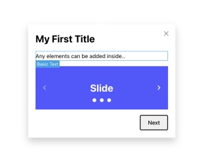
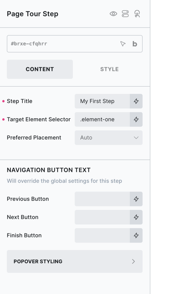
Step Title – Optional Title that would appear at the top of the step
Target Element Selector – Provide the selector for the element on the page the popover needs to be attached to.
Preferred Placement – Auto is the default, where it’ll go where there is space. This can be changed if you prefer it to first try to fit in a certain direction.
Navigation Button Text – If using the built-in global navigation buttons, here you can override the button text for each individual step if needed.
Popover Styling – The popovers can be styled differently per step, this will override the styles set on the page tour element.
Using with Query Loops
Each step can be populated dynamically with query loops and dynamic data. Simply insert the step inside of a query loop and use dynamic tags inside the nested content and in the settings.

Multi-Page Tours
if you’re looking to move the user between pages during a tour, here’s how it can be done..
- Make sure the page tour element exists on both pages. (in a site wide template ideally)
- Inside of one of the steps, you’d need to create a link to take the user to another page.
- Enable the ‘Remember User Progress’ option on the page tour element, this will ensure the data is saved.
- Lastly, for the ‘Step to return to’ option, select ‘Next Step’. This will ensure when the user arrives at the next page, the next step of the tour will be waiting for them.
To get started with this element..
1. First, Add the page tour element to your page
By default, the page tour will be populated with two steps.
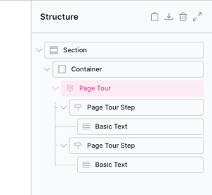
In the preview area, you’ll see a preview of the first step (click the next step in the structure panel to view it).
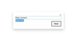
By default it will just contain a basic text element, but it’s nestable so can be replaced with any elements.
2. Create as many steps as you need, and then go to each page tour step settings to link each step to a target element on the page
Some steps may not need target elements, in which case you can leave it blank and that step will appear in the center of the viewport by default.
You can also add an optional title that will appear above the content. The rest of the step popover is nestable, so you’d add elements inside it to populate it with content.
The navigation button text can be changed for each step, if you need it to be different to the global tour settings.
If wanting to populate dynamically with a query loop, simply wrap the first page tour step element inside of a block with a query loop. (everything works the same, it’s just that now the loop is controlling how many steps there are and you’d be using dynamic tags in the content.
3. Set the overall behaviour / styling from the parent page tour element
Now you have the steps in place, go to the parent page tour element settings to configure the tour.
Here you’ll find the configuration options. How to trigger the tour to start, when to show the same user the tour (similar to the modal/notification element functionality), change all the navigaton buttons and styling for all the steps.
You can control the overall behaviour, and there are also some optional extras built in such as a progress bar, and an overlay to prevent clicking other elements while the tour is open.
Choosing the ‘remember user progress’ option is for if you want the tour to start off at the same step if a user leaves the page and returns before finishing the tour. If they cancel or complete the tour, this will be disabled.
That’s it
Now view on the front end and trigger the tour to see the step popovers appear next to each target element.
Some notes on the built-in accessibility..
- Focus trapping within each step is autamatic, the focus will move into each step as they open and remain inside the step until it closes.
- Cancelling by pressing ESC key is available in the settings.
- Moving quickly between steps with left/right nav keys is available in the settings.
- The built-in navigation are <button> elements. If using custom navigation, we recommend to also use buttons.
Note that ‘Element Interactions’ must be enabled in BricksExtras > Misc settings.
This element adds new triggers to Bricks’ interactions options, so you can trigger actions based on the state of the element.
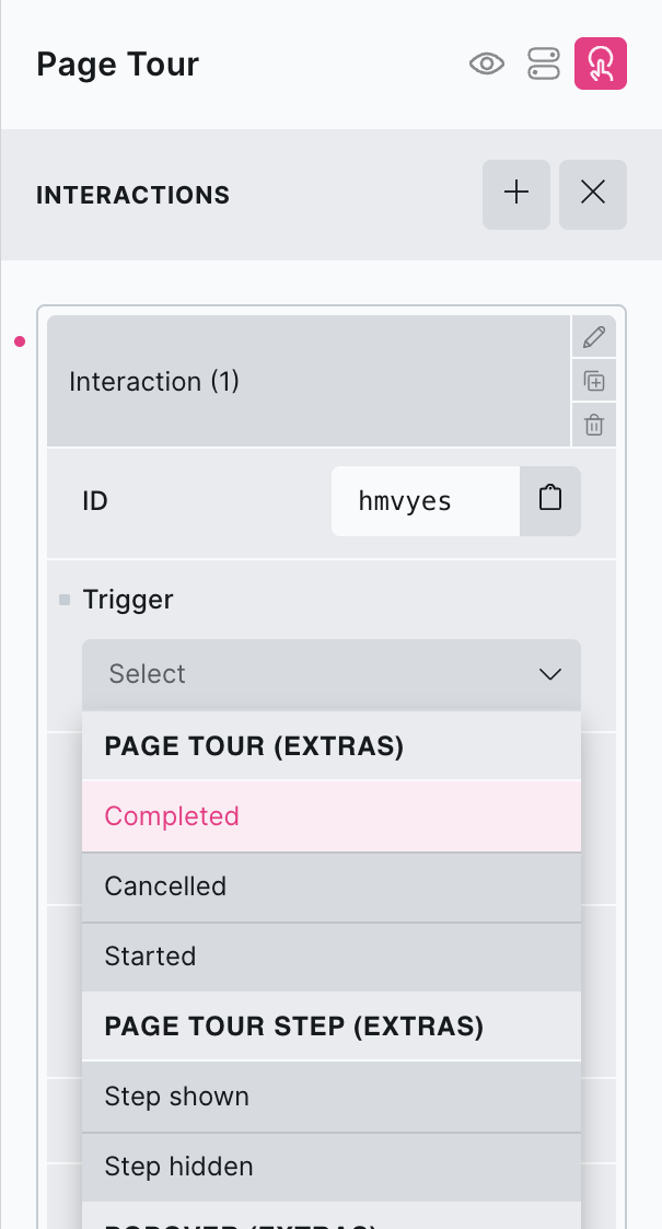
Triggers
Page Tours..
Started – Triggered when page tour first started
Completed – Triggered when page tour completed
Cancelled – Triggered when user cancelled tour (either clicked the close button, or clicked the overlay)
Page Tour Step..
Shown – Triggered when that individual page tour step is shown
Hidden – Triggered when that individual page tour step is hidden
Options
Delay – How long to wait after the event until the chosen action takes place .
Actions
The element can be controlled with interactions.
- Set the target to the element using a CSS selector
- Use one of the following functions below to set the action.
bricksextras.pagetour.start – Force start a tour (from the beginning, regardless of element settings)
bricksextras.pagetour.maybestart (v1.6.3+) – Start a tour (taking into account element settings – if the user has seen the tour and the settings say to never show again, this won’t start)
bricksextras.pagetour.resume (v1.6.3+)– Resume a tour (ensure Remember User Progress is enabled in the tour settings to remember the step the user was at)
Here’s how you can access the tour instance.
Find the identifier from the data-x-id attribute on the element. For example, if your page tour element has the attribute data-x-id="auxrry", to get the tour instance, you can do so like this:
const myTour = xPageTour.Instances.auxrrySome example code, showing how you could control a tour in your JS..
/* Start a tour */
myTour.start();

/* Go to next step in tour */
myTour.next();

/* Go to back one step in tour */
myTour.back();

/* Complete the tour */
myTour.complete();

/* Cancel the tour */
myTour.cancel();

/* Looping through your steps */
myTour.steps.forEach((step, index) => {

    step.on('shown', () => {
        // Do something when the step is shown
    });

    step.on('hide', () => {
        // Do something when the step is hidden
    });

});