Media Player (audio)
This element is nestable, allowing for any Bricks elements to be added inside.
This element can be used inside query loops.
This element supports being used inside AJAX filtered content, either by Bricks’ native filter elements, WPGridbuilder, JetSmartFilters or PiotnetGrid
This element has it’s own interaction settings. Refer the interactions tab below for the list of element-specific triggers and/or actions.
This element support being used inside both components & nested components.
- General
- Quick Start
- Custom UI
- Chapters
- Accessibility
- live stream
- Interactions
- Developer
- Support FAQ
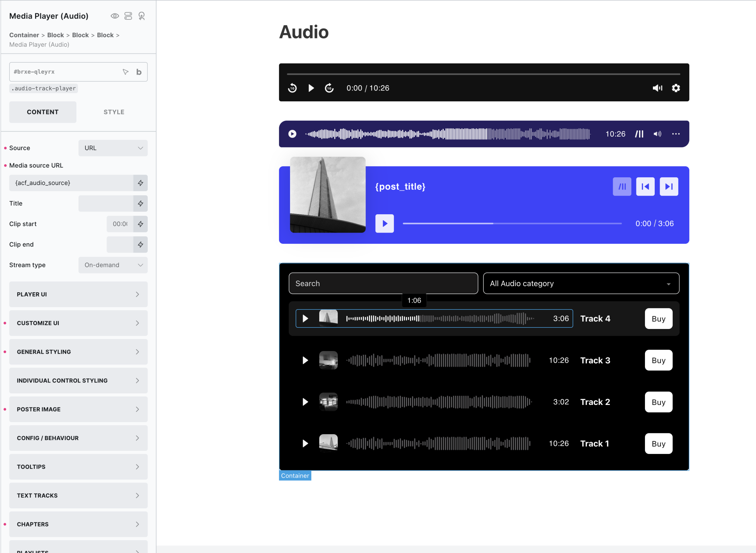
Built on top of the same code base as the Media Player, this element is designed specifically for audio. This nestable element allows you to visually build your own UI to best fit your use case. Featuring an audio waveform view, supports using query loops for building custom playlists, adding chapters & custom poster images.
View the demo to get a quick idea of different setups / use cases on the ‘audio’ page. If you to set up a sandbox install based on that demo page, go here.
The element is powered by VidstackJS, the successor to Plyr/Vime.
Related elements for use with the player – Media Playlist, Media Control
Feature Highlights
- 4 Loading Options – Load only as the player comes into view (lazy loading), load only after user clicks the player or load only if audio attempted to be played or custom if you want to control exactly when the media is allowed to load via interactions.
- Easily create your own playlist using Bricks’ query loop and the nestable ‘Media Playlist‘ element.
- Use local poster images.
- Customizable UI. Add/remove/style/re-order all internal controls.
- Custom UI – Advanced option for nesting elements to create your own custom player UI.
- Divide media into skippable chapters via custom fields (or via TTF/SRT).
- Built-in support for using in filtered content (WPGB/Piotnet Grid/JetSmartFilters) and in lightboxes, modals.
- Built-in autopause (playing one player will automatically pause any others).
- Add clip start/end times to the audio.
Audio Formats
Audio – supports the following formats – m4a, m4b, mp4a, mpga, mp2, mp2a, mp3, m2a, m3a, wav, weba, aac, oga, spx.
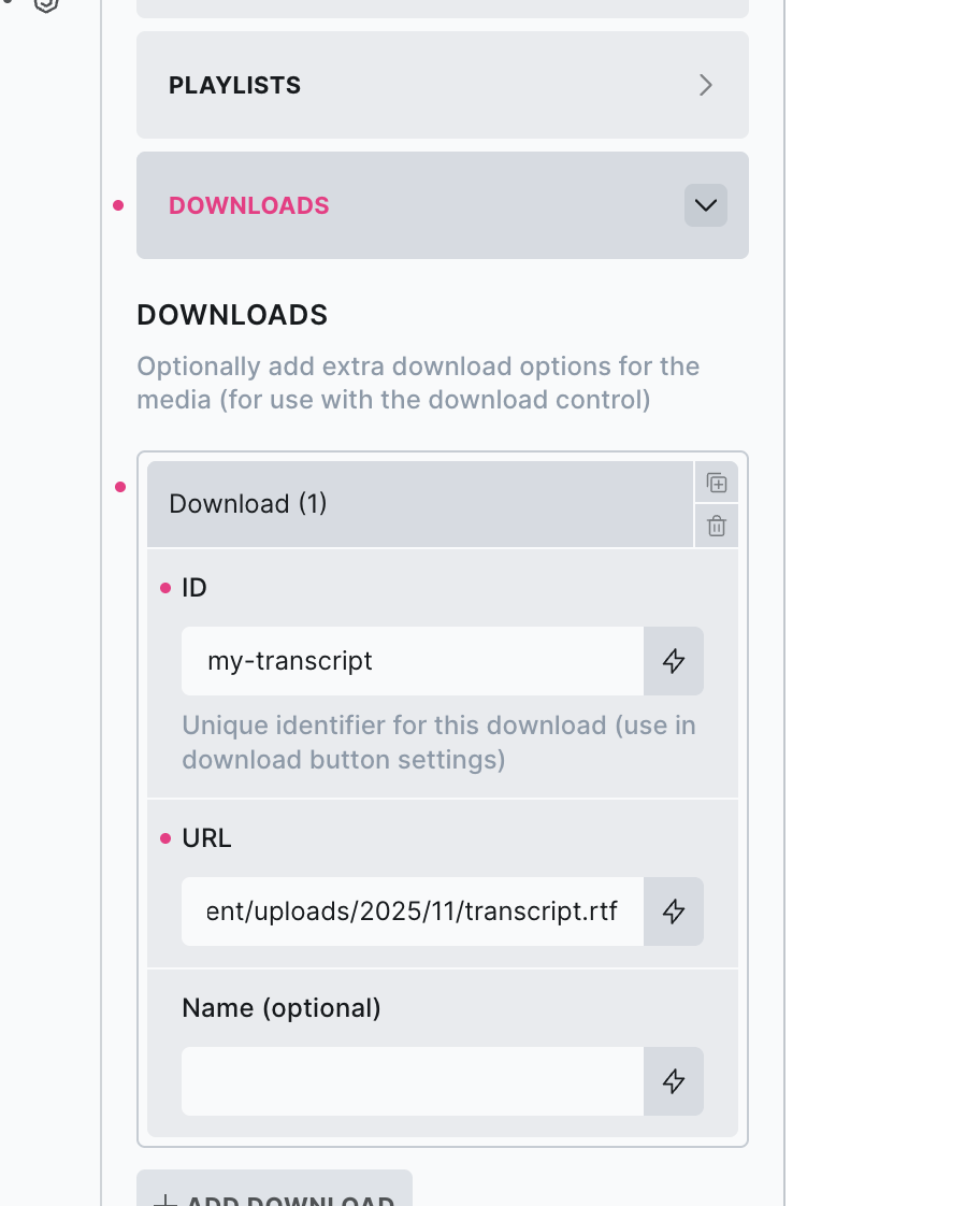
Download Control
For the ‘Download’ control type, it can be used to either to..
- Allow the user to download the current audio from the media player (this will change dynamically if using playlists where the URL changes as the user browses through the playlist)
- Or.. allows the user to download data related to the current audio (useful for transcripts, a locally saved mp3 of the audio, show notes etc)
There are dedicated settings for managing media downloads on both the player and playlist elements where you’d add along side other media data (title/artist/poster etc).
Supported media download formats
‘.mp3’, ‘.wav’, ‘.ogg’, ‘.m4a’, ‘.m4b’, ‘.mp4a’, ‘.mpga’, ‘.mp2’, ‘.mp2a’, ‘.m2a’, ‘.m3a’, ‘.flac’, ‘.aac’, ‘.wma’, ‘.opus’, ‘.webm’, ‘.weba’, ‘.oga’, ‘.spx’, ‘.mp4’, ‘.webm’, ‘.ogv’, ‘.mov’, ‘.avi’, ‘.wmv’, ‘.flv’, ‘.mkv’, ‘.m4v’, ‘.jpg’, ‘.jpeg’, ‘.png’, ‘.gif’, ‘.webp’, ‘.bmp’, ‘.ico’, ‘.tif’, ‘.tiff’, ‘.heic’, ‘.heif’, ‘.avif’, ‘.pdf’, ‘.txt’, ‘.rtf’, ‘.srt’, ‘.vtt’, ‘.ass’, ‘.ssa’, ‘.sub’
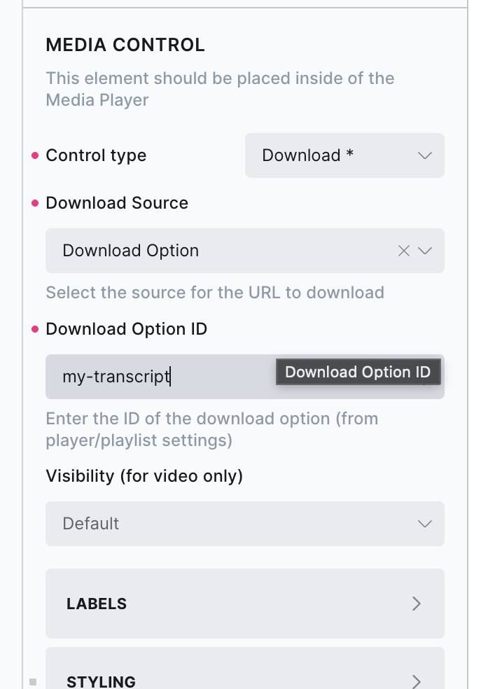
Simply add in the URL of the file on your site to download, making sure to also add in an ID to be able to reference later by the download button inside the player UI.
Then inside the player UI, use that ID to reference the download on the control.
Note that for files hosted on external servers, download behavior depends on the hosting server or CDN. Some allow direct downloads, while others only allow streaming, so clicking the download button may open the file in a new tab instead of downloading it.
The media player comes with a lot of customization options, which can make it appear quite complicated. However, if you’re not trying to build something too custom and just need a nice-looking player to customize, it’s very quick to get started.
Here’s the quick start guide with how to first get set up and then to customize further if needed..
Minimal Setup
Set your media source – this is the URL of your audio.
Set a title (if needed) – it will be displayed wherever the ‘title’ control is inside the player.
That’s it. Now you have a fully functional media player. All commonly needed controls are in the default UI, with labels and optional tooltips in place. The media is lazyloaded by default.
Customize
Make some customizations to the player and controls..
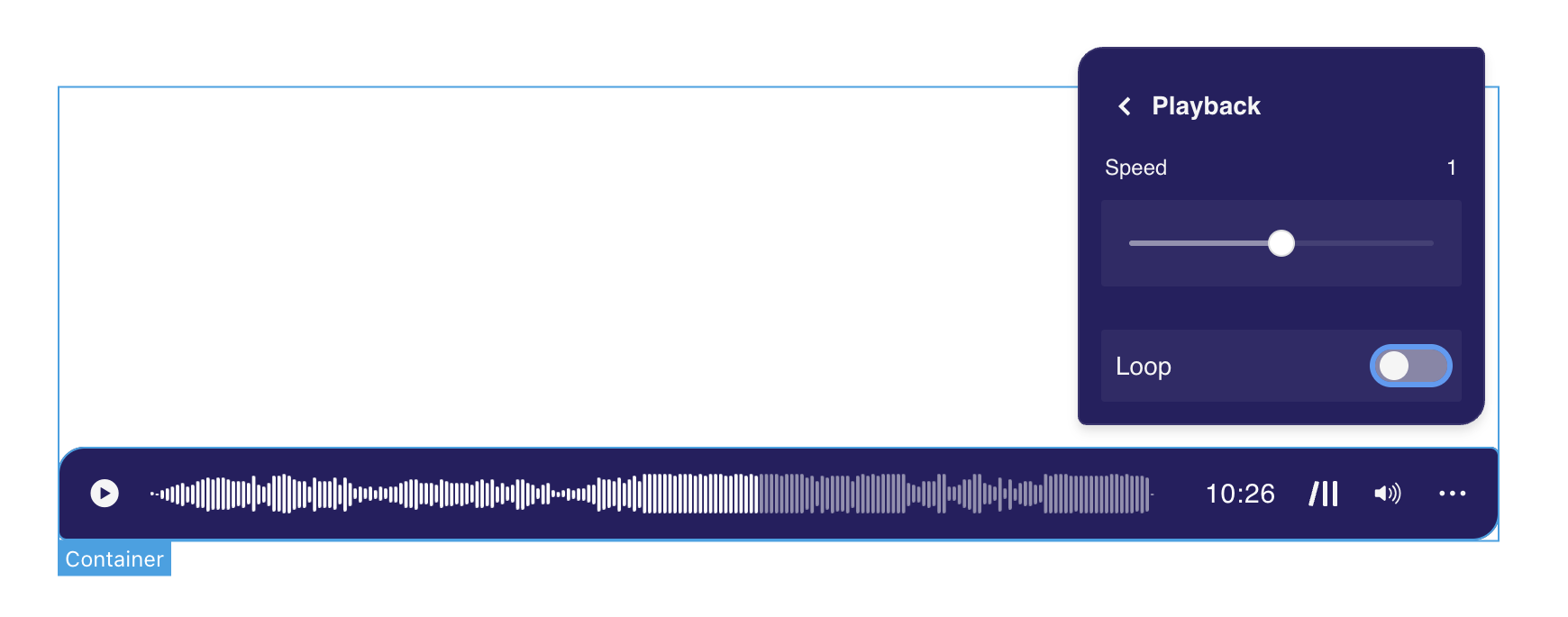
Changes to the UI – You may prefer to switch a few controls around, maybe change some icons or set the time slider to show the audio waveform. This can all be done from the ‘Customize UI’ tab. Change the order, add/delete different controls for each zone, and customize each icon/label if needed.
Player styles – The player itself and controls can be styled from the ‘General styling’ tab. Here you can add global styles that will apply to all controls of the same type (styling using a class if you want to apply these styles to multiple players across your site). Change colors, icon sizes, button padding, gaps between the controls, etc. Volume slider, time slider, and captions all have their style options.
Now you have your custom player, styled to fit better with your overall site design.
Optimize
Configure the behavior of the player and add more content..
Load strategy – By default, the player won’t load any media until the media player is scrolled to (lazy loaded). You may want to completely prevent any media loading unless the user interacts with the player. In this case, choose ‘on click’ as the load strategy and set up a local poster image to show where the video would be. The player UI will show, and then as the user clicks the media will load.
Config / Behaviour – Make tweaks to the overall behavior of the player based on the use case.
Add subtitles/captions/chapters – Chapters are great for dividing up the content and allowing users to skim through multiple topics.
Advanced
When you need something more custom..
Custom UI – Sometimes you just need a completely different layout, the custom UI option removes the default UI completely and gives you a blank canvas. Fill the player with media controls and any other elements.
Set up Playlists – If you have multiple videos that you want the user to have access to, an alternative to adding lots of players is to instead set up one player and add a playlist.
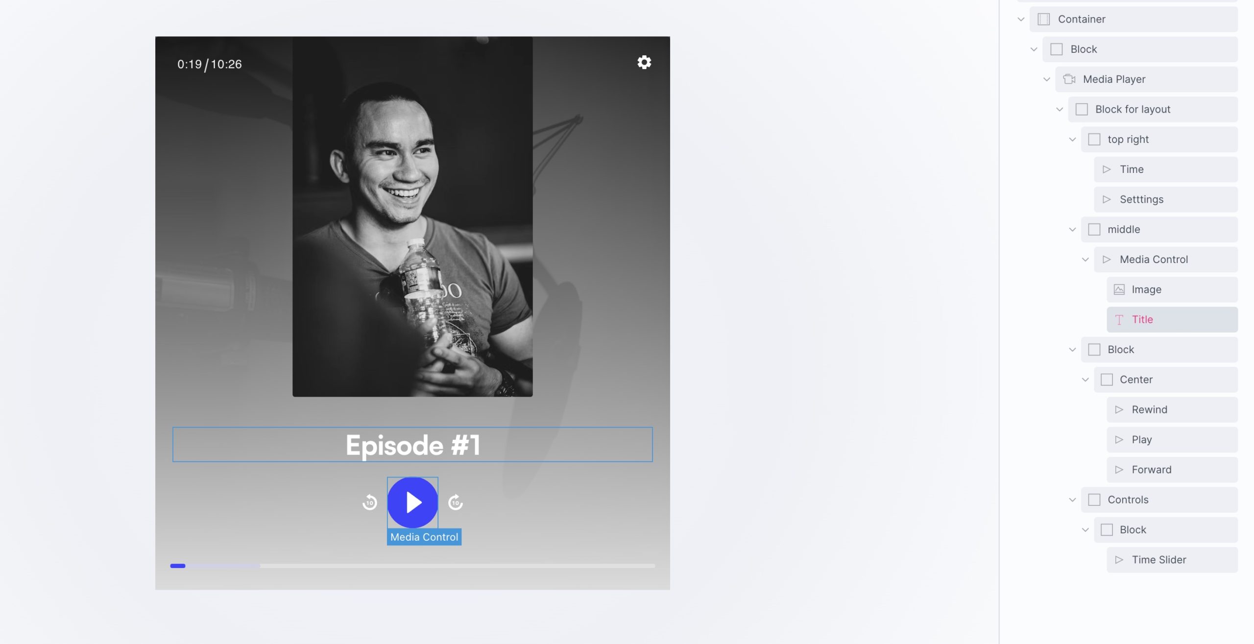
Custom UI (advanced)
The built-in UI has enough customisation options to cover most use cases for audio players. Most common UI layouts can be achieved from those settings alone, quite quickly by moving the settings around to where you need them and styling the buttons. All the controls can be customised, styled, change icons, and positioned around the top,center and bottom of the player.
To cover the other use cases, (for users needing create custom UIs) there’s also an option to completely remove the built-in UI and build your own by nesting in active controls, or any elements, where you need them.
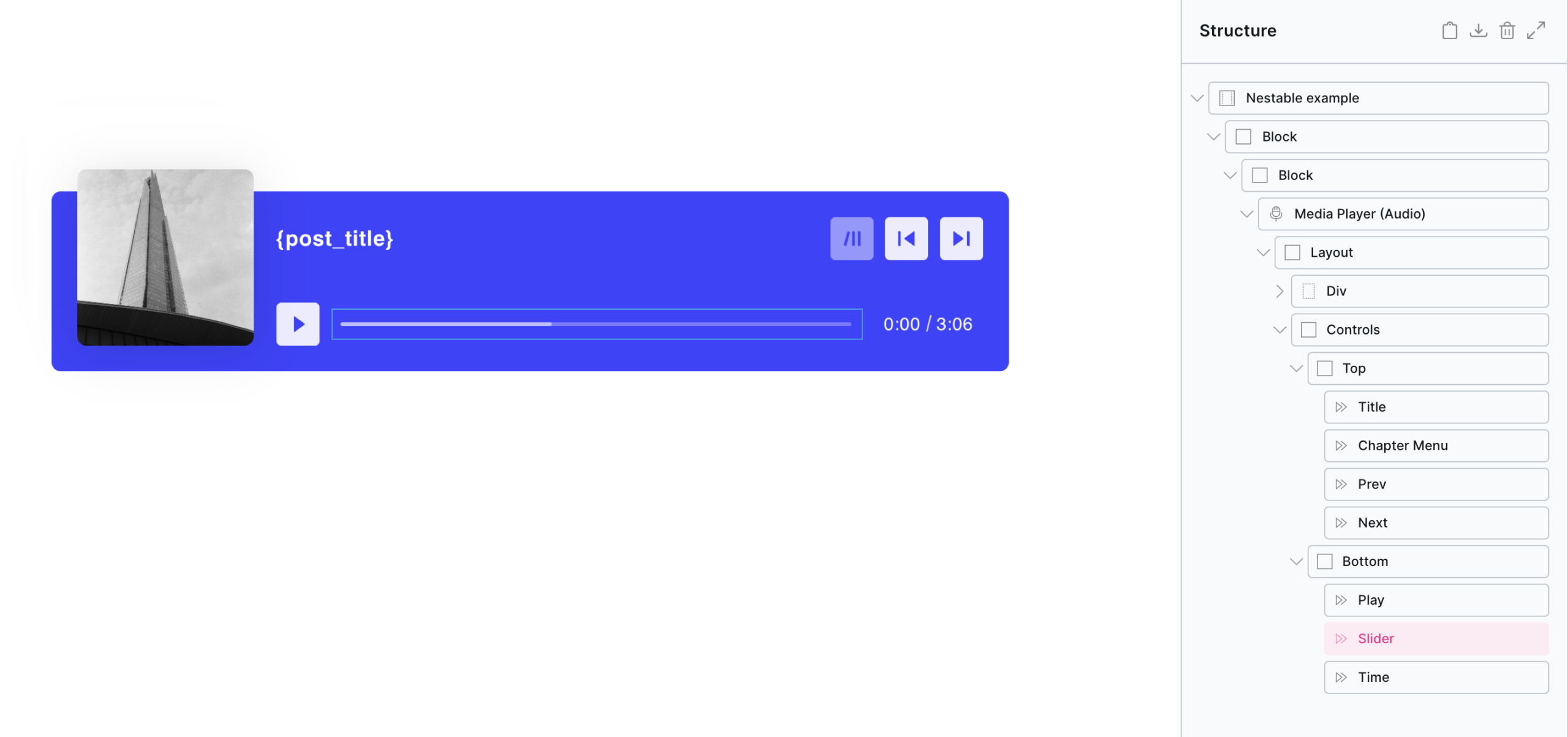
For details on adding active controls inside your player layout, see the Media Control element.
Example custom layout, .. (notice the layouts are created using ‘block’ elements using flex/grid. Neither the controls or the player itelf is controlling the layout, it’s all being done with Bricks like any other layout of elements)
The above are just examples, with custom UI the layout/styling would be entirely up to you.
Note that the custom UI should be considered an ‘advanced option’, if you’re just looking for something to add a video to a page and style to match your site, this option is likely overkill. Although it gives maximum flexibility, building a player UI with considerations for all the different device sizes, and player states is no small feat and may take a while to get right if you haven’t done it before.
Adding chapters to media is a great way to split up longer content. After adding chapters, three things in the media player will change.
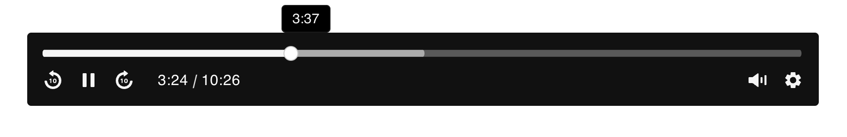
- The ‘time slider’ control will be divided up into chapters with the chapter title in the tooltip as the user scrubs through the timeline.
- The ‘title’ control will auto-update as the player reaches each chapter time.
- The ‘settings’ control will include any chapters to allow users to skip through each chapter.
There are three ways to add chapters to your media player..
Text Tracks
If you already have a VTT file or SRT, simply add as a new text track as you would if adding subtitles or captions. (more about the WebVTT format)

Adding chapters via settings
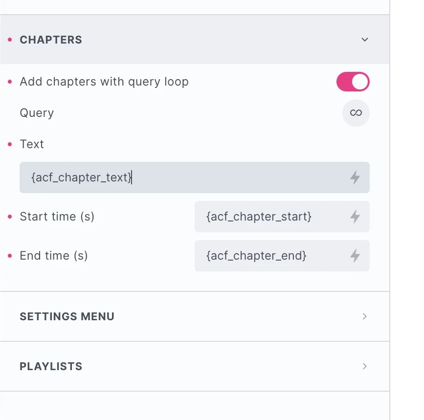
If you prefer to add the chapter data inside Bricks, head to the ‘chapters’ tab and either in the data for each chapter there.

Query Loop / Dynamic data
Or select the query loop option and set up a query for populating the chapters dynamically with custom fields.
Keyboard Interaction
(To control whether these keys control the player globally, or only when that particular player is focused, go to Media Player > Interaction > Keyboard)
| Key | Action |
|---|---|
0 to 9 |
Seek from 0 to 90% respectively |
space |
Toggle playback |
K |
Toggle playback |
| ← | Seek backward by the seekTime option |
| → | Seek forward by the seekTime option |
| ↑ | Increase volume |
| ↓ | Decrease volume |
M |
Toggle mute |
F |
Toggle fullscreen |
C |
Toggle captions |
L |
Toggle loop |
Better support for live stream in the audio player & source URLs that don’t have extensions (live stream URLs) coming in v1.6.1
Stream URLs
Out of the box the player supports HLS, which is common with many streams. The URLs will typically end with .m3u8.
For streaming URLs that don’t include an extension, from BricksExtras v1.6.1 the player now has a new option to set the MIME type: audio/mpeg, audio/ogg, audio/3gp, audio/mp4, audio/webm, audio/flac, audio/object.
Note you may need to adjust the crossorigin setting in the player’s config settings, for streaming from 3rd party sites.
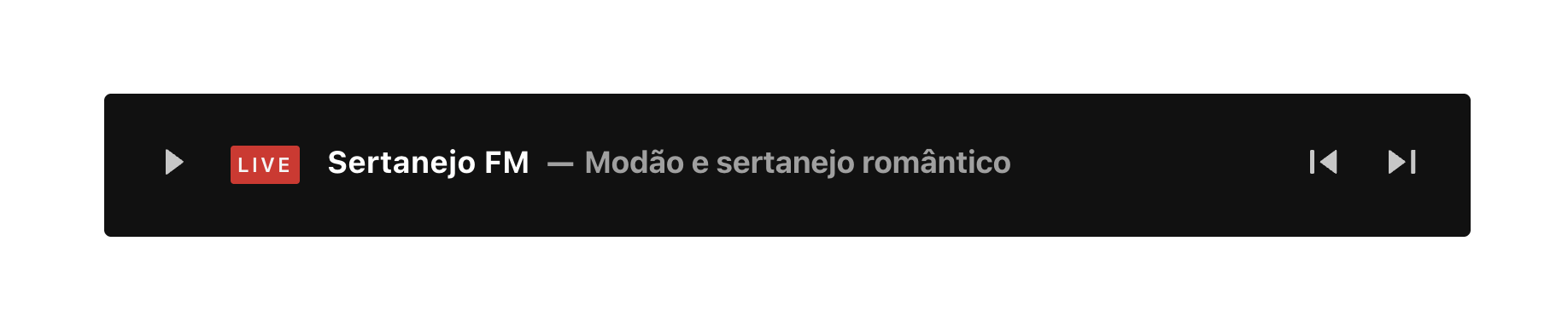
The Player in Live Mode
When setting the stream type from ‘on-demand’ to one of the available live options, certain controls will be hidden out of the box. Take this into account if including both live/on-demand URLs in a playlist, as the UI will need to adapt for the different content type.
Controls in live mode..
Time control – Will just be outputting live/live so is hidden whenever live streaming is detected.
Download control – Will be hidden by default unless the source is not a live stream.
Time Slider / Waveform – For live streams, a waveform can’t be created so this would be hidden if this option is selected and replaced with a time slider. The time slider will be in ‘live mode’ meaning the user can’t scrub forward/back unless the live stream supports it.
Live Button – This little ‘live alert button’ will appear only when in a live stream. It will show it’s on edge when the user is listening to very up to date part of the stream. If the stream supports scrubbing backwards (so the user is no longer listening to the very latest) then it will show a different styling, and clicking the button will bring the user ‘back to the edge’.
Note that ‘Element Interactions’ must be enabled in BricksExtras > Misc settings.
This element adds new triggers to Bricks’ interactions options, so you can trigger actions based on the state of the element.

Triggers
Started – Triggered the moment the media is first played.
Ended – Triggered when the media reaches the end.
Paused – Triggered when user pauses the player.
Resumed – Triggered when user resumes playback after the player had been paused.
Seeked to new time – Triggered when user finishes using the time slider to seek to a new time.
Time reaches x from start – Triggered the first time the media reaches x from the start. (x can be a fixed time in min/sec or a percentage of the duration)
Time reaches x from end – Triggered the first time the media reaches x from the end. (x can be fixed time in min/sec or a percentage of the duration)
Watch time has reached x – Triggered after the user has played at least x (x can be fixed time in min/sec or a percentage of the duration).
Options
Time measurement – For the time based triggers, it allows you to choose between a fixed time (in minuted/seconds) or a percentage based time (ie 5% from the end of the media)
– True – Will trigger the action (useful if you’re using a trigger to display something within the player or to control the player)
– False – Will disable the action if currently in fullscreen mode.
– Wait – Will wait until the user has finished in fullscreen mode and then run any action that was set up.
– Force Exit – When it triggers, it will force the video out of fullscreen mode and run the action.
Trigger Delay (ms) – Allows you to set a short delay between the actions.
Actions
The element can be controlled with interactions.
- Set the target to the element using a CSS selector
- Use one of the following functions below to set the action.
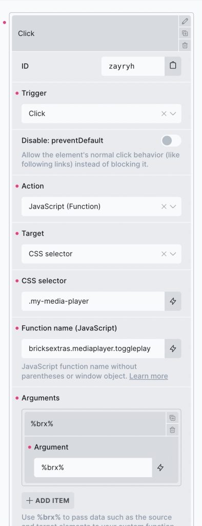
(always add the %brx% as the argument, which is required for Bricks interactions whenever using the JS action)
bricksextras.mediaplayer.play – Start playback
bricksextras.mediaplayer.pause – Pause playback
bricksextras.mediaplayer.toggleplay – Toggle between play/pause
bricksextras.mediaplayer.togglemute – Mute or disable mute
bricksextras.mediaplayer.skip – Skips the media to the new time (second parameter for seconds)
bricksextras.mediaplayer.load – Ideal if using custom loading strategy on the player. Will load the media for any players matching the given selector. Add a second parameter to ‘true’ if you wish for this to be remembered in the browser local storage, so on next page load the media will automatically load. The main use case is that you need the user to agree to something, so they click to load the players. When the same visit returns, ideally you don’t want them to have to click again.
You can easily control the media player programmatically in your JS, first you need to get the instance. (find the data-x-id attribute on the element for the identifier for that player)
Example code.. (if the element data-x-id was ‘xkjsjd’)
First, get the instance..
const mediaPlayer = xMediaPlayer.Instances.xkjsjd
Controlling the player and listening for state changes..
/* play */
mediaPlayer.play()

/* pause */
mediaPlayer.pause()

/* EVENTS */

mediaPlayer.addEventListener('ended', () => {
  /* do something when media reaches end */
})

mediaPlayer.addEventListener('paused', () => {
  /* do something when media is paused */
})

mediaPlayer.addEventListener('play', () => {
  /* do something when media starts to play */
})
/* open modal element when user reaches 60 seconds into media play */
mediaPlayer.addEventListener('time-update', () => {

   let seconds = 60;

   if (seconds === Math.floor( player.currentTime ) ) {
    xOpenModal( 'modal-1' )
   }

});
Player Status Data Attributes
For more dynamic style options, based on the state of the player, see the following list of data attributes that are added/removed from the player as it changes it different states. If you need to show/hide controls or other elements conditionally based on certain states of the player, these attributes make that easy to do.
|
data-autoplay |
Autoplay has successfully started. |
|
data-autoplay-error |
Autoplay has failed to start. |
|
data-buffering |
Media is not ready for playback or waiting for more data. |
|
data-can-fullscreen |
Fullscreen mode is available. |
|
data-can-load |
Media can now begin loading. |
|
data-can-pip |
Picture-in-Picture mode is available. |
|
data-can-play |
Media is ready for playback. |
|
data-can-seek |
Seeking operations are permitted. |
|
data-captions |
Captions are available and visible. |
|
data-controls |
Controls are visible. |
|
data-ended |
Playback has ended. |
|
data-error |
Issue with media loading/playback. |
|
data-fullscreen |
Fullscreen mode is active. |
|
data-ios-controls |
iOS controls are visible. |
|
data-loop |
Media is set to replay on end. |
|
data-media-type |
Current media type (audio/video). |
|
data-muted |
Whether volume is muted (0). |
|
data-orientation |
Current screen orientation (landscape/portrait). |
|
data-paused |
Whether playback is paused. |
|
data-pip |
Picture-in-picture mode is active. |
|
data-playing |
Playback is active. |
|
data-playsinline |
Media should play inline by default (iOS). |
|
data-pointer |
The user’s pointer device type (coarse/fine). |
|
data-preview |
The user is interacting with the time slider. |
| data-seeking | User is seeking to a new playback position. |
|
data-started |
Media playback has started. |
|
data-view-type |
Current view type (audio/video). |
|
data-waiting |
Media is waiting for more data to resume playback. |
|
data-focus |
Whether player is being keyboard focused. |
|
data-hocus |
Whether player is being keyboard focused or hovered over. |
Example Uses
- You may have a vertical video, where you decide you want to change the player background to black if the user choosing to watch the video full screen.
- You decide to hide the time slider when the video is full screen.
Using the attributes above, these types of changes can be made with just a couple of lines of CSS.
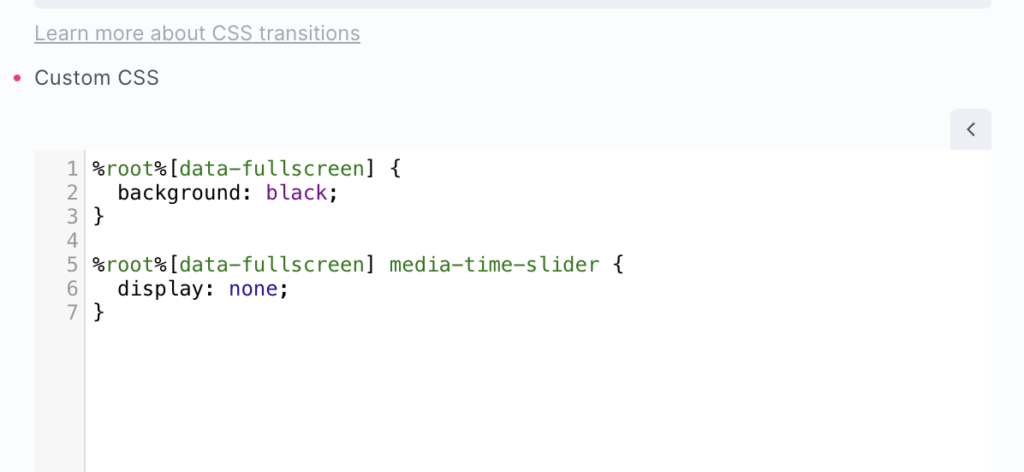
Familarising yourself with the above data attributes and the controls will allow for lot of customisation outside what is available in the settings.
Vidstack
For further customisation of behaviours, refer to the Vidstack API documentation