Panorama Viewer
This element can be used inside query loops.
This element supports being used inside AJAX filtered content, either by Bricks’ native filter elements, WPGridbuilder, JetSmartFilters or PiotnetGrid
This element has it’s own interaction settings. Refer the interactions tab below for the list of element-specific triggers and/or actions.
This element support being used inside both components & nested components.
- General
- Accessibility
- Interactions
- Support FAQ
- Developer
This Panorama Viewer element displays interactive 360° panoramic images that users can navigate by dragging, scrolling and clicking on hotspots. It supports both single panoramas and multi-scene virtual tours.
Getting Started
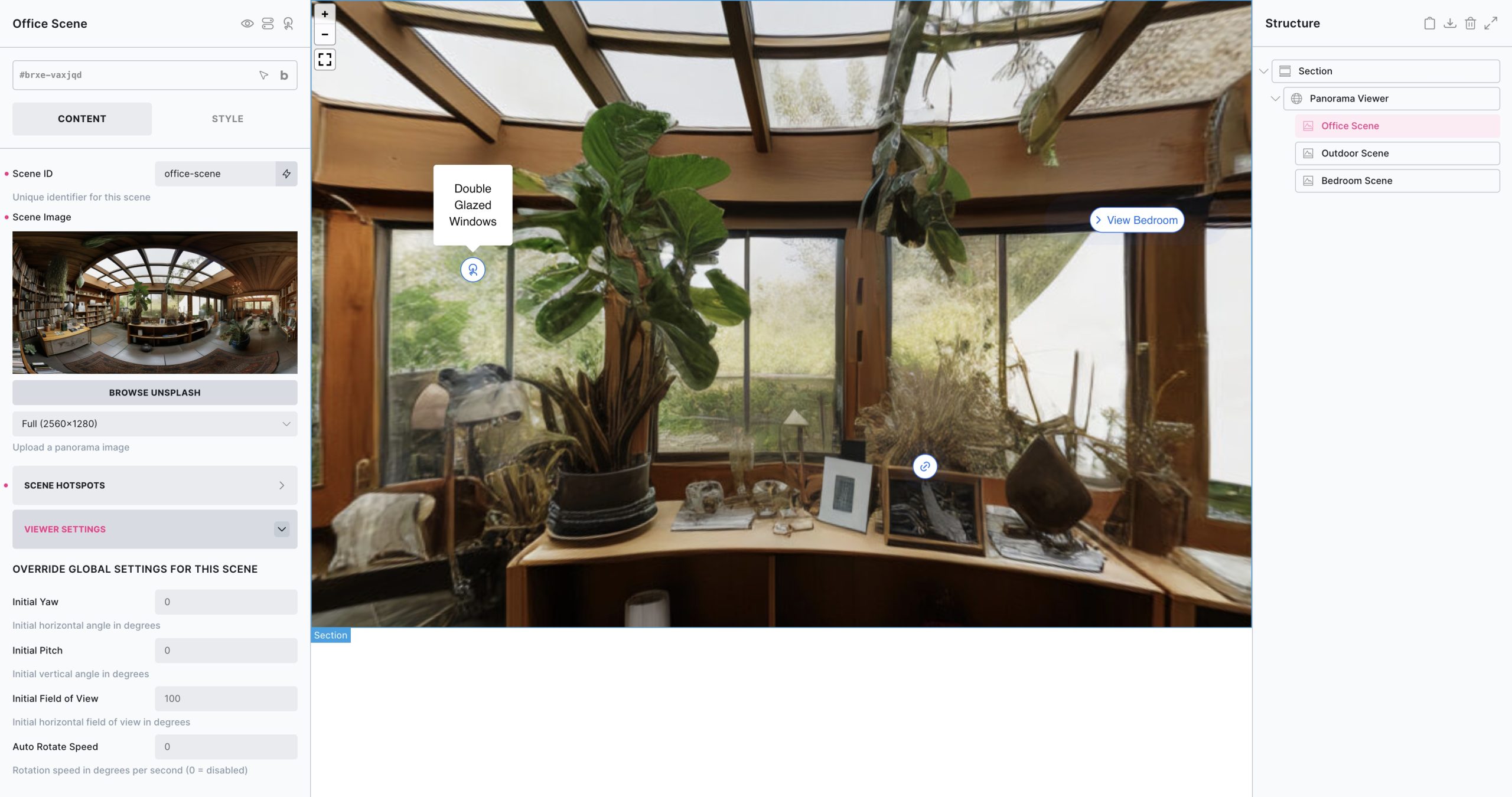
By default one panorama scene is added inside of the panorama viewer element. At least one scene is always needed inside of the panorama viewer element. The scene element contains the panoramic image as well as any hotspots for that scene and any viewer settings that apply to that individual scene (the initial rotation/field of view etc).
Multiple scenes can be added (either by manually adding more panorama scene elements inside of the structure as shown in the image above, or by populating by query loop by wrapping the panorama scene element in a block with a query loop), and can be linked together so the user can navigate between scenes.
First configure the scene, by adding in your custom image and add any required hotspots. If a second scene is then needed, add in a second scene with a new image and link it to the first by adding in a hotspot set to ‘scene-link’ which will allow the user to navigate to the next scene when clicked)
When viewing inside of the builder.. to load in the scene (and hotspots for that scene) simply click on the scene element inside of the structure panel to see it.
View Settings
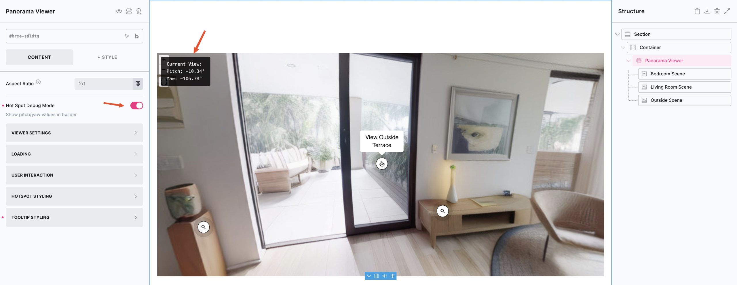
The view settings applied to the viewer element will apply to every scene inside, unless specifically overridden at the individual scene level. The view settings set the original view, the direction/zoom etc.
- Yaw: Initial horizontal rotation in degrees (-180 to 180)
- Pitch: Initial vertical rotation in degrees (-90 to 90)
- Field of View : Initial zoom level in degrees (30-120, default: 100)
- Auto Rotate Speed: Automatic rotation speed in degrees per second (0 = disabled)
Hot Spot Debug Mode – Enable debug mode when in the builder to see the current Yaw/Pitch values in the top left corner. These are useful for when positioning hotspots. Clicking these values will copy to clipboard, if you wanted to paste into the hotspot settings.
Panoramic Images
To get the full 360 deg, the image should have an aspect-ratio of 2/1 (the width double the size of the height) and ideally be at least 5000px wide for allowing users to zoom in without blurring.
As you’ll be using the ‘full’ image size, allowing for the zooming & panning, we recommend using compressed images for faster loading. For reference, the demo images uploaded for use on the BricksExtras sandbox page are ~400kb per image and are 5000px/2500px images.
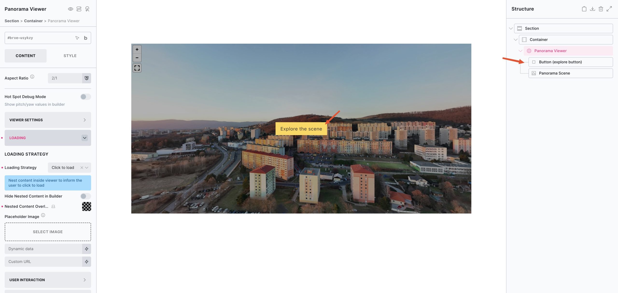
Loading Strategy:
Placeholder Image – Add in a smaller placeholder image for initial page load or until the user loads the panoramic can be useful for performance.
- Eager – Load immediately
- Lazy – Load when element comes into view (default)
- Click – Adds an overlay which can be used to nest elements inside which the visitor will see until the overlay is clicked to load the scene.
- Interactions – Manual loading via Interactions. This allows you to add custom buttons or links which you can set up to load the scenes using Bricks’ interactions.
Tip – by using the click to load option, you can nest in elements to control what is displayed in the overlay before the visitor clicks to load the scene (position the elements using the flex layout settings from the style tab)
See below for an example where a button element has been nested inside the overlay. This means on page load only the placeholder image and the button would be output. Once the user clicks the overlay, the scene and panorama image will load.
Loading Spinner
A customisable loading spinner will appear when panoramic images are loading, whether the first scene or if loading another scene after the user has navigated to another scene via a scene link.
For easier styling, enable the ‘Preview spinner in Builder’ setting to have it visible in the builder.
Scroll Instructions
In a similar fashion to Google Maps, the viewer can only be zoomed either by pressing ⌘/Ctrl + scrolling for desktop, and navigate by using two fingers on mobile. (This is to prevent the viewer from zooming accidentally when the user is trying to scroll the page.)
The scroll instructions overlay, by default, will appear if the user tries to zoom with one finger or uses a scroll pad to provide instruction on how to interact with the viewer.
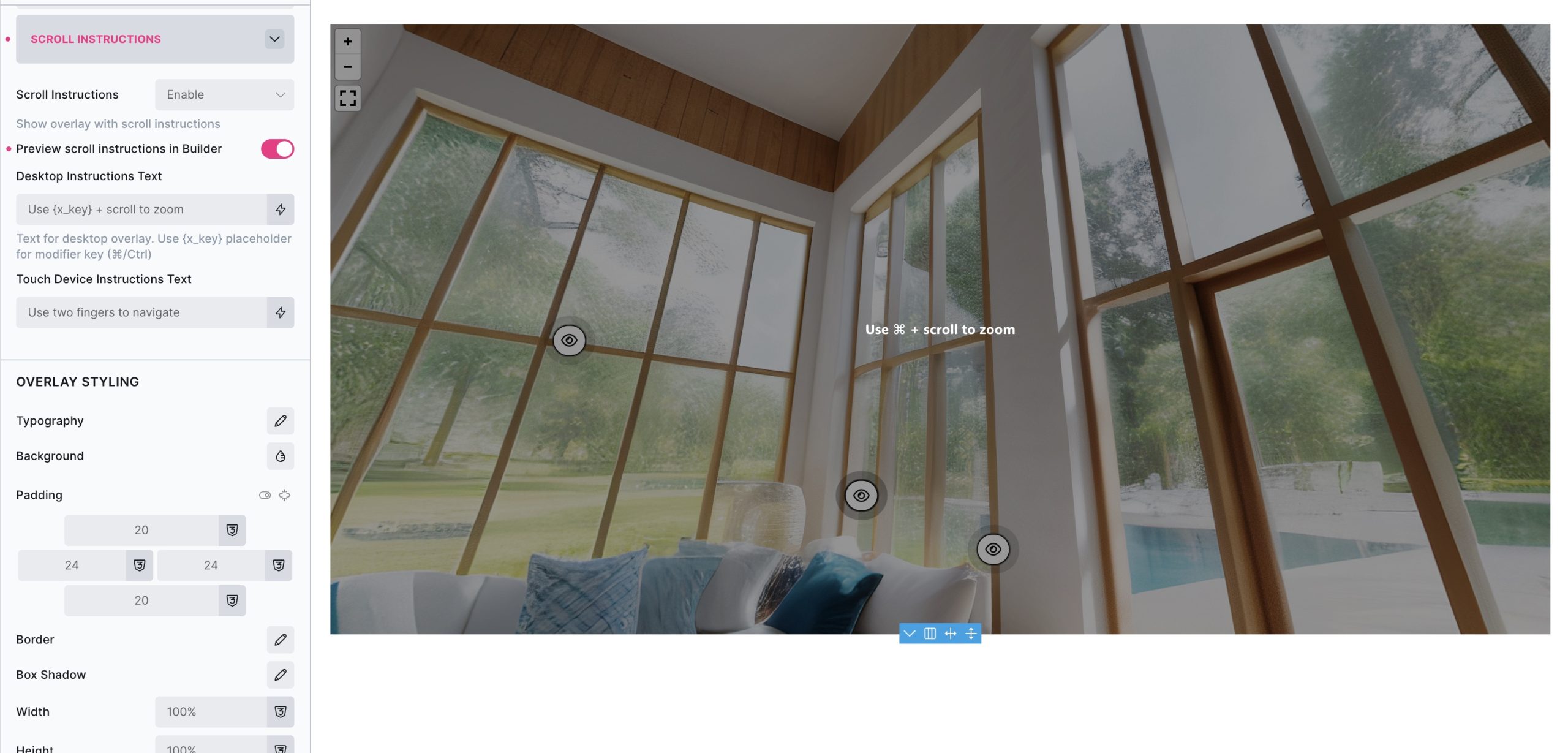
Desktop Instructions Text – Change the text that shows for none-touch desktop visitors.
The default is: Use {x_key} + scroll to zoom were {x_key} is replaced with ⌘ for Apple, and Ctrl for Windows.
Touch Device Instructions Text – Change the text that shows for touch devices.
The default is Use two fingers to navigate
This overlay can also styled from the settings and also disabled if preferred. For easy styling, enable the preview scroll instructions in builder option.
User Interaction
- Show Zoom Controls: Display zoom in/out buttons
- Show Fullscreen Control: Display fullscreen toggle button
- Fullscreen Fallback: For devices that don’t support the fullscreen API, the option to fallback to full window is available.
- Mouse Zoom: Enable mouse wheel zooming (requires Ctrl/Cmd key outside fullscreen)
- Mouse Zoom Sensitivity: Adjust zoom speed (0.1-2.0, default: 1.0)
- Draggable: Allow mouse/touch dragging to navigate
- Friction: Control momentum when dragging stops (0.1-1.0, default: 0.5)
- Disable Keyboard Controls: Turn off arrow key navigation
Panorama Scene Element Settings
- Panorama Image: 360° image for this scene (be sure to choose ‘full’ size if picking from the media library)
- Scene ID: Unique identifier for linking between scenes
- Override Global Settings: Use different view settings if needed for this specific scene only. If left blank the scene will inherit the settings as set on the viewer itself.
Hotspots
Choose between manual hotspots or query loop for dynamic content:
Adding Manual Hotspots
- Pitch: Vertical position in degrees
- Yaw: Horizontal position in degrees
- Icon: Custom icon
- Tooltip Content: Rich text content displayed on hover
- Button Text: Optional text to displayed next to icon
- Hotspot Type:
- Info – Standard tooltip hotspot
- Scene Link – Navigate to another scene
- Link – External/internal link
- Link URL: Destination URL (for link type)
- Scene ID: Target scene identifier (ie which scene to link to)
Query Loop Hotspots
- Use Query Loop: Enable dynamic hotspots from posts/custom post types
- Query: Configure post query (same as other Bricks elements)
- Pitch/Yaw: Use dynamic data from custom fields
- Icon: Dynamic icon selection
- Tooltip Content: Dynamic content from post fields
- Button Text: Dynamic text
- Hotspot Type: Dynamic hotspot type
- Link URL: Dynamic URL from custom fields
- Scene ID: Dynamic scene linking
Mobile Orientation
For devices that feature a gyroscope, a sensor that detects orientation and rotation, a new control option will be available in the controls to allow users to navigate the scene by moving their device instead of using their fingers to pan around.
Some notes on accessibility..
- Each hotspot is either a button or link, depending on the type set which can be navigated to and pressed by keyboard
- Aria labelling etc will be added in the final version and be customisable.
- See below for the keyboard navigation controls (very similar to Google Maps)
| Key | Description |
|---|---|
| ← or a | Move view to the left |
| → or d | Move view to the right |
| ↑ or w | Move view upwards |
| ↓ or s | Move view downwards |
| Tab | Move focus to the next hotspot, or move focus within hotspot tooltip |
| Shift + Tab | Move focus to the previous hotspot |
| Ctrl/Cmd + scrollpad | Zoom in / out |
Note that ‘Element Interactions’ must be enabled in BricksExtras > Misc settings.
Actions
The element can be controlled with interactions.
- Set the target to the element using a CSS selector
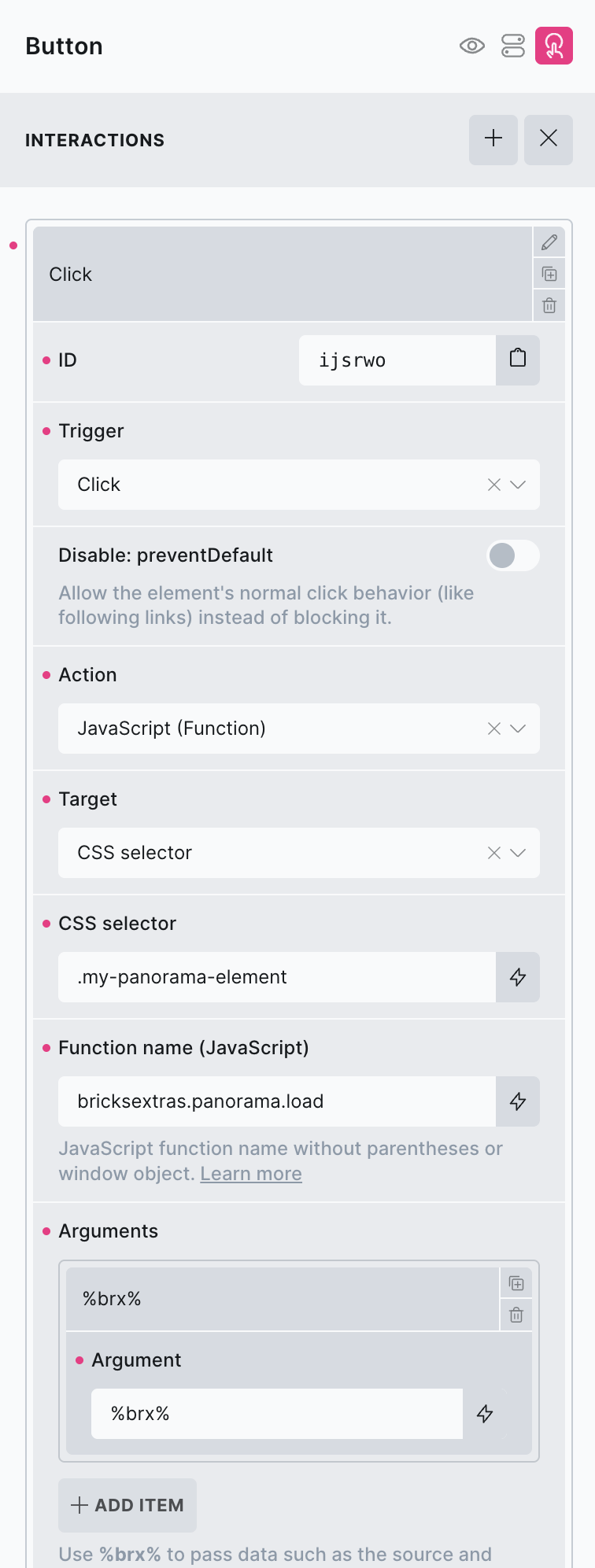
bricksextras.panorama.load – Will load the first scene & panoramic image into the element. (ideal if creating custom loading strategy)
[More to be added, to allow to control the element via interactions]