Along with the recent changelog, here are a few extra details on some of the key features and changes that were made in 1.2.7 based on user feedback over the last few weeks. New features and lots of changes to existing elements for better workflows.
Easier Styling for WSForm
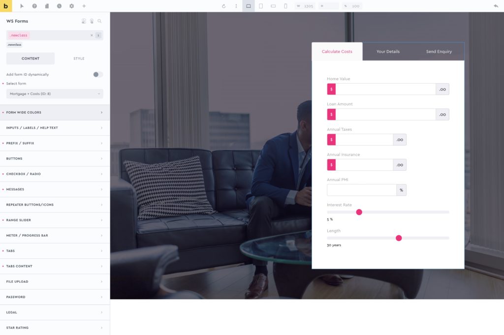
Our new element ‘WSForms‘ allows you to add and style WSForms individually, at a class level. This is something that isn’t easy with the WS Form plugin alone, which works more on global styling. (For quite a powerful form plugin, the styling part we found extremely difficult). This element should make it much easier.
Having the style controls at the element level means you can now style multiple versions of your forms with classes, to use in different places across the site. See the docs for our current recommended workflow for styling forms.

Improved ‘column stacking’ in the Dynamic Table
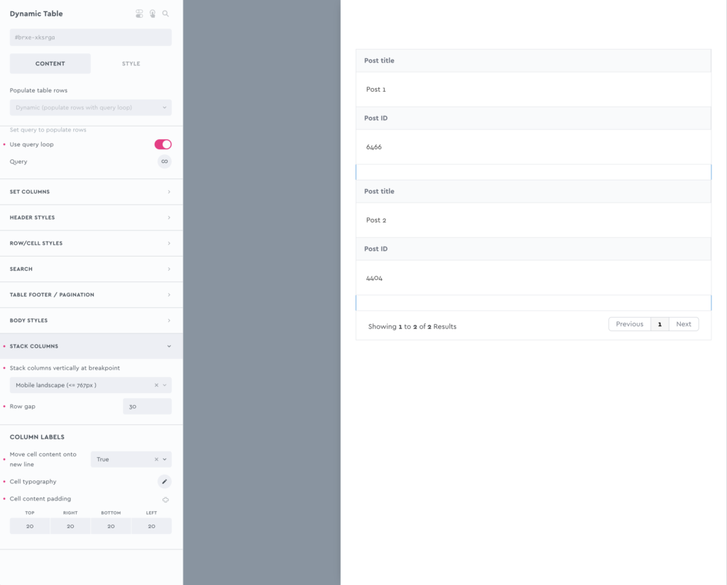
Column stacking is a feature we added to allow columns to be stacked in the table to create a vertical mobile view. However, in cases where the column heading text was quite long, it wasn’t always an ideal solution.
We’ve improved this by adding the option to move the cell content onto a new line. Generally looks much neater, and makes more sense for those situations with a lot more table content.

No more class-style limitations on the dynamic lightbox
Hooray! ???? Generally, it’s a good idea to always style with classes, but having to remember to always switch to classes (especially for elements inside of the lightbox if inside a loop) could be a slower workflow and something new users found a little confusing.
(This limitation was due to technical reasons, with the lightbox being appended to the bottom of the page and how Bricks’ applies styles inside loops, we had to limit how this one element could be styled).
We have now implemented a solution that makes this step unnecessary. Obviously styling by class is still a good idea, but it just means if you forget (or don’t want to) the styles are still going to be applied. This is on by default from now on, but can be disabled if you need to from the settings.
Added More Pro Slider Controls
The feedback on the Pro Slider Controls element has been great over the last few months (so much so we’ve been told other people are now starting to copy our idea ????). But it has been really nice to see people create so many interesting layouts using these external controls when helping through the support channels. We’ve now taken this idea further and have extended with two new control types as a new way to interact with the slider.
Autoplay Progress
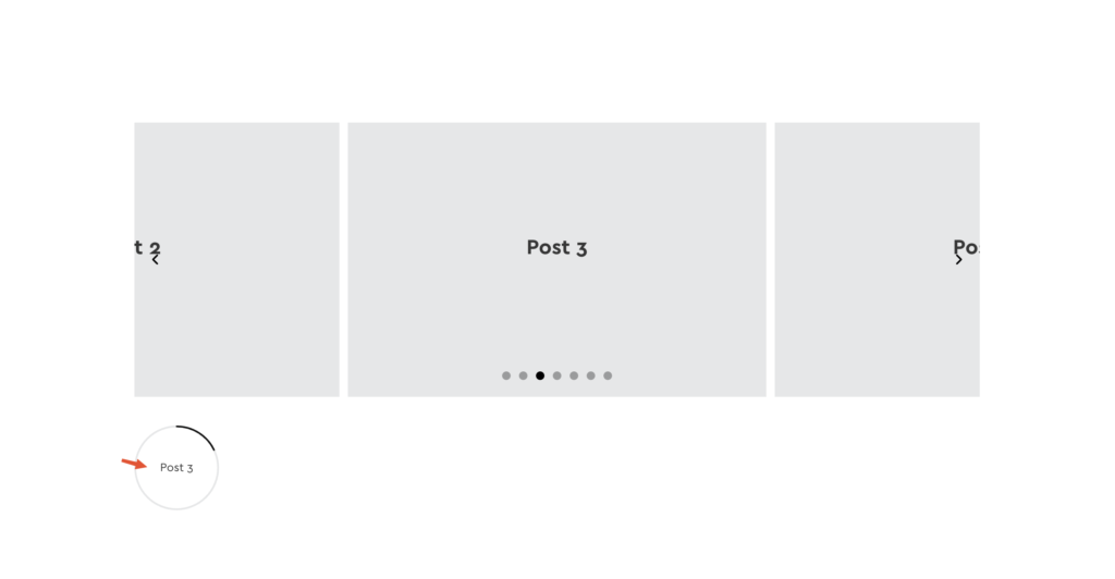
The existing ‘progress bar’ type is for displaying progress along the slider, ie if there’s 4 slides and it’s on slide 2, the progress bar will be halfway along. This new ‘Autoplay progress’ type is specifically for the autoplay and is progressing based on the autoplay intervals. The progress is showing how long to wait before the slider moves. The ‘circle’ option is nestable, so you can add another control inside. For eg for showing the current number slide or dynamic content or similar. (as can be seen in the image below)
Slide Content
This was added mainly due to a specific request to ‘be able to display the image captions from a Pro Slider Gallery OUTSIDE of the slider itself’. We liked the idea to take content from inside the slider and somehow display it elsewhere, so decided to extend further to make this a more useful feature. You can now show any text or dynamic data from inside the slides, and have it appear outside of the slider when that slide becomes active.
Why would you want to do this?
For a simple example see below; Let’s say you have a query loop on the slides, now you can show that data from the currently active slide anywhere on the page without having to create a new slider or do any syncing. The content will change as the slider moves, and will always show the content relevant to the current active slide. This could be a dynamic tag, ie the post title, the slide number, a custom field etc. See the docs for how to implement it.

Other Pro Slider Improvements
You may have noticed, with Bricks and other addons, the CSS for elements are often loaded in the footer. This is due to how the Bricks API is set up to enqueue the CSS. One example is Bricks’ nestable slider, where Splide CSS is added inside the footer. Another example is the Gallery element, where the Isotope CSS is inside of the footer (FOUC – flash of unstyled content as the page loads being the main problem people bump into)
From early on, we added our own solution to make sure the CSS for our elements is always loaded in the header instead. The one place this wasn’t the case was the Splide library CSS from Bricks, where the Pro Slider is using the same library and was still being added later down the page. We’ve now addressed this, so any pages using a Pro Slider, the Splide CSS is going to load early with the rest of the CSS in the header to reduce FOUC as much as possible as the page loads.
Added clip-direction setting – The track-overflow setting enables you to make the slides overflow the slide track. However, overflow is always in both directions (there is no ‘overflow-right’ in CSS). So we’ve added a new clip-path option, which will automatically clip the slider in either direction so you can more easily create slides that appear to overflow only to the left or right.
See this quick screen recording from a recent conversation in the Facebook group to see what the left/right clip looks like and what the use case is – https://support.bricksextras.com/recordings/Blx9pytLb7UBfw6zkKNY
Added ‘easing’ setting – You can now edit the easing that the slider uses to control the movement of the slider. This can be used to change how the slider ‘feels’ as it moves, feel snappier, lazier etc.
Added ‘Grouping’ to the Pro Slider Gallery when using Bricks’ Lightbox
This has been added as a new optional setting.
Quick Explanation on why it had been removed: Since Bricks changed the lightbox in one of the latest updates, the behaviour of the lightbox when used with images inside of a slider is different to how it originally was. The images now zoom in/out the page as the lightbox is opened and navigated. This is generally ok, but when used with images that happen to be inside of a slider (any slider) it can appear a bit buggy (images having to zoom left/right into their position as the slider moves – this was to the point where people were reporting as a bug) As this was something happening with the lightbox inside Bricks, not our own, we couldn’t change that behaviour, the grouping was removed to remove the buggy behaviour that was being reported.
We still recommend using our own dynamic lightbox when using images inside sliders, which doesn’t have this issue. But due to popular demand.. with wanting to use the Bricks’ lightbox option with grouping, we’ve now added this grouping back in, but as an optional setting instead of the default.
Countdown Redirects
In one of our most recent elements, the Evergreen Countdown, we’ve added the option to redirect the user to a new URL when the countdown timer ends. By default the page redirect won’t be seen by admins, to prevent you from being redirected yourself as you build the page. This can be disabled.
That’s it
All other changes can be found in the changelog.
As always, we encourage you to send in requests if there’s something you’re trying to build where you think BricksExtras could help. This isn’t limited to requesting new elements, if any existing elements or features don’t quite have the settings/behaviour you need, get in touch (with examples of what you’re trying to achieve if possible).
We’re always extending/improving what is already there based on the feedback that comes through and we try to make any additions as useful as possible to cover a wide number of use cases, not just for the specific thing being asked for.
